The Comparison Everybody Ships On
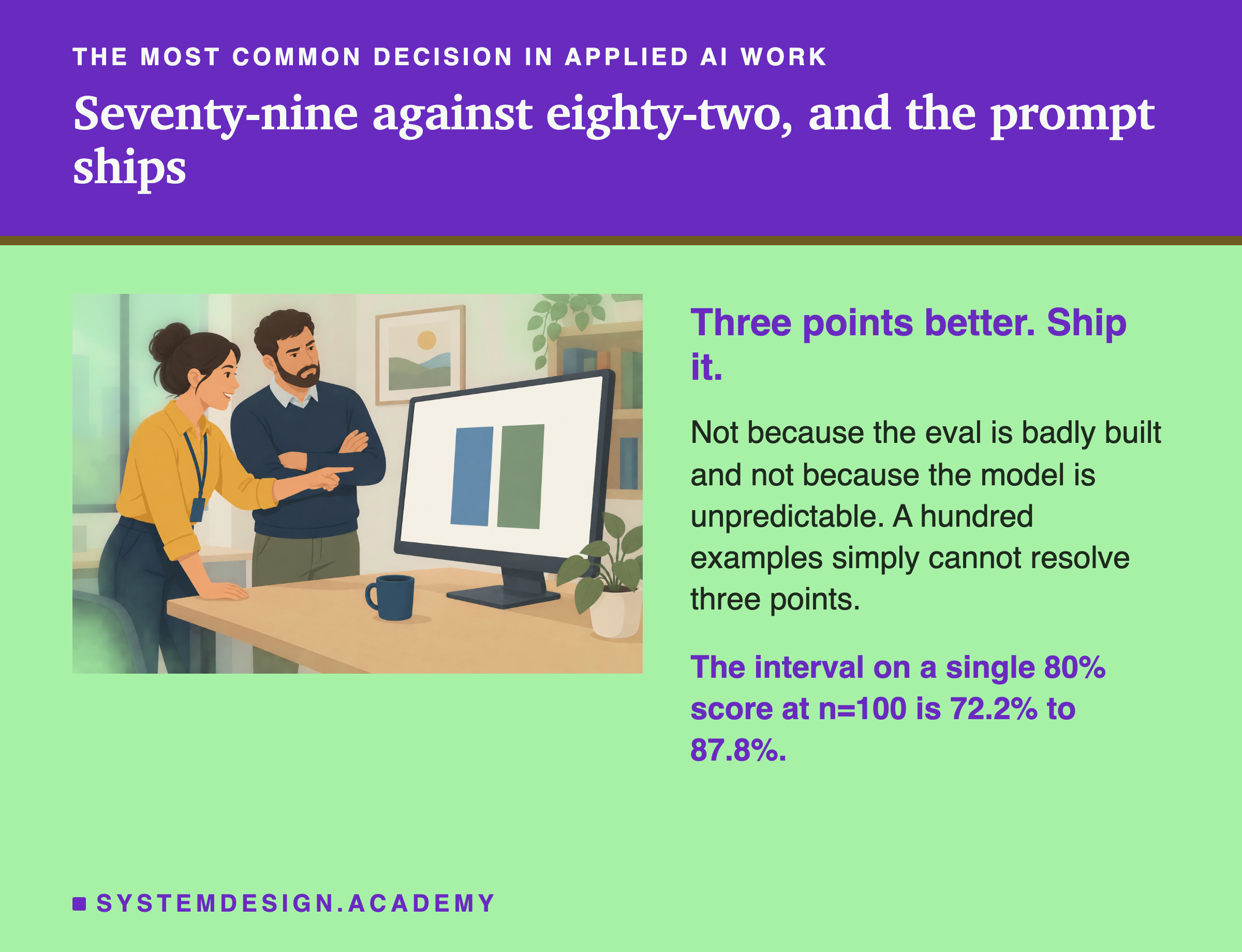
You change the prompt. You run the eval. The old version scored 79%, the new one scores 82%.
Three points better. You ship it.
That is the most common decision in applied AI work, and on a hundred-example set it is close to a coin toss. The eval is not badly built. The model is not being difficult. A hundred examples simply cannot resolve three points.
By the end you will know what a set of your size can see. You will know which changes are worth measuring at all, and what to write on the results table instead of a bare percentage.
One thing to keep in mind from here on. Every detection rate below assumes each version was scored on its own separate sample. That is the least favourable case, and most teams do something better without knowing it. We come back to that near the end.
One Score, and the Range Around It
Start with a single number. An eval of 100 examples reports 80%.
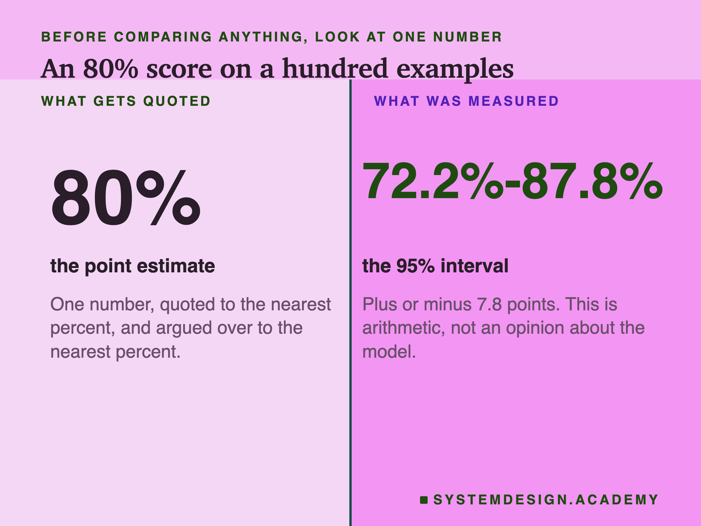
Where does that range come from? You ran the system on a hundred cases out of the much larger pool of things your users ask. A different hundred would have produced a different score. The interval says how different.
Two caveats worth stating once. This is the normal approximation, the interval every A/B calculator shows. It is a little optimistic. At 80% and n=100 its true coverage is about 93% rather than 95%. At n=50 its upper end sits about two points above the tighter Wilson interval. It also assumes your hundred cases are a sample of the traffic. If a colleague hand-picked them and froze them a year ago, the arithmetic still runs but it describes a narrower question than you think.
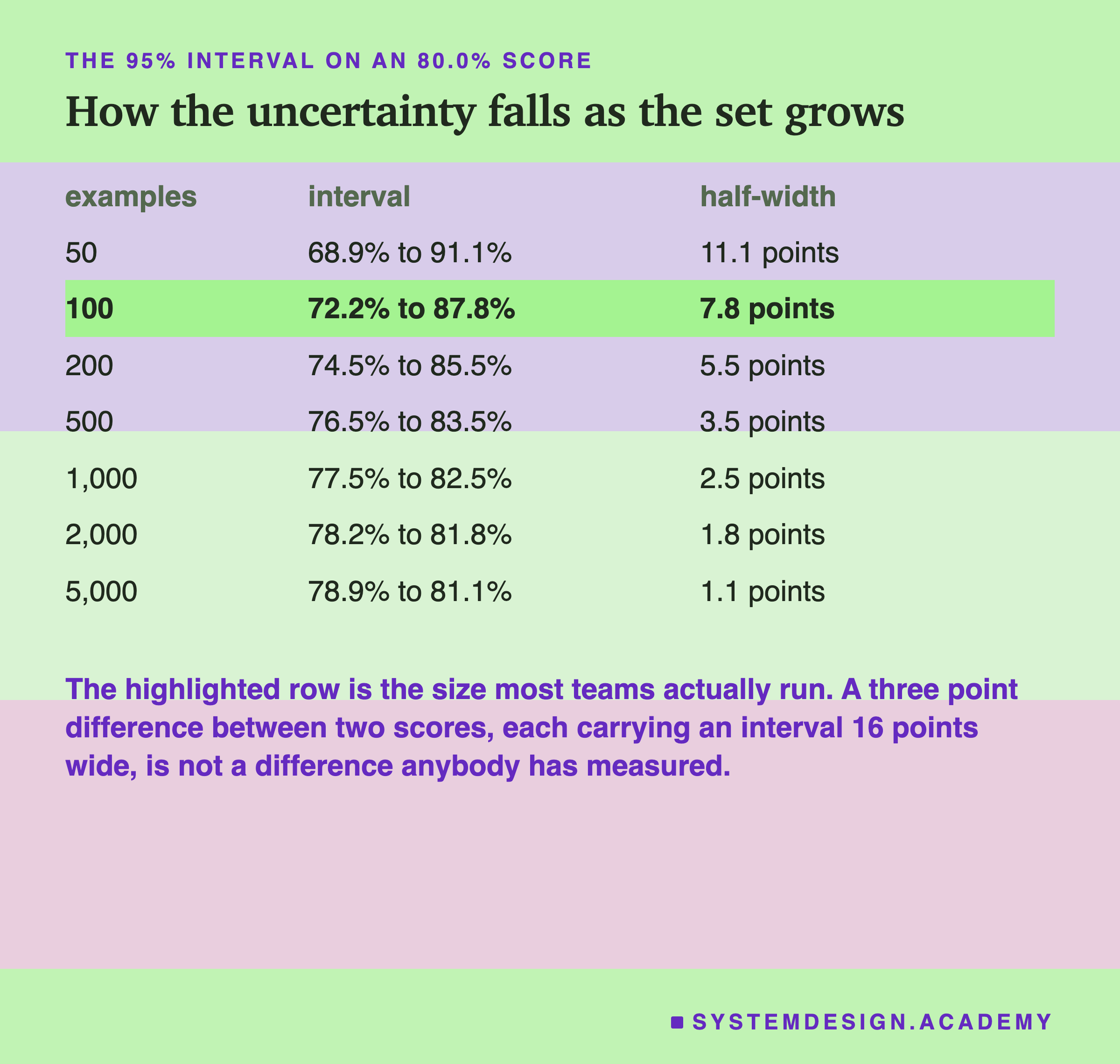
Here is the same calculation at every size the lab tests.
| examples | interval on an 80% score | half-width |
|---|---|---|
| 50 | 69% to 91% | 11.1 points |
| 100 | 72% to 88% | 7.8 points |
| 200 | 74% to 86% | 5.5 points |
| 500 | 76% to 84% | 3.5 points |
| 1,000 | 78% to 82% | 2.5 points |
| 2,000 | 78% to 82% | 1.8 points |
| 5,000 | 79% to 81% | 1.1 points |
Drawn on one axis, the shape of the problem shows up at once.
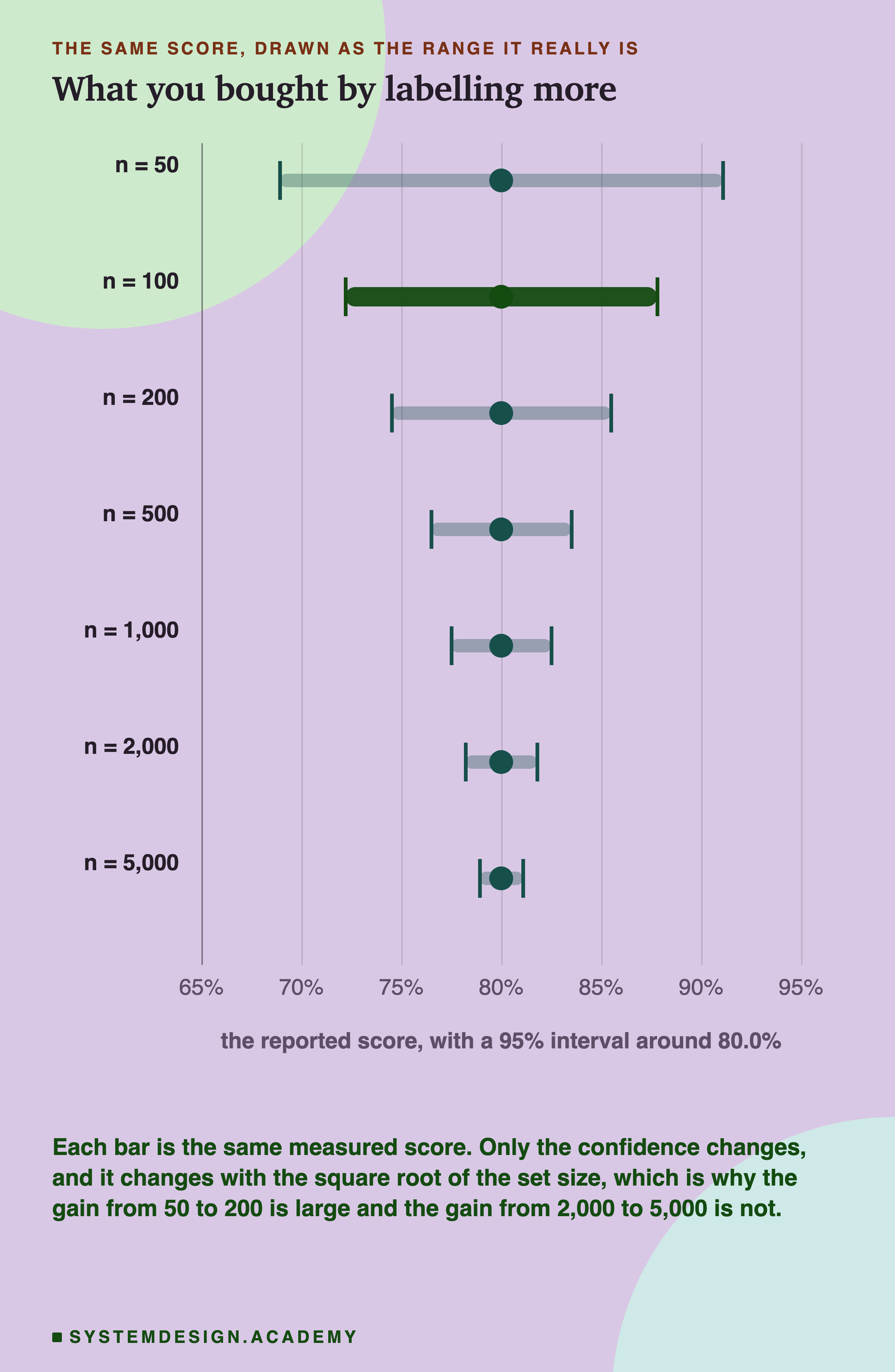
The rule underneath is worth memorising, because it governs every decision later in this lesson. To halve the interval you need four times the examples. Going from 50 to 200 takes eleven points of uncertainty down to five and a half. Going from 2,000 to 5,000 costs three thousand more labels and returns two thirds of one point. That is why "just label more" stops being an answer long before you get to a small effect.
The Number You Actually Wanted
Back to 79% and 82%. Each has its own range.
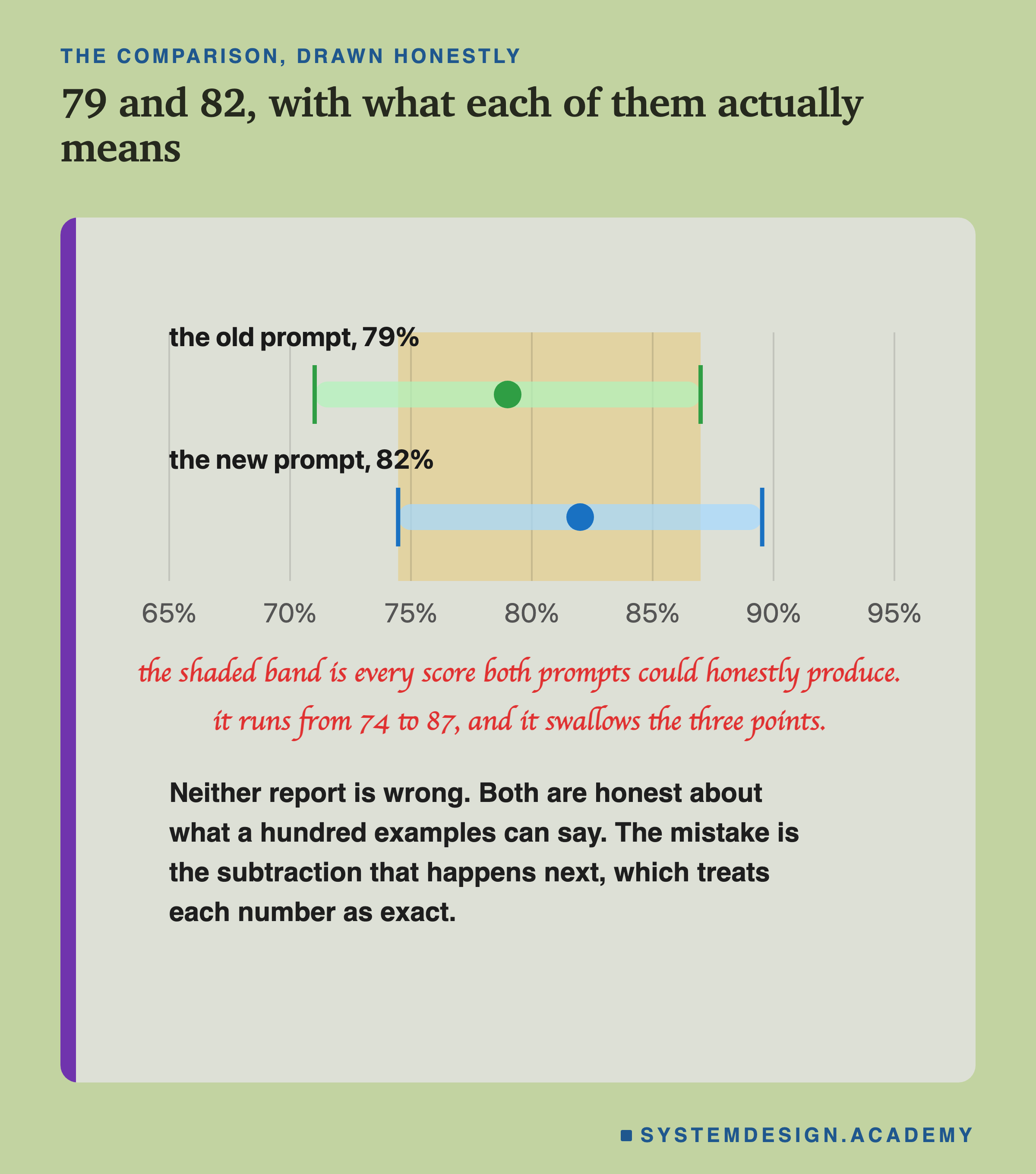
That picture is useful for intuition and dangerous as a rule. Overlapping intervals are not a test. Two 95% intervals can overlap while the difference between the scores is comfortably significant: 80% against 90% at n=100 each is one example, and there are plenty more. The overlap check is biased toward telling you there is nothing there.
The number that answers the question is the interval on the difference, and the lesson has been circling it for four figures.
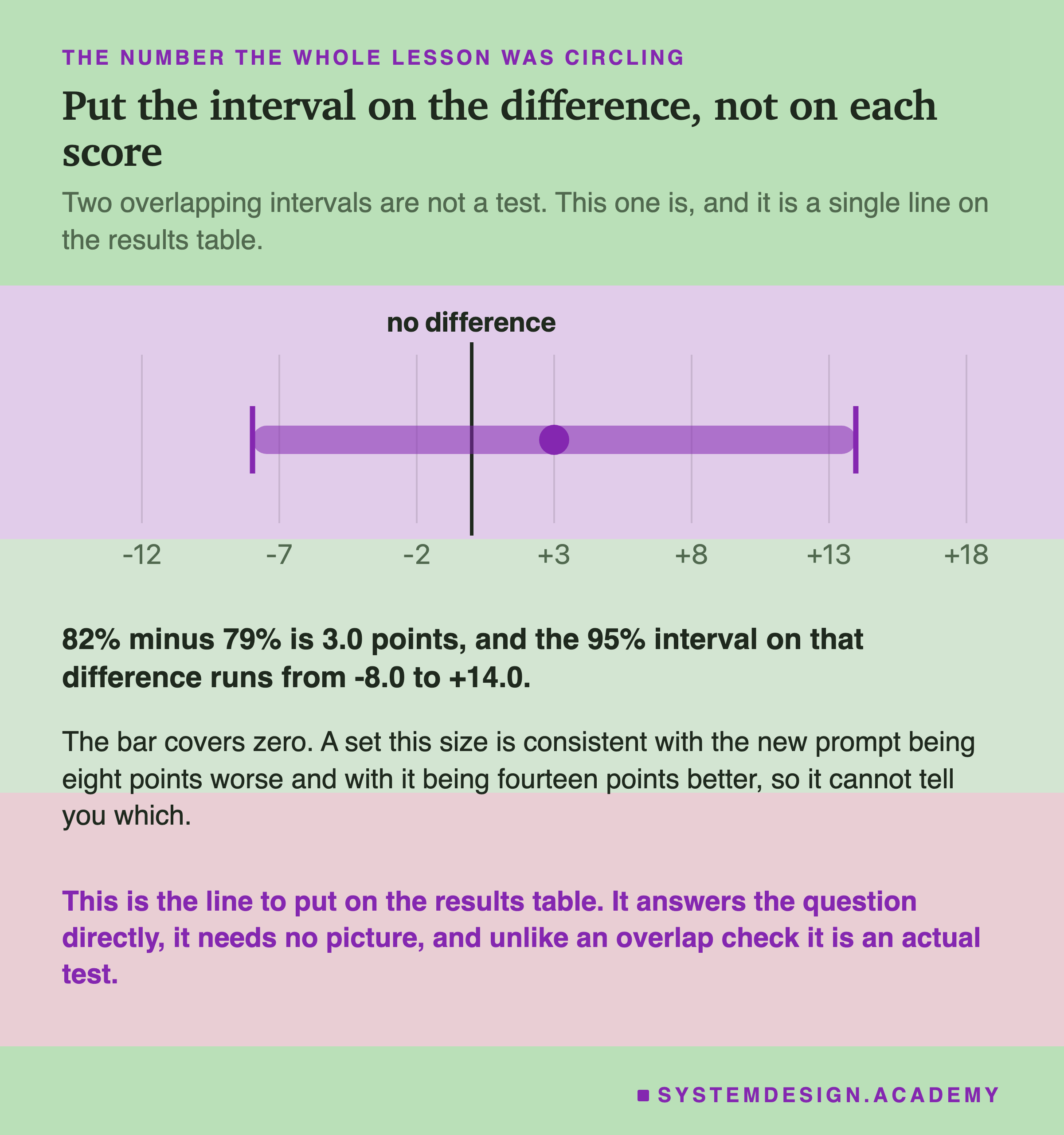
Plus three points, and the range around it runs from minus eight to plus fourteen. It covers zero, so this run is consistent with the new prompt being meaningfully worse and with it being much better. That is one line of arithmetic, it replaces the overlap picture, and it is what belongs on the results table.
How Often You Catch a Real Improvement
Intervals tell you what one run could have been. The question that decides whether your work survives is different: if the new version really is better, how often does the eval say so?
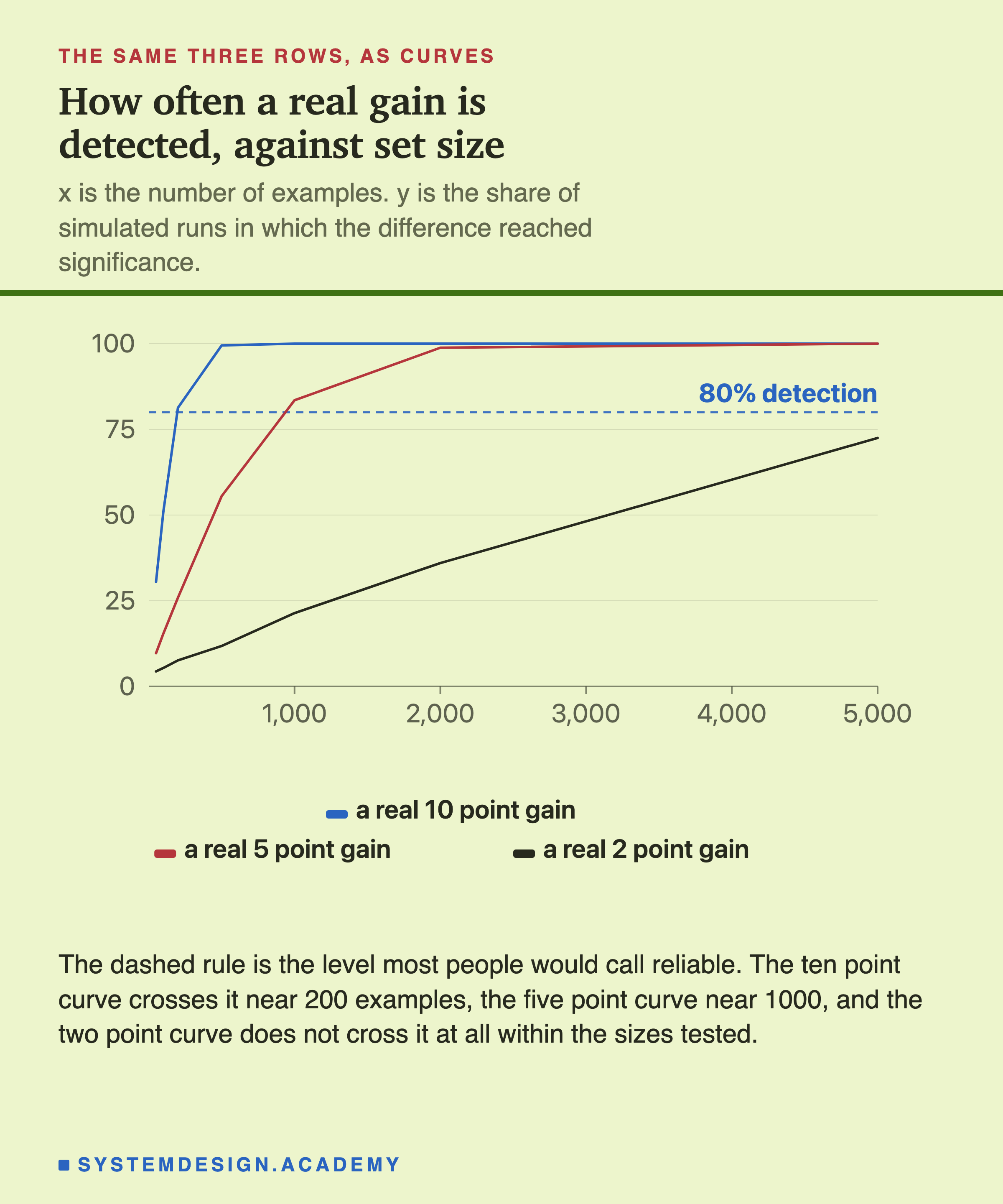
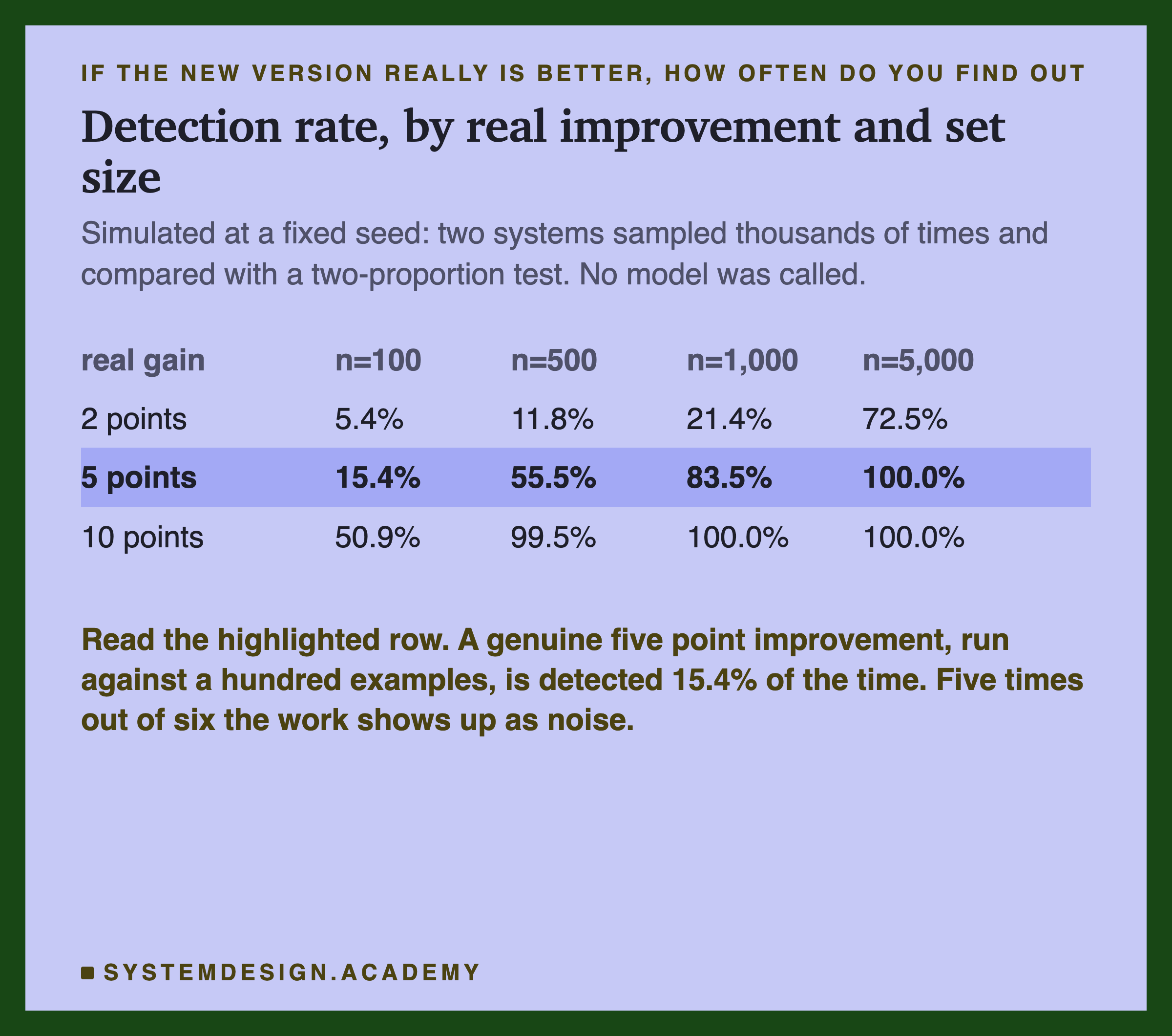
That is called power. The table below is simulated rather than derived. Two systems are sampled thousands of times at each size. Each pair is compared with a two-proportion test at the 5% level, and counted only when the new version came out ahead. Requiring the right direction makes the effective one-sided level 2.5%, which is the honest way to count a result you would actually act on.
| real gain | n=100 | n=200 | n=500 | n=1,000 | n=5,000 |
|---|---|---|---|---|---|
| 2 points | 5.4% | 7.6% | 11.8% | 21.4% | 72.5% |
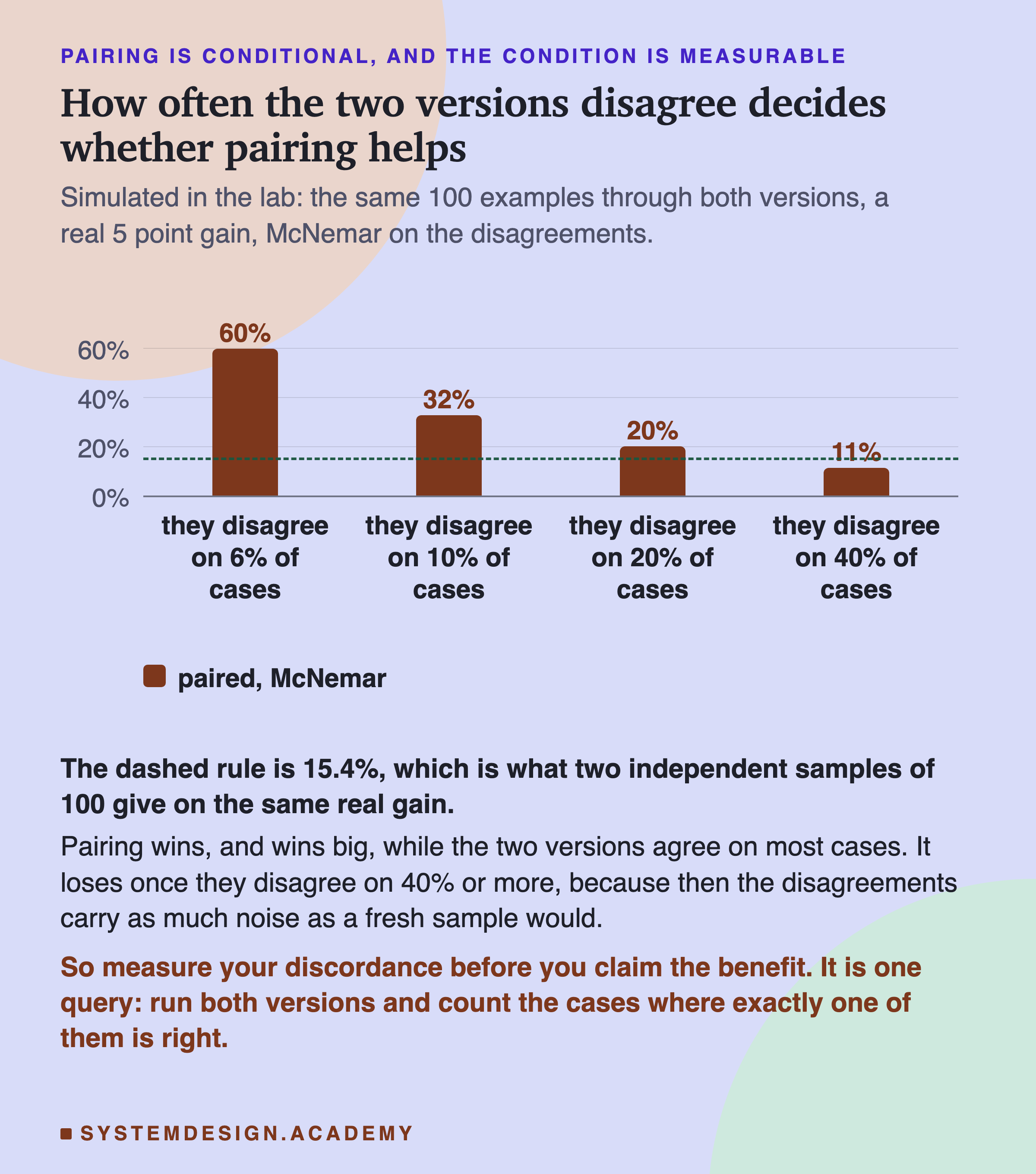
| 5 points | 15.4% | 25.9% | 55.5% | 83.5% | >99.9% |
| 10 points | 50.9% | 81.3% | 99.5% | >99.9% | >99.9% |
What 15% Costs You
Fifteen per cent is easy to read past. Here is the same number as a picture.
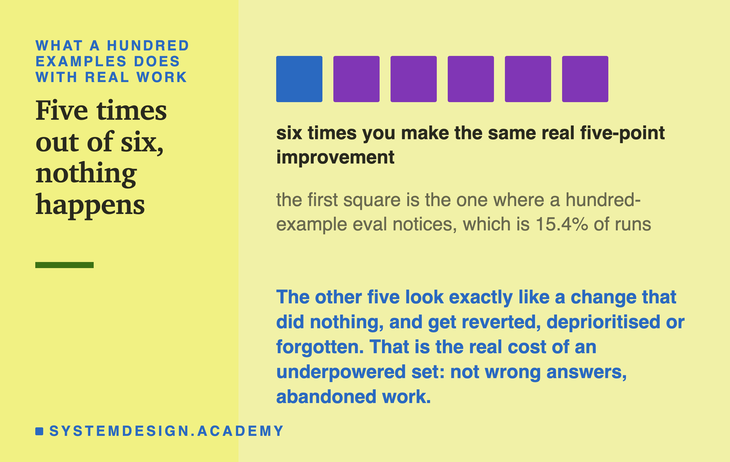
Roughly one time in six, the eval notices. The other five times the result is indistinguishable from a change that did nothing, and what happens next is worth following step by step.
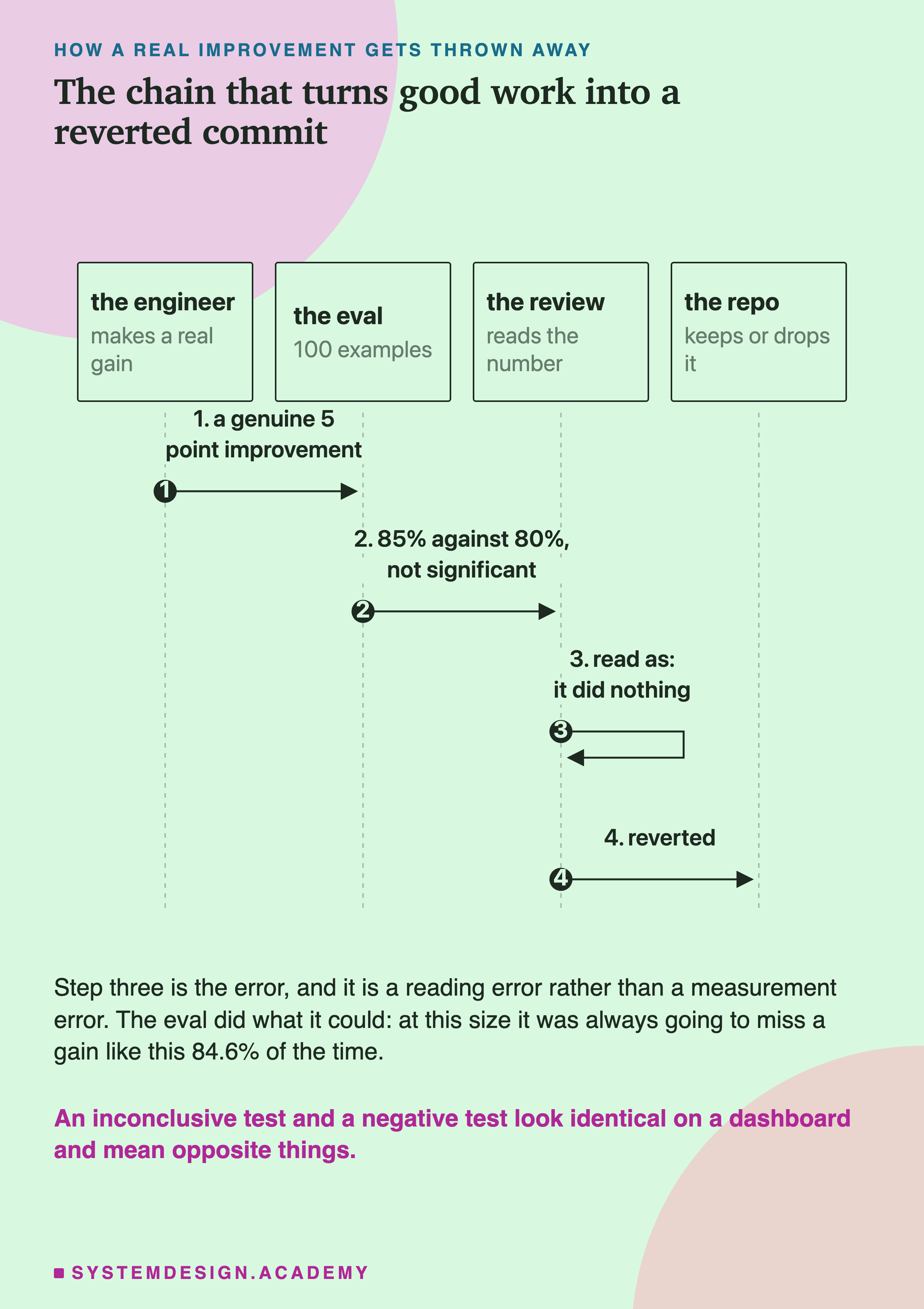
Nobody in that chain was careless. The engineer improved the system, the eval did what a hundred examples can do, and the review read the number in front of it. The failure is at step three, where "did not reach significance" was read as "did nothing", and a dashboard shows those two identically.
The cost of an underpowered eval is not wrong answers. It is abandoned work, and it is invisible, because nobody writes a postmortem for an improvement that was quietly dropped.
The Sizes That Actually Work
Turn the table around. To catch a real improvement 80% of the time:
- a 10 point gain needs about 200 examples.
- a 5 point gain needs about 1,000.
- a 2 point gain needs roughly 6,000, which is past every size the lab tests.
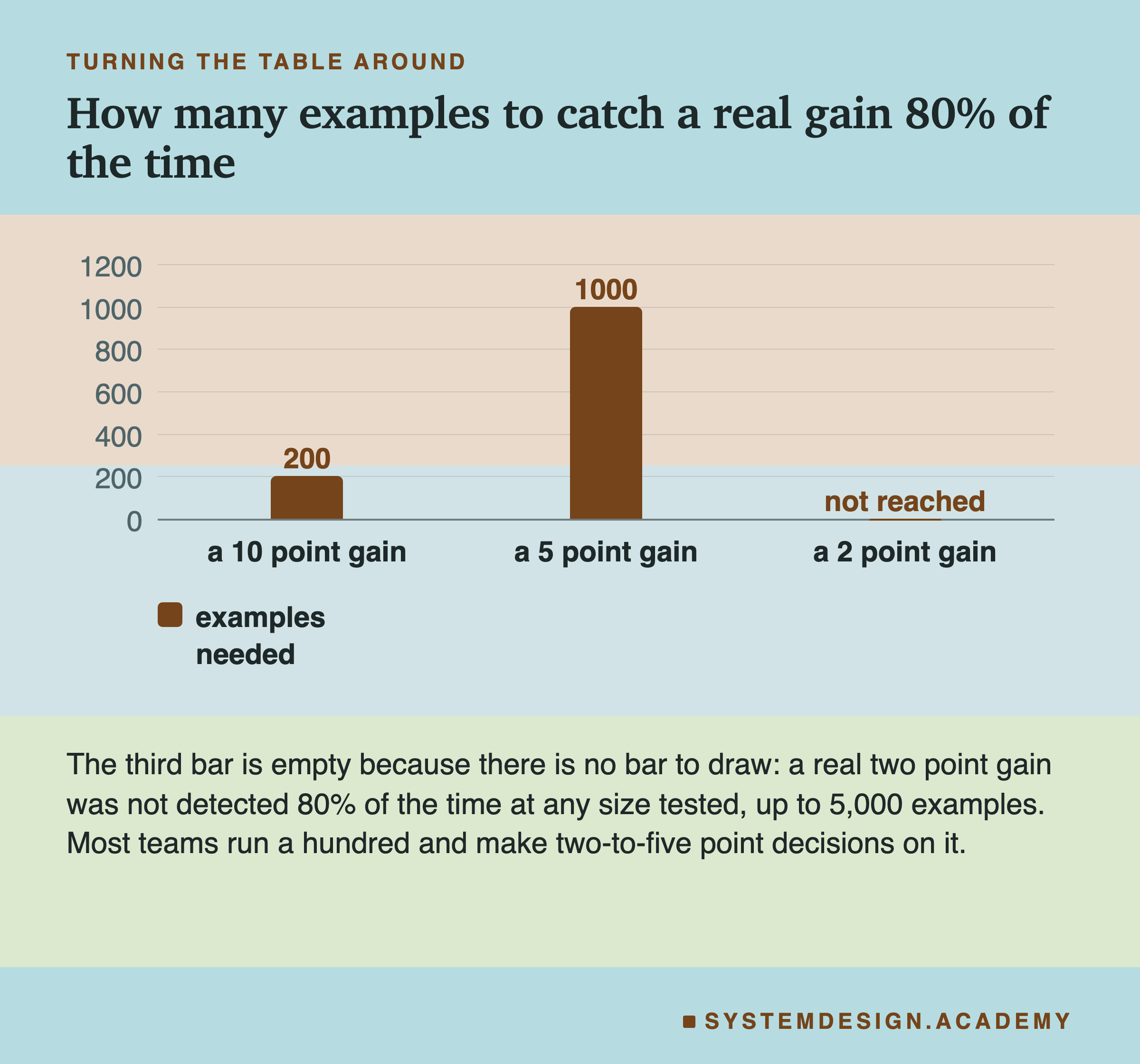
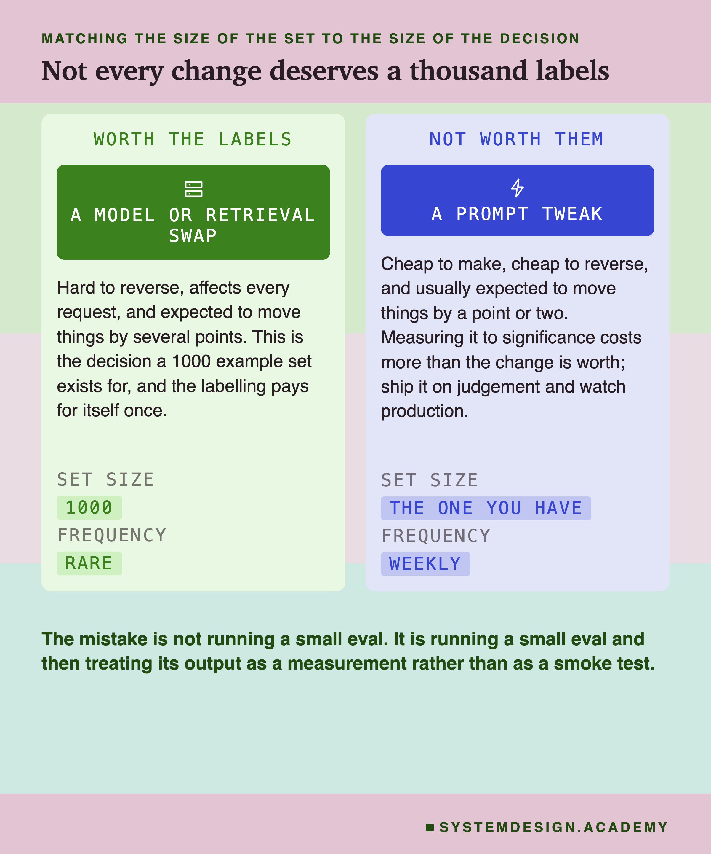
Most teams run a hundred examples and make two to five point decisions on them. Everything else in this lesson follows from the distance between those two facts.
There is a second way to read the same numbers, and it changes what you do on Monday. Rather than asking how big the set must be, ask how big the change must be.
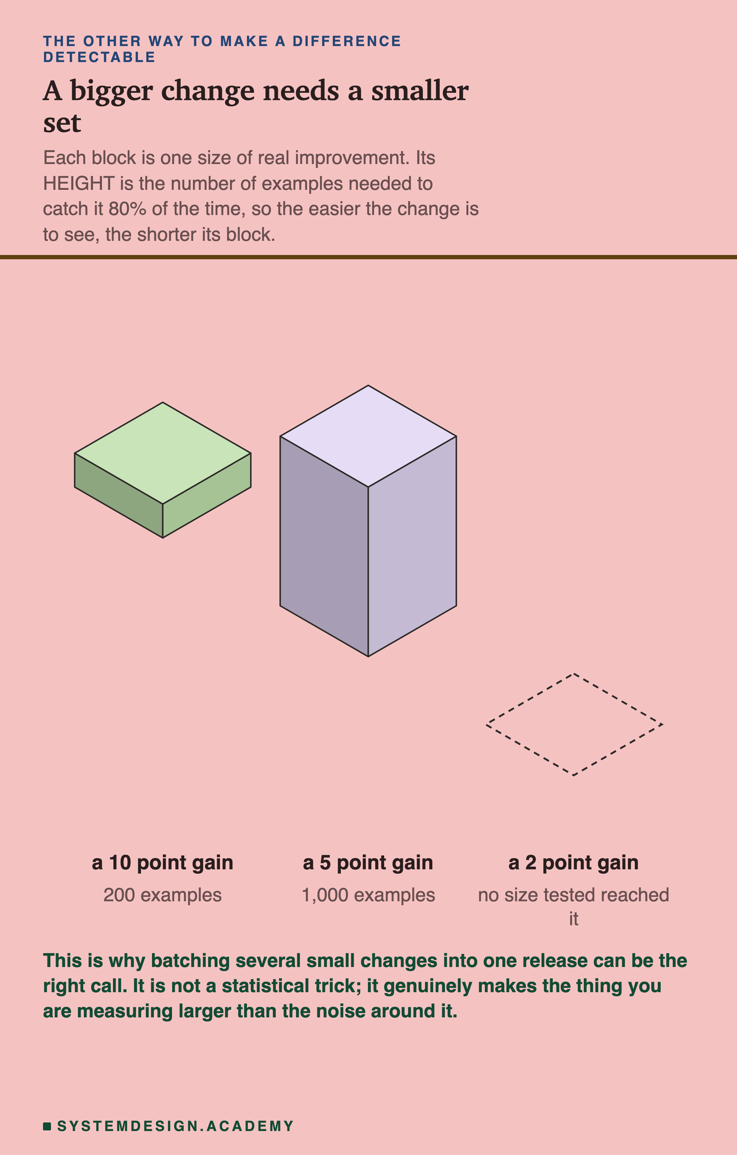
A larger change needs a smaller set, which is why shipping five small prompt tweaks as one release and measuring the release can be the right call. The thing you are measuring is genuinely larger.
It has a cost, and the figure does not show it. A batch that comes out flat leaves you with five suspects and no way to tell which one hurt. Unpicking a release costs more than unpicking a commit. Batch when the individual changes are cheap to keep and you mainly want to know whether the set of them helped.
What a Null Result Is Allowed to Mean
The eval ran. The number did not move. What have you learned?
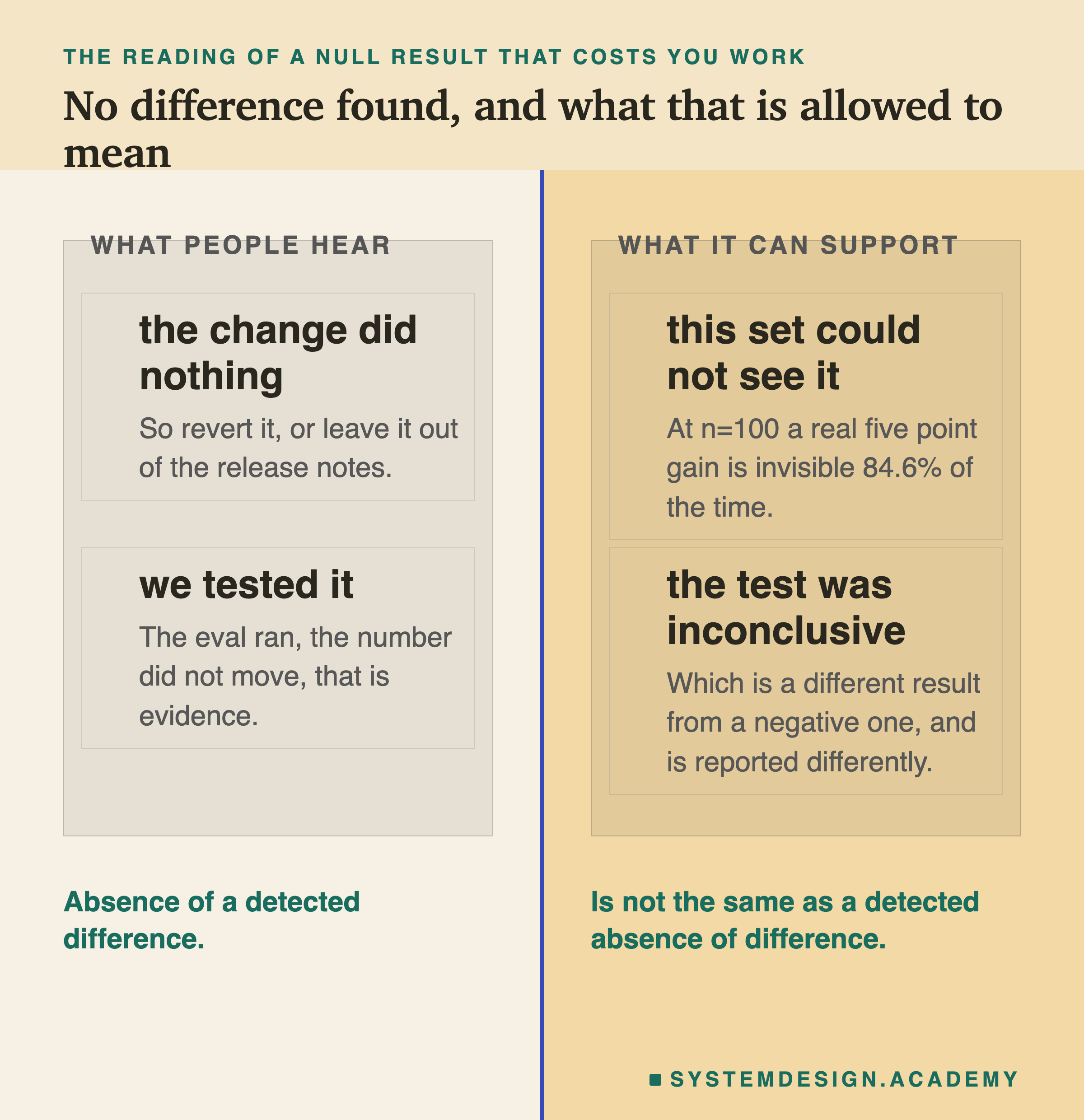
Absence of a detected difference is not the same as a detected absence of difference. The first is what a small eval gives you almost every time. The second is a real finding, and it needs a set large enough to have found the difference if one were there.
Which of the two you are holding is a procedure, and the procedure is two questions long.
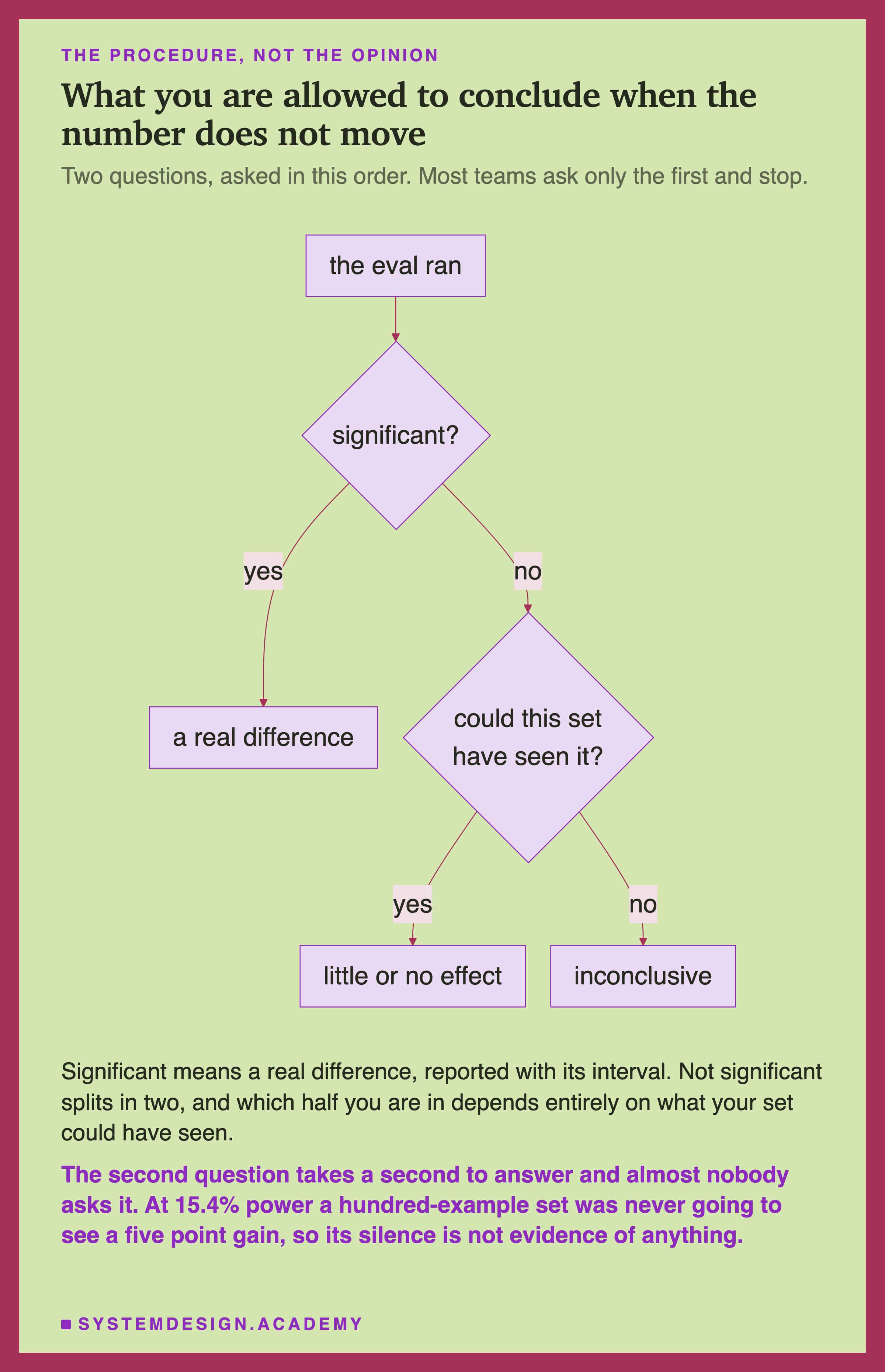
Almost everyone asks the first question and stops. Answering the second takes one lookup in the power table, and it changes what you are entitled to write down. In a review, say "this set could not tell" rather than "the change did nothing". Those five words have saved a lot of good work.
Why Running It Again Does Not Help
The first thing almost everybody does with a result that fell short of significance is run the eval again.
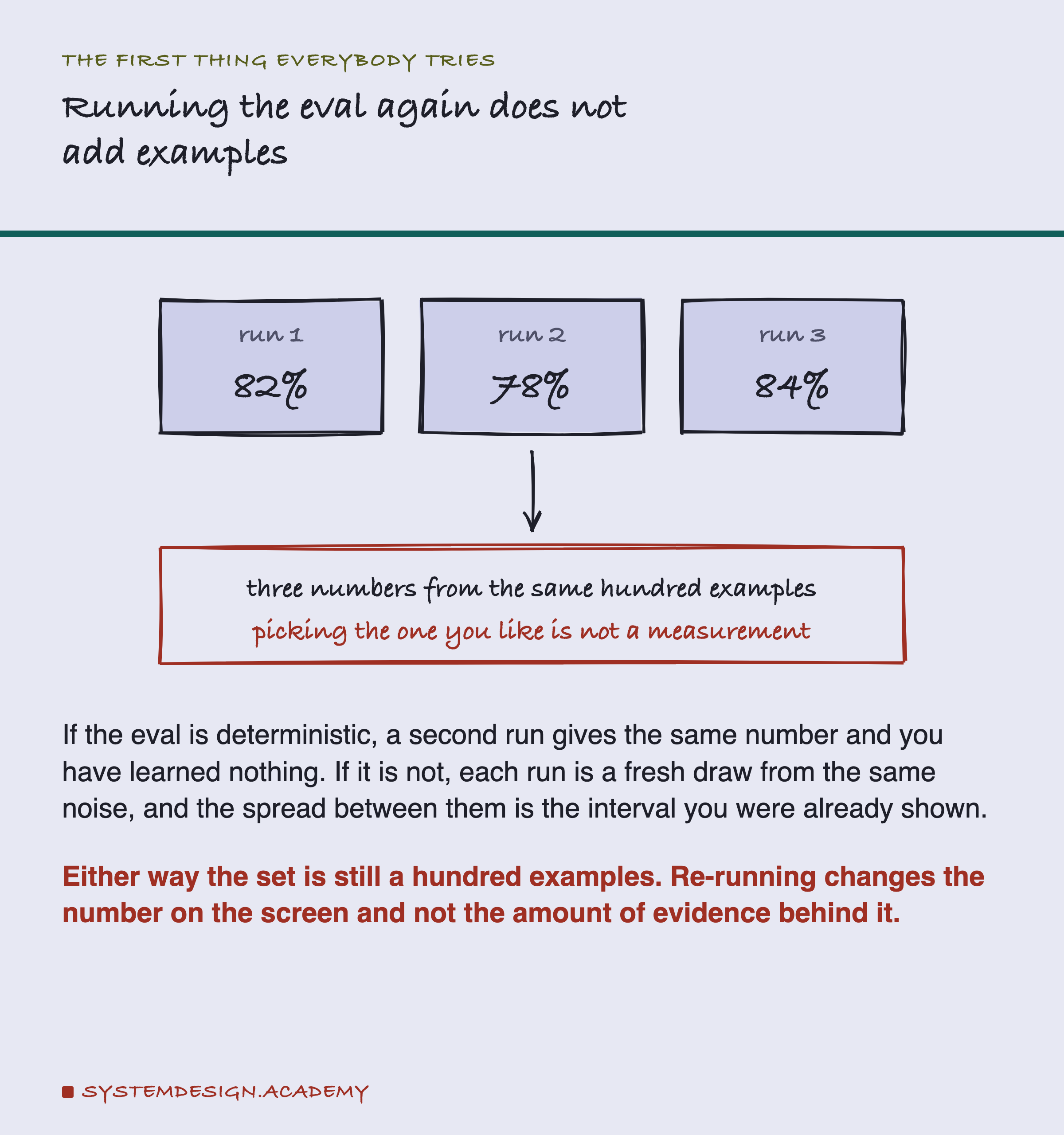
It feels like more evidence. Being precise about why it is not takes one distinction.
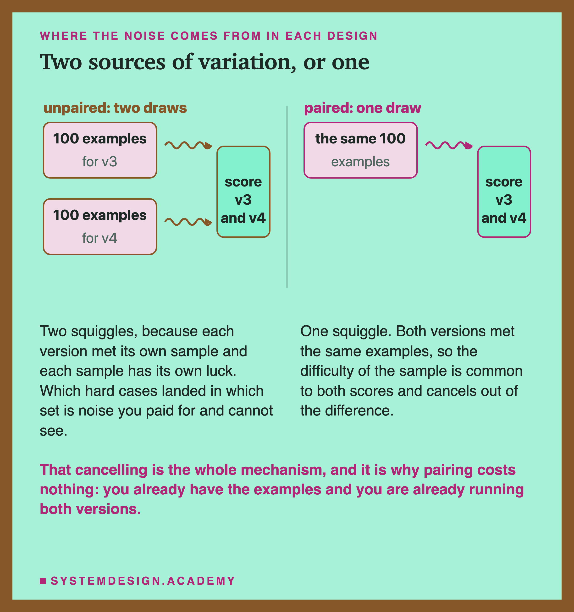
There are two separate sources of wobble. One comes from which hundred examples you happen to have, and that is the source the intervals above describe. The other comes from the model answering the same example differently on two runs at a non-zero temperature. Re-running your eval resamples the second and leaves the first exactly as it was.
So averaging several runs does help a little: it shrinks the generation wobble by the square root of the number of runs. It does nothing at all to the sampling wobble, which is the larger of the two and the one this lesson is about. Your set is still a hundred examples afterwards.
Picking whichever of three runs supports the change you wanted to ship is a different problem, and an older one. If you re-run, average every run, decide the number of runs before you look, and report the average.
Run It
Every detection rate on this page comes from the script below. It computes the intervals with arithmetic and simulates the rest at a fixed seed. No model is called.
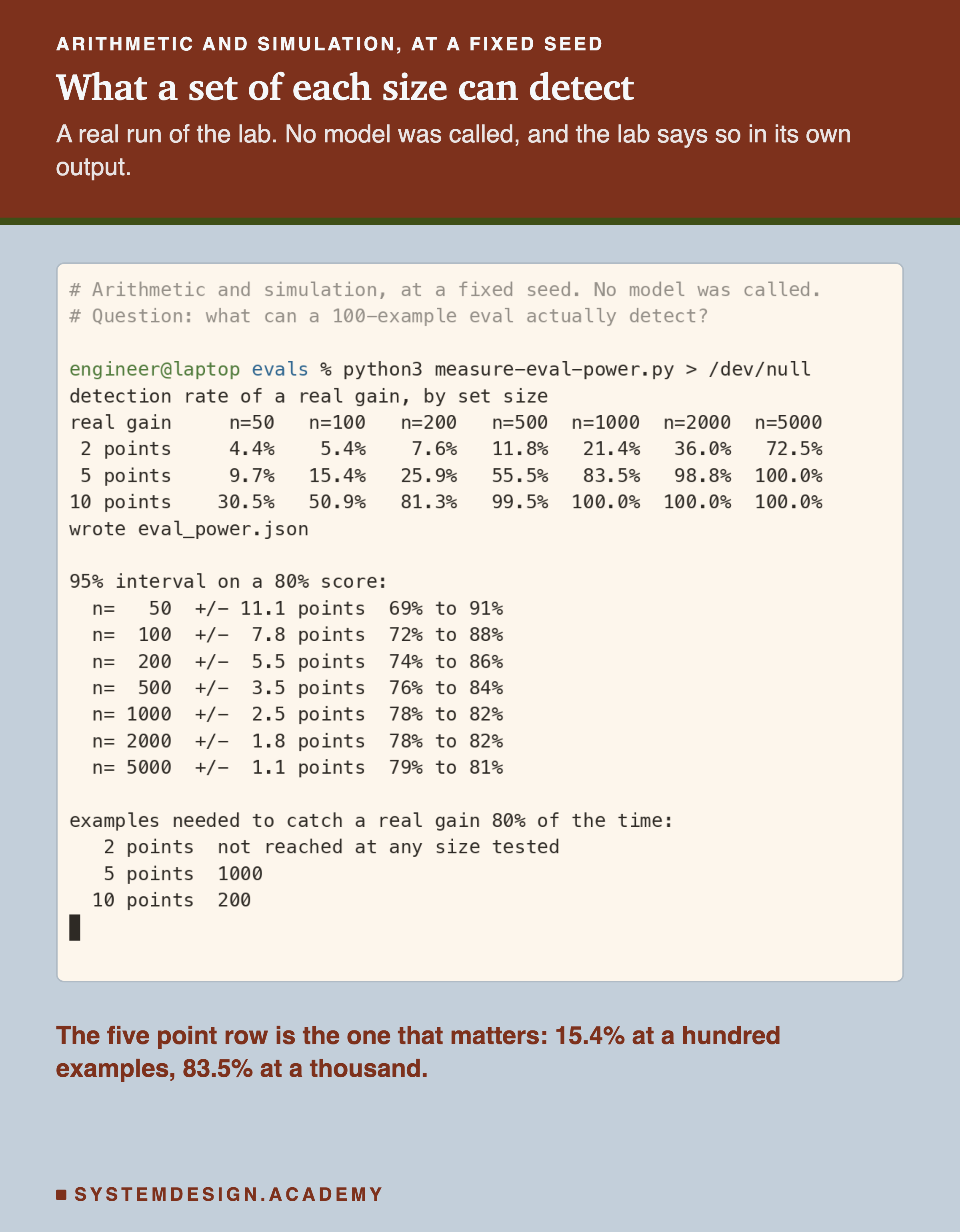
Three constants decide whether the answer is about your system or about mine.
BASELINEis your current pass rate. Every number above is computed at 0.80, and the shape changes as you move away from it.DELTASis the improvement you actually expect. Set it to what you would bet on, rather than what you hope for.SIZESis the list of set sizes tested. Add your own. If your set holds 137 examples, put 137 in the list, because reading between 100 and 200 on a square-root curve is guesswork.
ALPHA is also yours to change, and unlike the version this lesson started with, changing it now changes the answer instead of silently returning zero.
What to Do With a Set You Cannot Grow
Labelling a thousand examples is expensive and often not possible this quarter. Growing the set is only one of four moves, and it is the last one you should reach for.
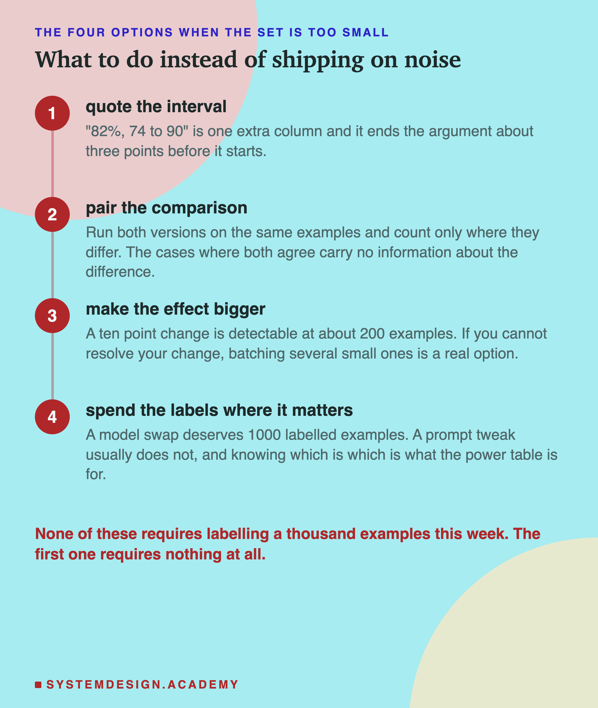
Take them in order of what they cost you.
Quote the interval. Free, one column, and it removes the argument about three points before anyone starts it.
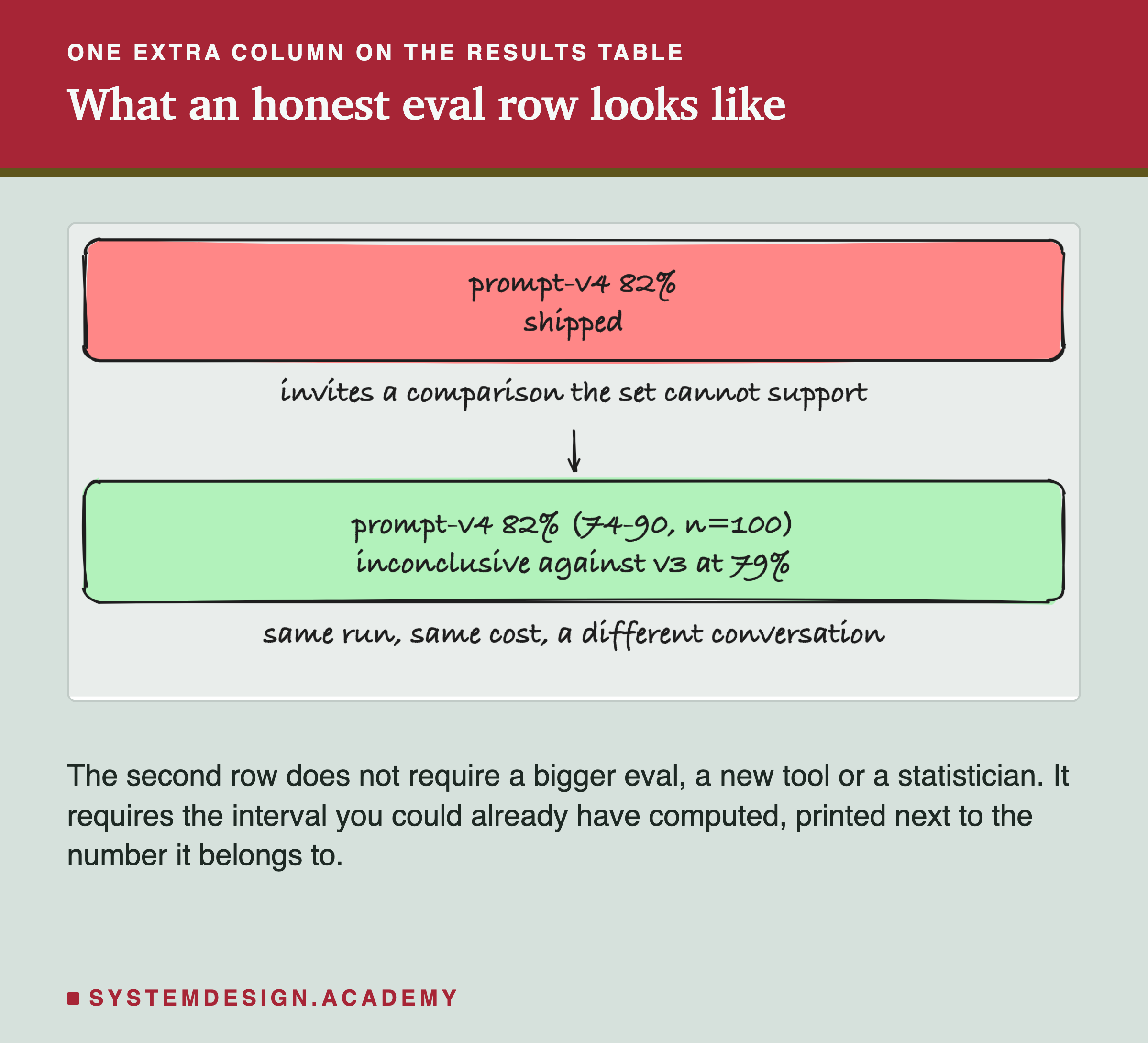
Print n alongside it. A score without its sample size cannot be read at all, and it is the field most results tables leave out.
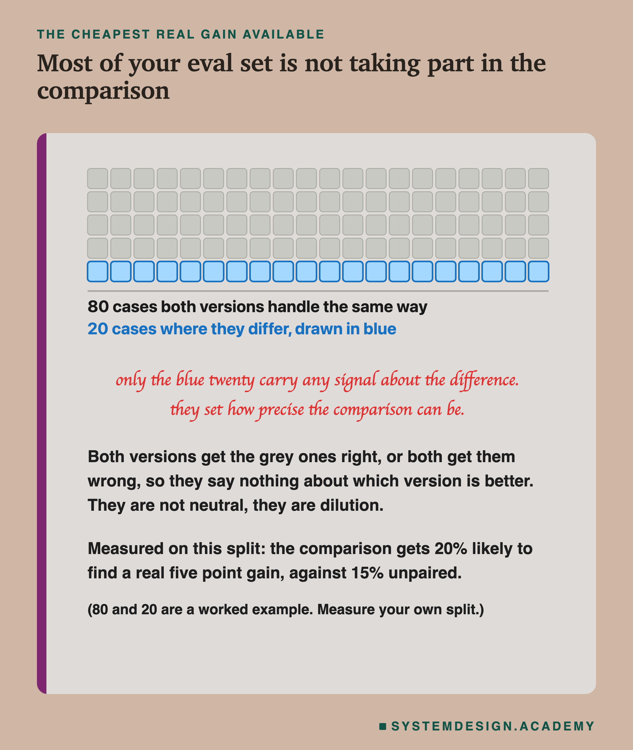
Pair the comparison. Also free, and the move with the largest effect.
None of This Needs a New Tool
When a lesson turns statistical there is a reflex to assume it needs a library, a platform, or somebody with a statistics degree. It needs three lines.
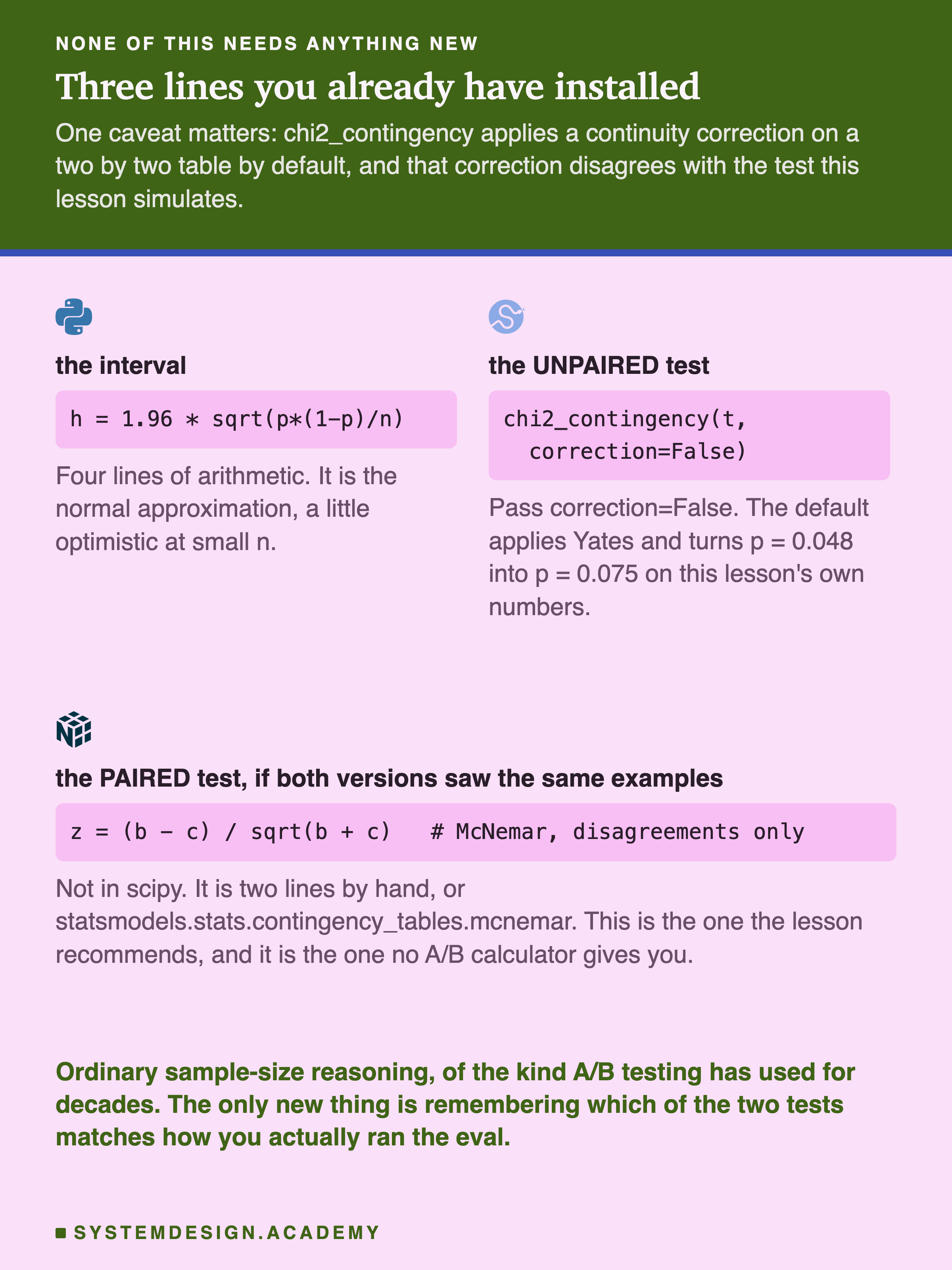
Two things on that figure will save you an afternoon.
The first is correction=False. On a two by two table, chi2_contingency applies a continuity correction by default. On this lesson's own numbers that correction turns a p of 0.048 into a p of 0.075. Follow the default and you get the opposite verdict from the simulation you just read.
The second is that the paired test is not in SciPy at all. McNemar lives in statsmodels, or you write the two lines yourself. The test this lesson recommends is the one no A/B calculator will hand you, which is a large part of why so few teams run it.
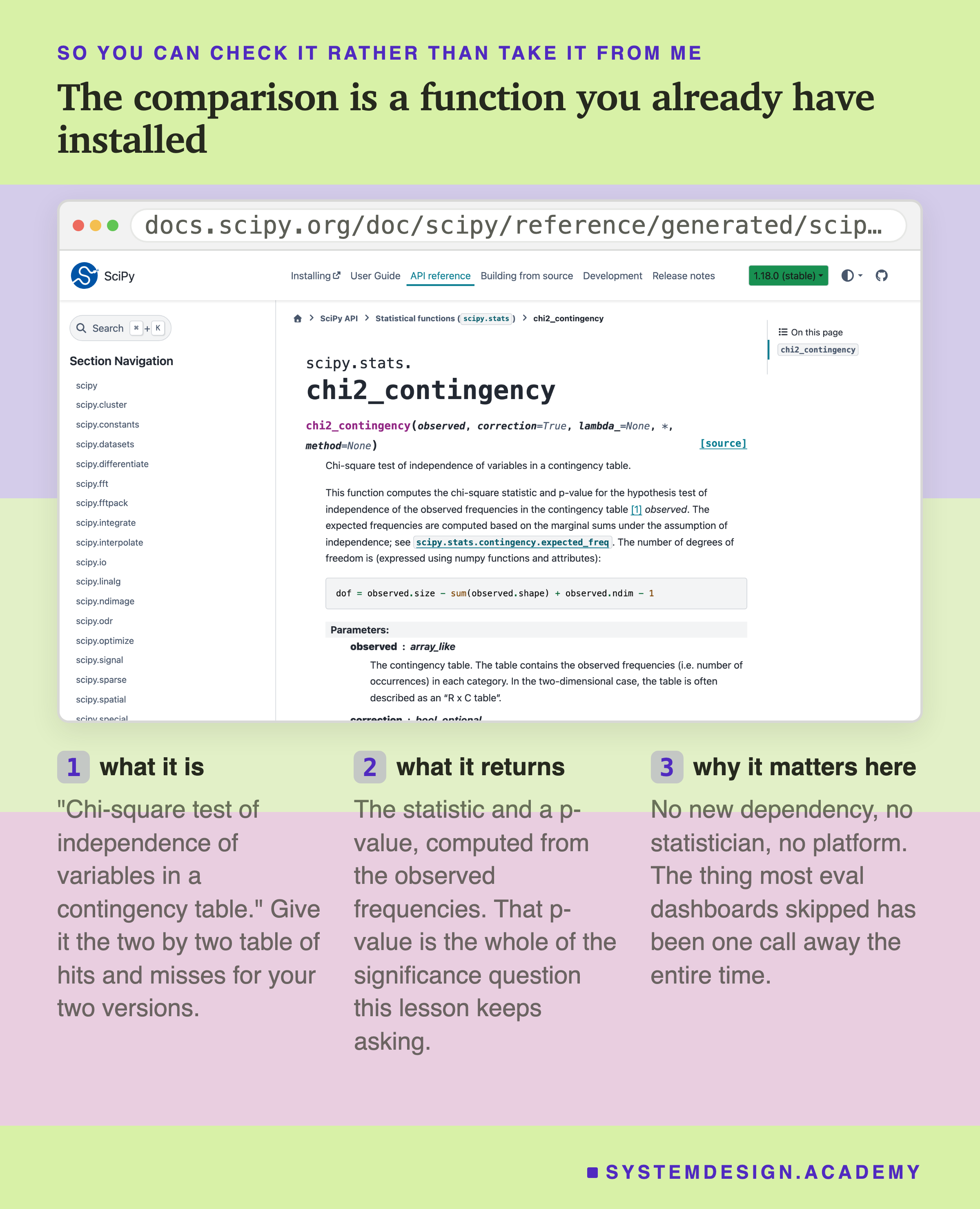
That is the real page, so you can check the signature and the default rather than take either from me. The maths here is ordinary sample-size reasoning of the kind A/B testing has used for decades. The only new part is matching the test to how you actually ran the eval.
Before the Next Prompt Ships
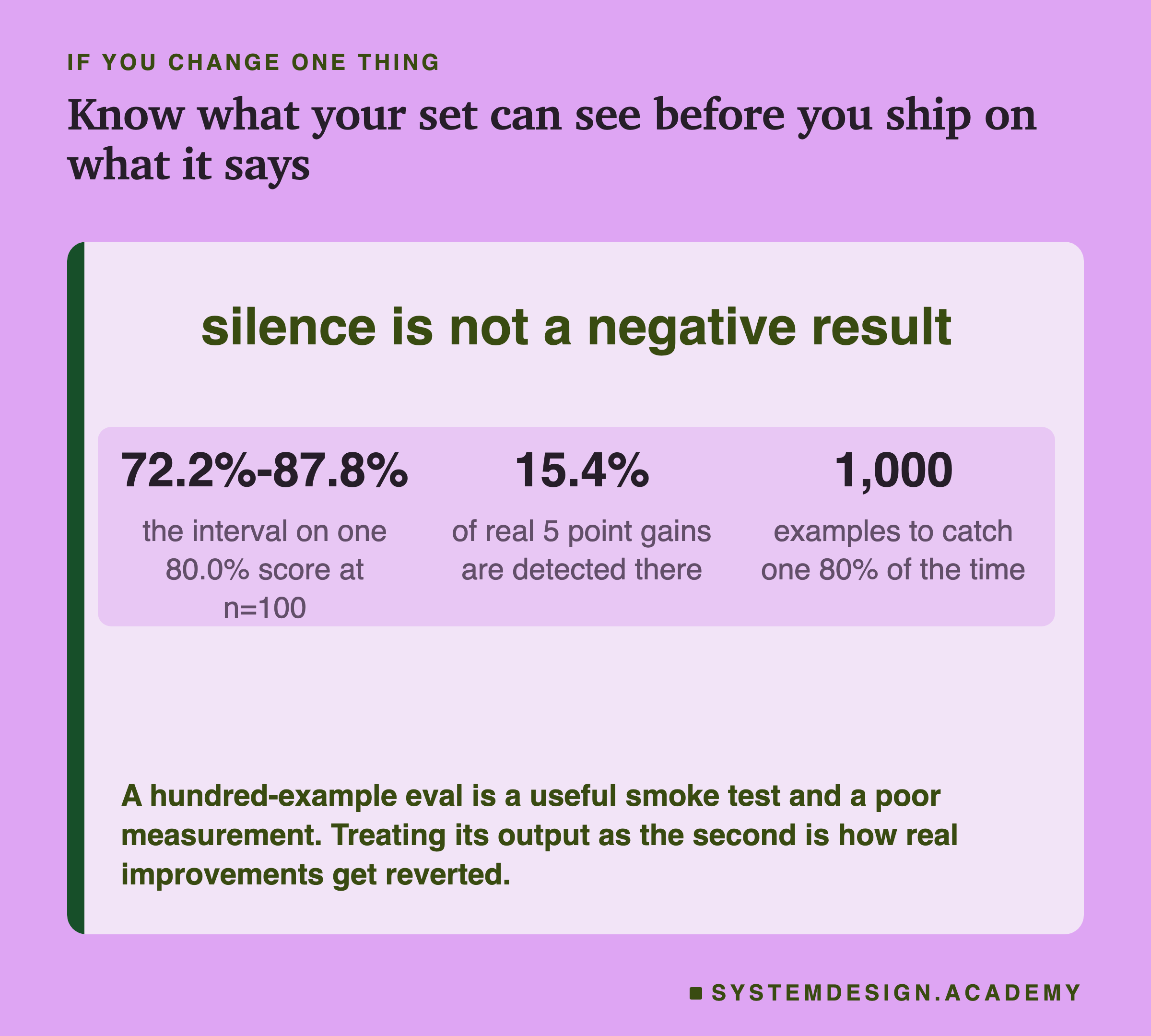
A hundred-example eval earns its place as a smoke test. It tells you the system still answers, the pipeline still runs, nothing has broken badly. Run it on every change.
As a measurement it is weak, and treating it as a strong one is how real improvements get reverted.
Four things to change, cheapest first. Print the interval and the sample size on every row. Pair your comparisons and measure your disagreement rate. Put your own baseline, your own set size and the improvement you actually expect into the lab below, and read off what you can see. Then, and only then, argue for more labels, on the decisions that are hard to reverse.
Knowledge Check
Knowledge Check
4 questions - Score 80% to pass
Your 100-example eval moves from 79% to 82%. What have you measured?
A genuine five-point improvement is run against a 100-example eval. How often does the eval detect it?
Roughly how many examples are needed to catch a real five-point gain 80% of the time?
You cannot afford to label 1,000 examples. What is the cheapest thing that actually helps?