An Alarm That Hears the Toast but Not the Gas
Let me start with a picture.
A smoke alarm rings every time someone burns a slice of toast. It is loud, it is annoying, and nothing is actually wrong. Then one day a gas tap is left on. There is no smoke, so the alarm stays silent, and that is the day it mattered.
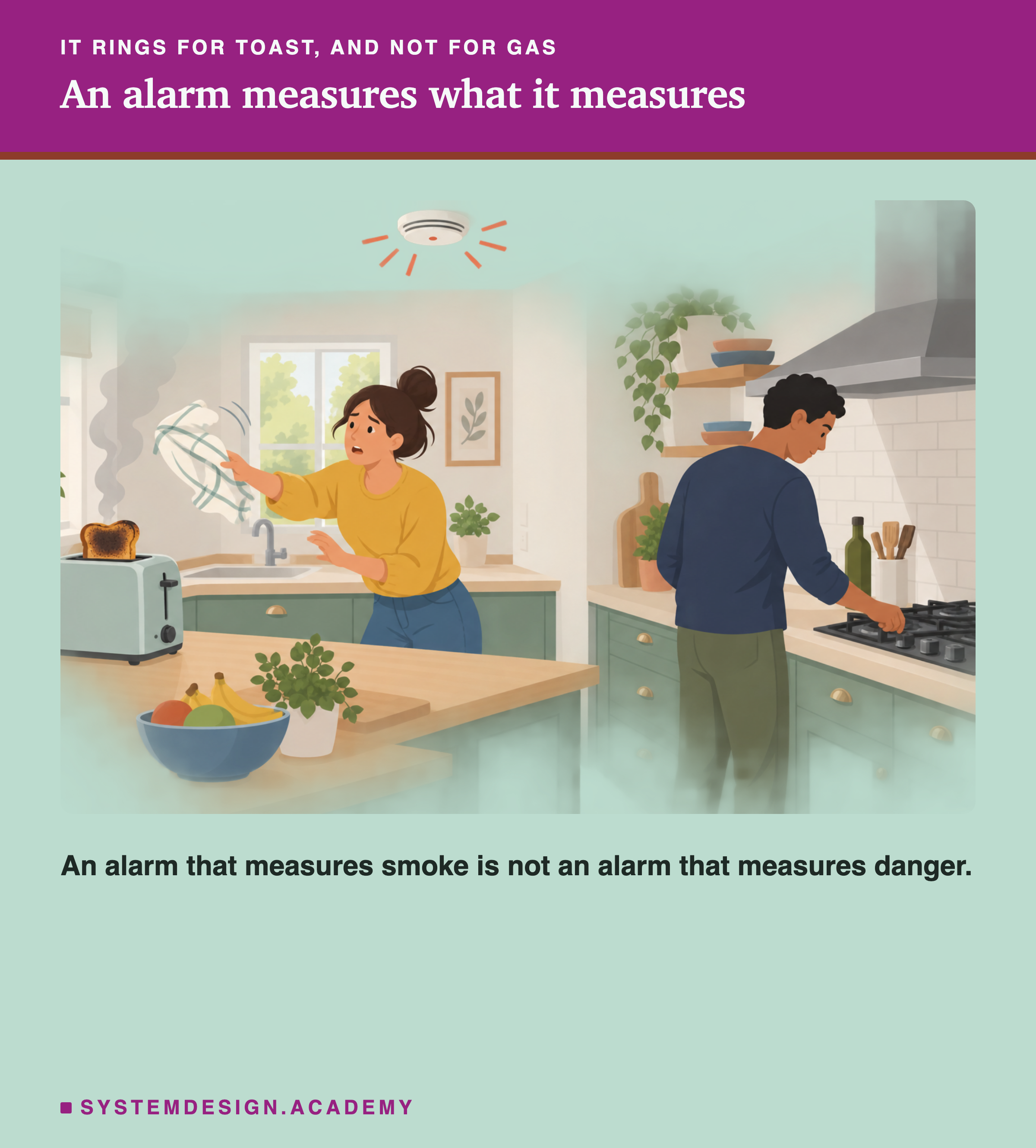
The alarm is not broken. It measures smoke, and smoke is not the same thing as danger.
Teams that run machine learning models have the same kind of alarm. It is called a drift monitor. It watches the new data coming in, and rings when that data starts to look different from the data the model learned from. The hope is that it rings when the model starts to go wrong.
This lesson measures whether it does. I built five kinds of new data and sent each to a real model 100 times. Every time, I checked two things: did the alarm ring, and was the model actually worse?
The Words You Need First
Please read this slide slowly if any word is new. Every slide after it uses these words.
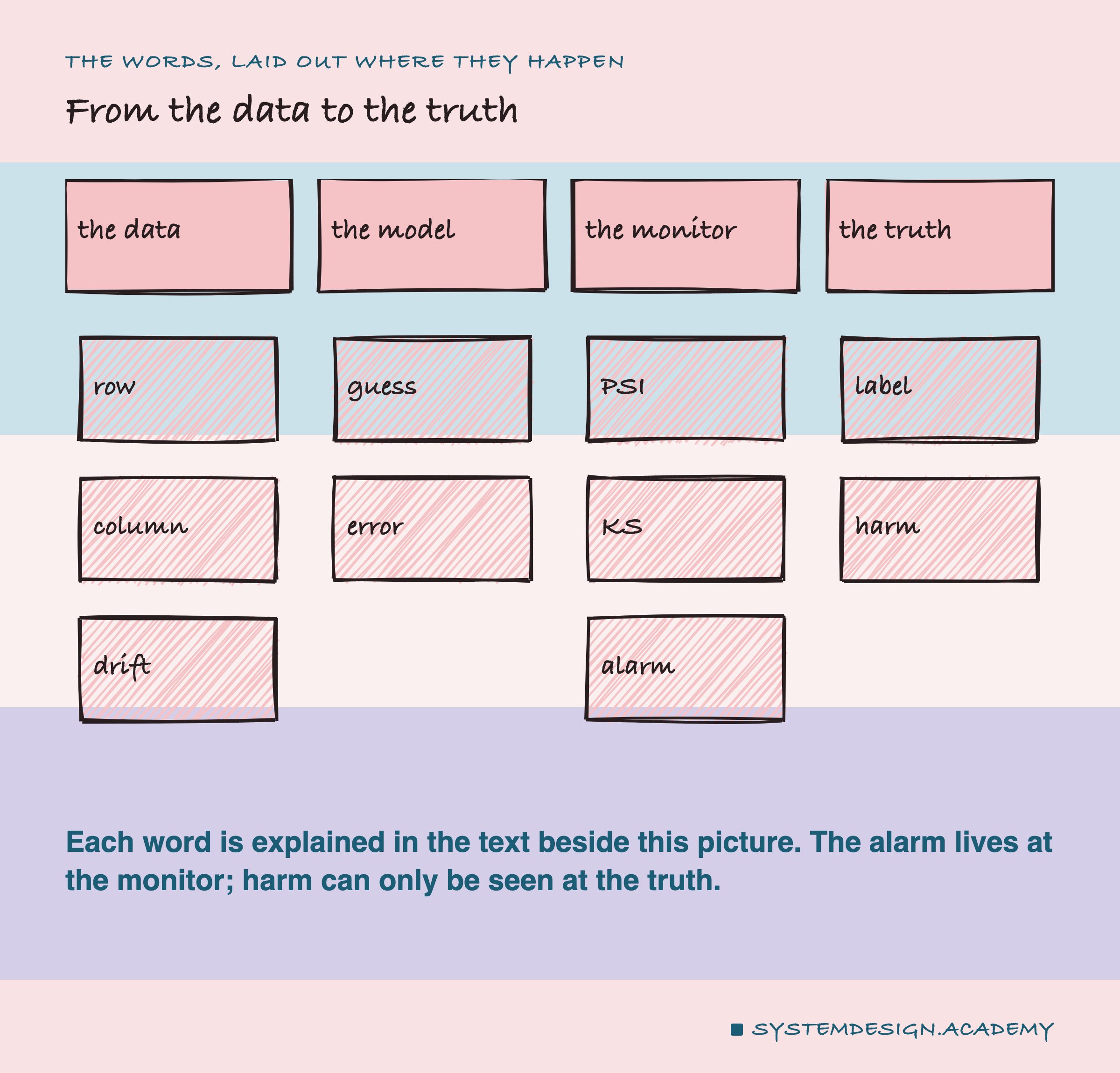
Row, column and batch. Data comes as a table. Each row is one example, here one district of California. Each column is one fact about it, like its location. A batch is a group of new rows checked together, here 500 at a time.
Median. The middle value: half the values are above it, half below.
Model and error. The model here guesses the typical house price in a district of California from 8 facts about it, like the median income and the location. Its error is how far each guess lands from the real price, averaged over many districts. Lower is better.
Label. The true answer for a row, here the real price. In real life labels often arrive late, weeks after the guess. That is why teams watch the inputs instead.
Training rows. The examples the model learned from. New rows are districts it never saw, standing in for the data it meets after launch.
Drift. New rows that look different from the training rows: richer districts, older houses, a different part of the state.
Drift monitor. A program that compares new rows with the training rows, one column at a time, and gives a number for how different they are. Above a chosen line, it rings an alarm. Two common ones:
- PSI (population stability index) cuts a column into 10 ranges and checks how the share of rows in each range has moved. Above 0.25 is the usual line for a big shift.
- KS (the Kolmogorov-Smirnov test) asks how likely a difference this big would be if nothing had changed. A very small likelihood rings the alarm, because a big difference is then unlikely to be luck. Here the alarm rings when the likelihood is under 5% in total. With 8 columns checked, each column gets an eighth of that, so a column rings below about 0.6%.
Prediction drift. Drift in the model's own guesses rather than in its inputs: the model suddenly guessing differently from how it guessed on the training rows. PSI can measure it too.
Harm. The model really doing worse. Here: its error on a batch of new rows is more than 10% above its usual error.
Five Kinds of New Data
-
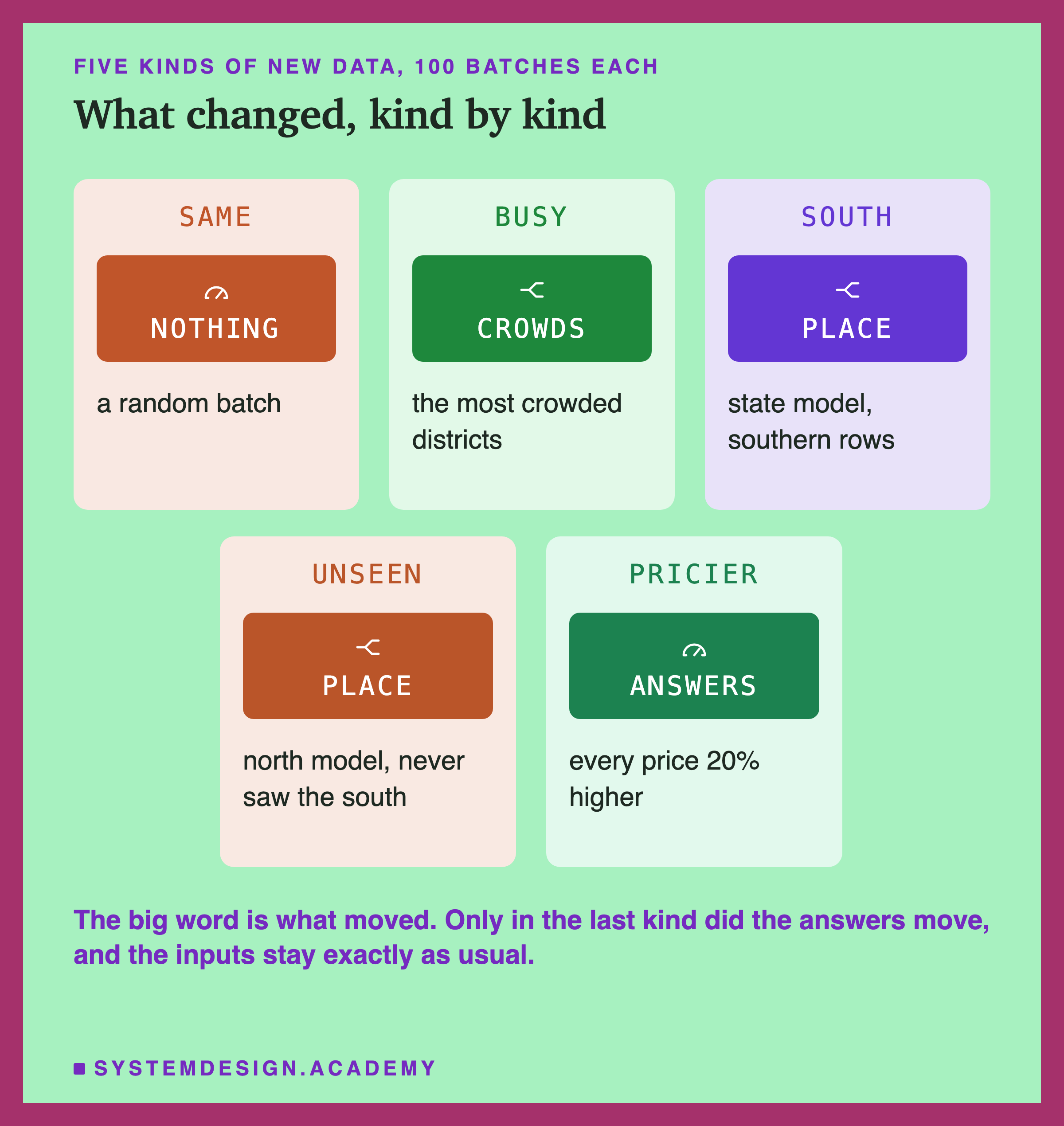
Same. A random batch of new districts. Nothing has changed, so any alarm here is a false alarm.
-
Busy. Only districts in the top 30% by population. The inputs clearly look different, but population is a column the model hardly uses.
-
South. Only districts in the south of the state. The model learned from the whole state, so it has seen places like these.
-
Unseen. Southern districts again, but sent to a second model that learned from the north only. It has never seen the south.
-
Pricier. A random batch, with every real price raised by 20%, as after a rise in house prices. The inputs are exactly as usual. Only the answers have moved.
The first four are real groups of districts. The fifth is simulated, because the dataset has no second year of prices.
How the Lab Was Built
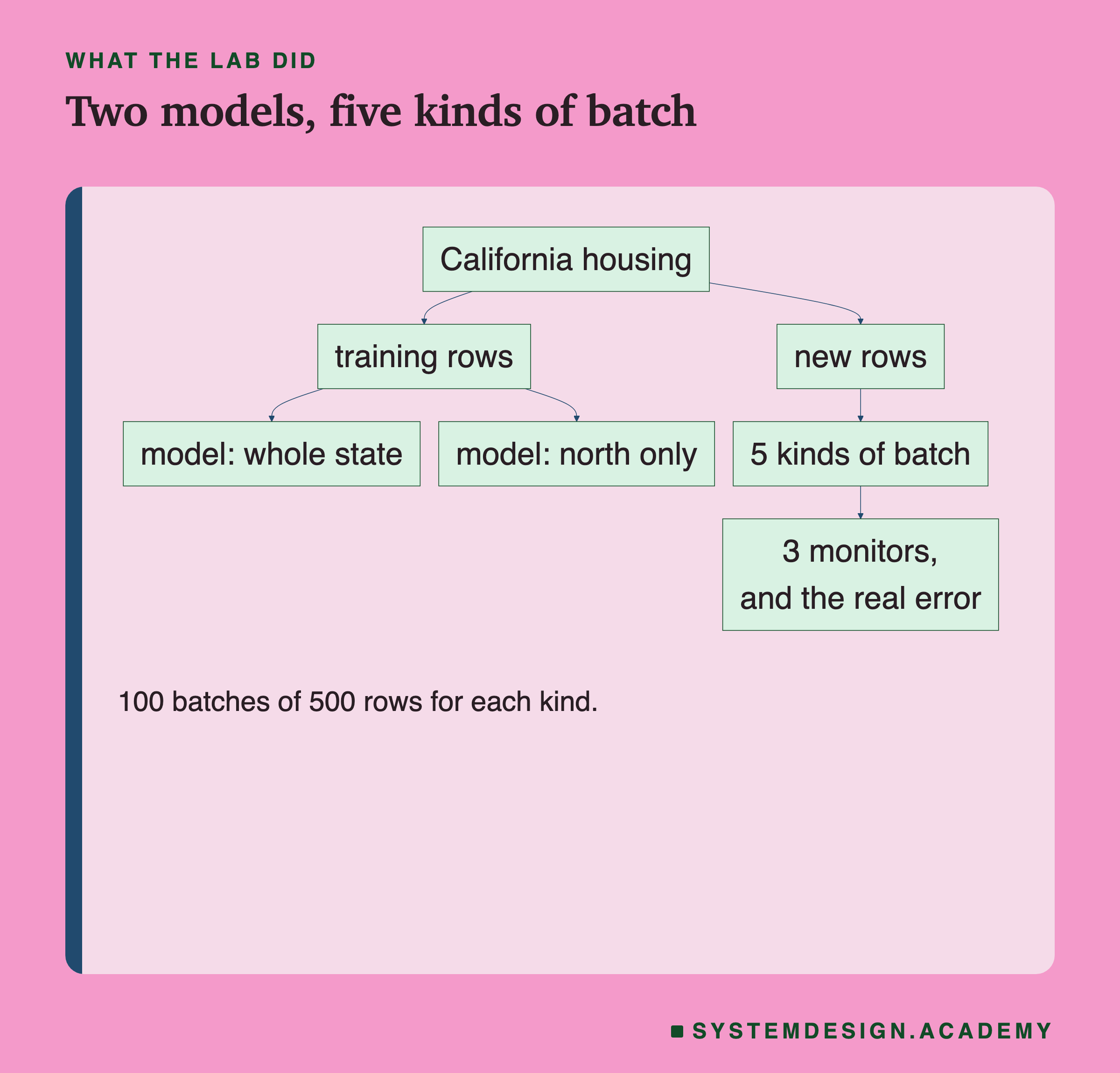
The flowchart reads from the top. The data is split once, and two models learn. Then every batch of new rows is checked in two ways: by the monitors, and by its real error. Here is each step.
-
The data. California housing, a public dataset. A dataset is a table of data, and this one anyone can download. It holds 20,640 districts from the 1990 US census, the government's count of every household, with the typical house price in each.
-
The models. A gradient-boosted tree. A decision tree is a chain of yes-or-no questions about the columns that ends in a guess. A gradient-boosted tree is many small ones, each correcting the mistakes of the ones before. One learned from 12,384 districts across the whole state. The other learned from the 5,277 of those in the north.
-
The batches. From the 8,256 districts neither model trained on, the lab drew 100 batches of 500 rows for each kind of new data.
-
Three monitors on every batch. PSI on every column, KS on every column, and PSI on the model's own guesses. That last one watches for prediction drift.
-
The truth. The lab knows the real prices, so it can measure the error of every batch and say whether the model was really hurt.
Rang or Quiet, Hurt or Fine
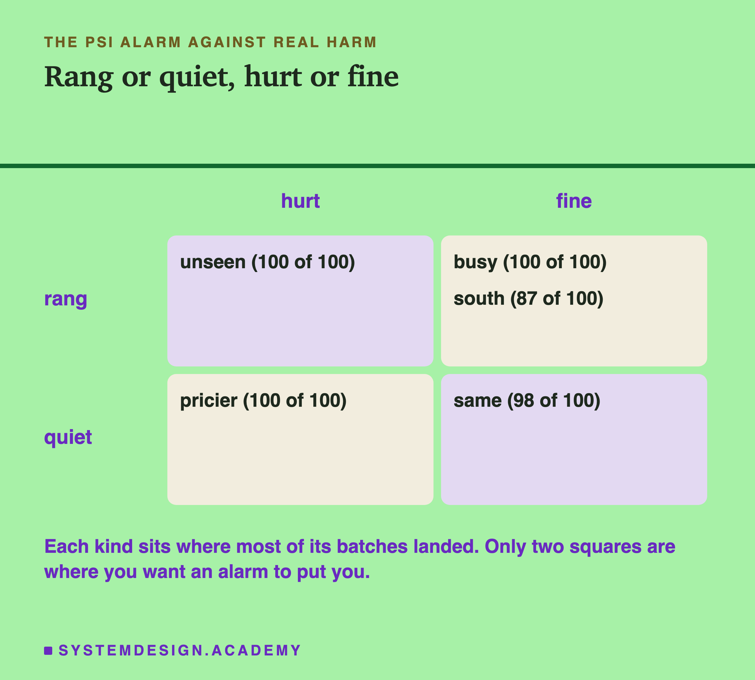
Each kind of new data sits in the square where most of its 100 batches landed.
Only one of the four shifts landed where you would want it: the unseen south rang on 100 batches and was hurt on 100. Ordinary batches landed well too, quiet and fine.
The other three landed in the wrong squares. Busy districts rang on every batch and were never hurt. The south, for a model that had seen it, rang on every batch and was hurt on only 13. The price rise was hurt on every batch and rang on none.
The Numbers Behind the Grid
Here is every count behind the grid.
| new data | PSI rang | KS rang | guesses drifted | hurt | error | against usual |
|---|---|---|---|---|---|---|
| same | 0 | 4 | 0 | 2 | $31,277 | +0% |
| busy | 100 | 100 | 0 | 0 | $28,577 | -9% |
| south | 100 | 100 | 0 | 13 | $32,543 | +4% |
| unseen | 100 | 100 | 100 | 100 | $111,488 |
Rang Every Time, Nothing Wrong
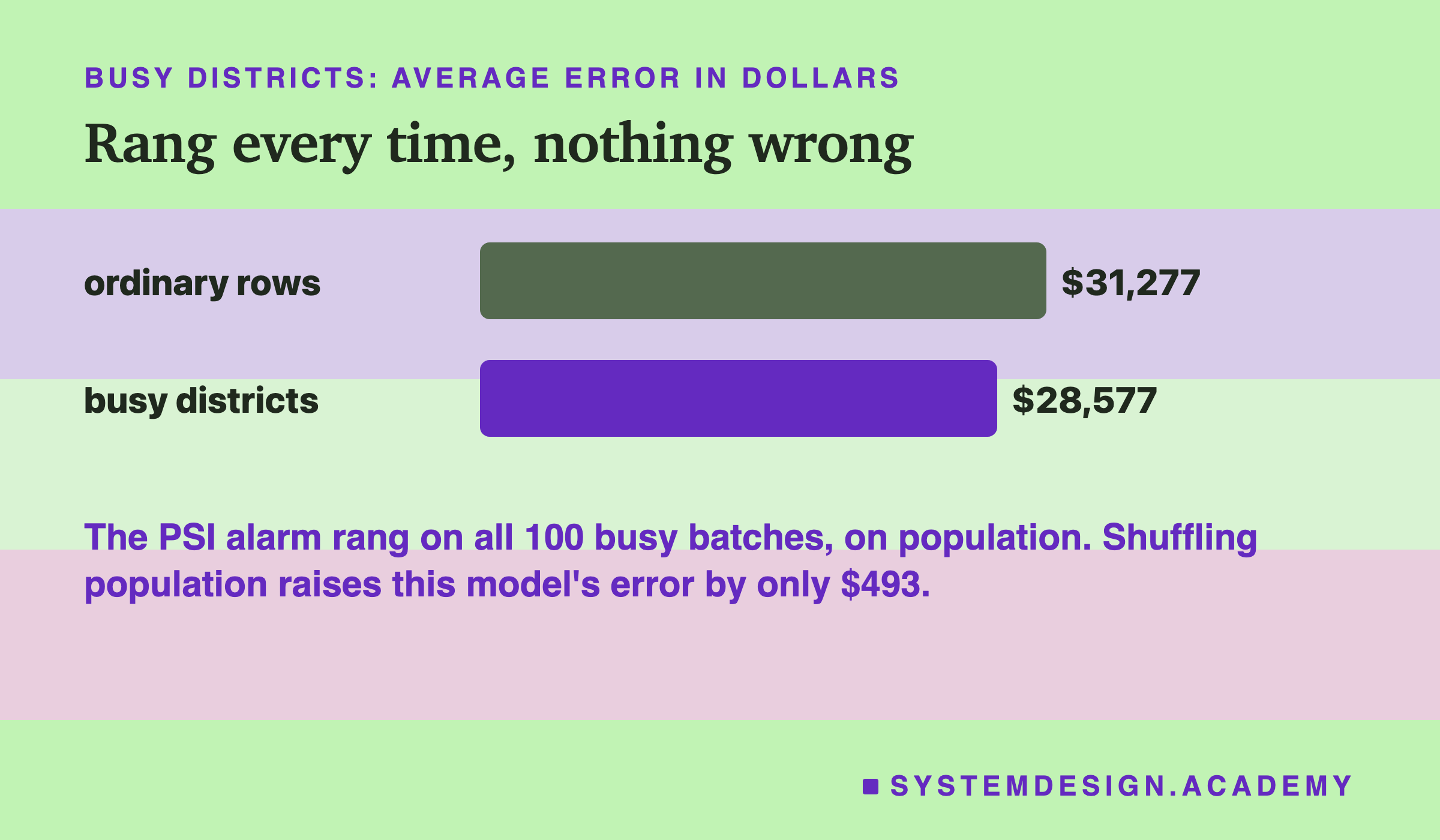
Busy districts are the top 30% by population. On every one of the 100 batches, the population column's PSI was over 0.25, and the alarm rang. House age rang too, on 39 batches, because busy districts have newer houses: a typical house age of 23.4 years against 30.9 elsewhere.
The model's error on those batches was $28,577, against $31,277 on ordinary new rows. That is -9%: lower, not higher.
Why? There is a way to ask how much a model uses a column, called permutation importance. Shuffle that column so it holds nonsense, and see how much the error rises. If the model ignores the column, the error barely moves. Shuffling population raised the error by only $493, the smallest effect of all 8 columns. Shuffling latitude raised it by $53,302. The alarm measured a real change, in a column that does not matter to this model.
What PSI Actually Compared
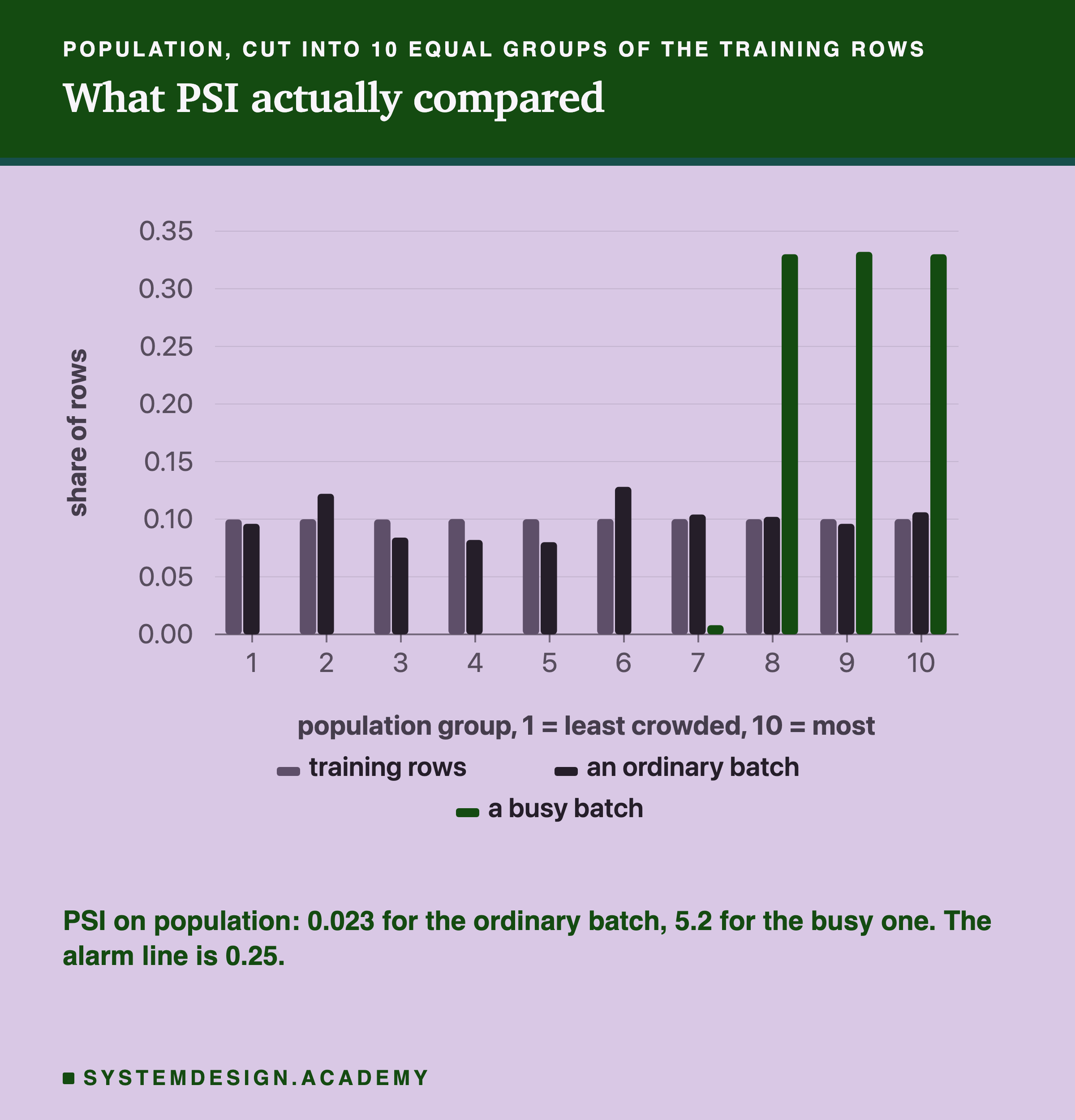
Here is what PSI does, on one real batch of each kind. It cuts a column into 10 groups using the training rows, so each group holds a tenth of them. Then it counts what share of the new batch falls in each group.
The ordinary batch lands close to a tenth in every group, and its PSI is 0.023. The busy batch has nothing at all in the six least crowded groups, and about a third in each of the top three. Its PSI is 5.2, about twenty times the 0.25 line.
So the alarm was right that the inputs moved, and moved a lot. It simply had no way to know that this model hardly cares about population.
Two Pages of the Log
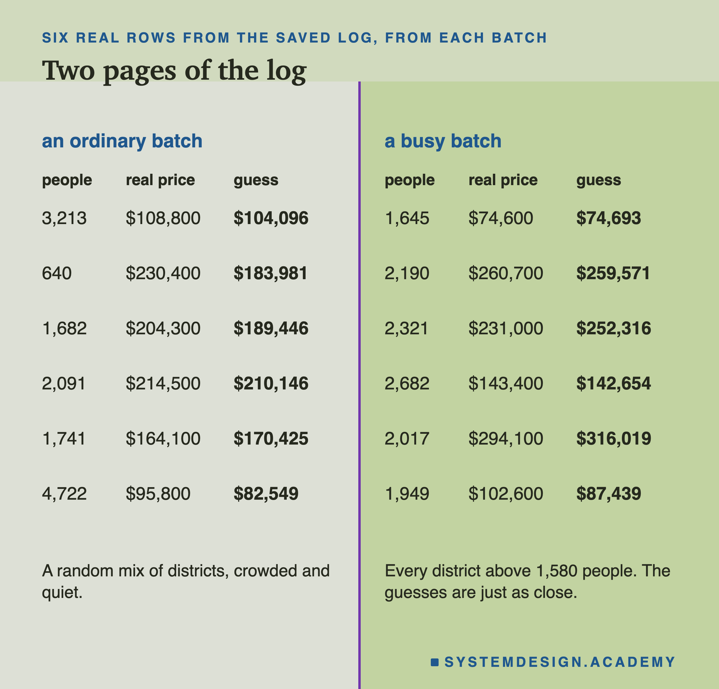
Here are real rows from the first batch of each kind, as a saved log would hold them. Each shows how many people live in the district, the real typical price, and the model's guess. Every district on the right page has more than 1,580 people, the cut for the busiest 30%. Batches full of such districts are what set off the alarm. A random batch has some crowded districts too, like the two biggest on the left page, but mixed with quiet ones. But the guesses sit just as close to the real prices as on the left page. The input moved; the model did not mind.
Read Which Column Rang
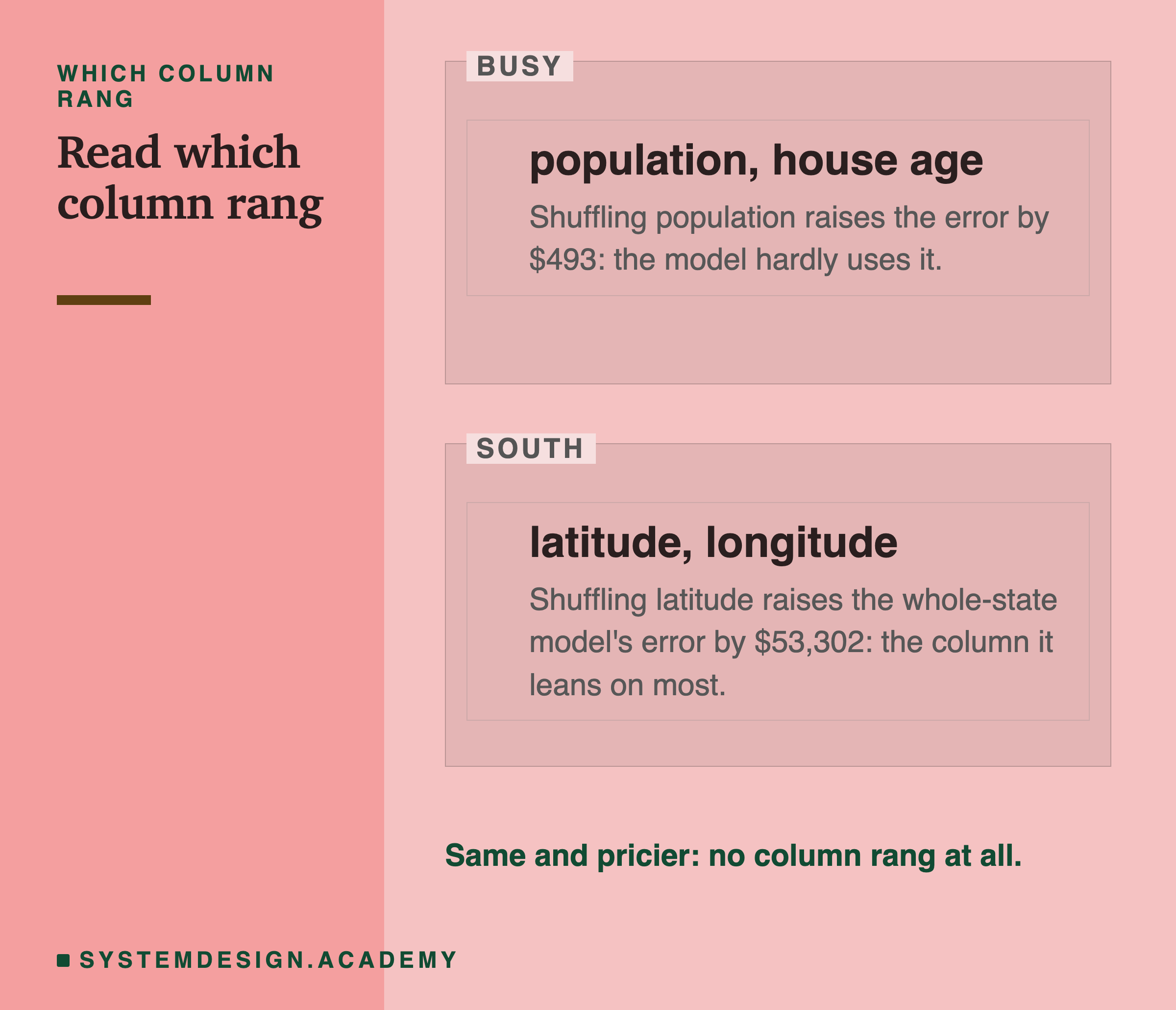
An alarm usually names the column that set it off, and that is its most useful part. On the busy batches it named population and house age. On the south and unseen batches it named latitude and longitude, the location.
So the next question is: how much does the model lean on that column? Population is the column this model leans on least, so a population alarm is worth a look but probably no action. Location is what it leans on most, so a location alarm is worth checking against real answers straight away.
The alarm cannot tell you which of those you are in. A ranking of how much the model leans on each column can.
Two cautions. The ranking was measured on ordinary data, and on shifted data the model may lean differently. And a sudden jump in any column, even an unused one, can mean a broken data feed, such as changed units or blanks filled with zeros. That is worth fixing whatever the ranking says.
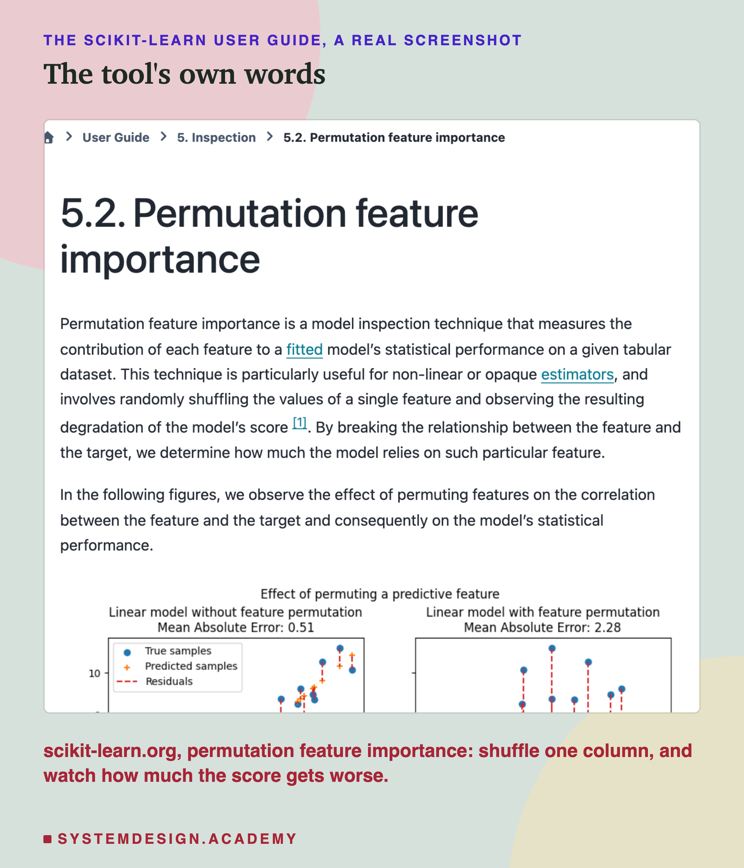
That shuffling test is not something I made up for this lab. It is a standard method, and this is scikit-learn's own description of it: shuffle the values of one column, and see how much the model's score gets worse.
The One Case the Alarm Was Made For
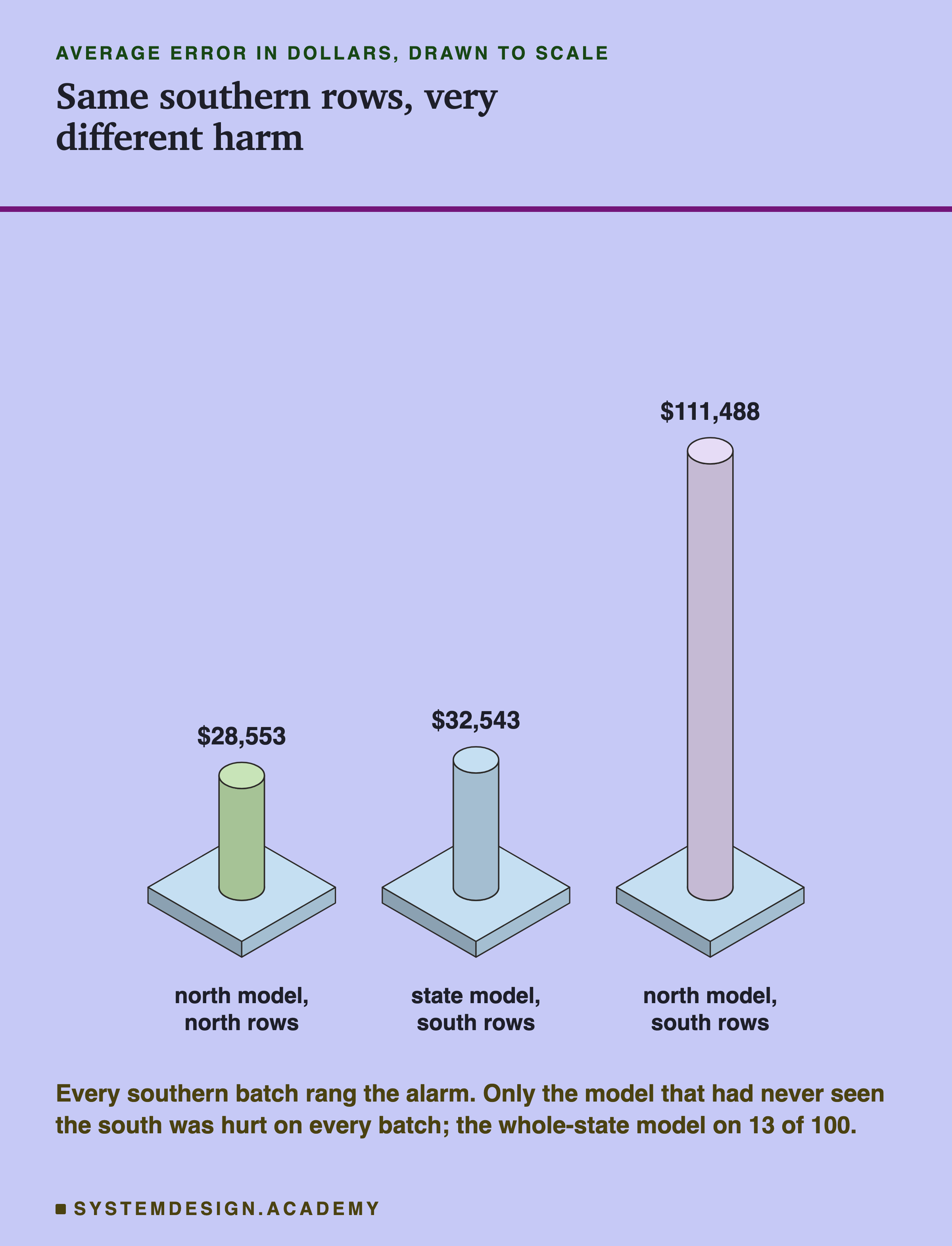
This is the case drift monitors are built for. The second model learned only from the north. Sent southern districts, it rang on every batch, on latitude and longitude. Its error was $111,488, against $28,553 on northern rows: +290%.
Now compare the south kind: the same kind of southern rows, sent to the model that learned from the whole state. The input alarm rang on every batch just the same. But the error was $32,543, only +4% above usual.
The input alarm alone could not tell these two apart. The monitor on the model's own guesses could: it stayed quiet on all 100 south batches and rang on all 100 unseen ones. Here, when the model met rows unlike anything it learned from, its guesses shifted too, and that showed up with no labels at all.
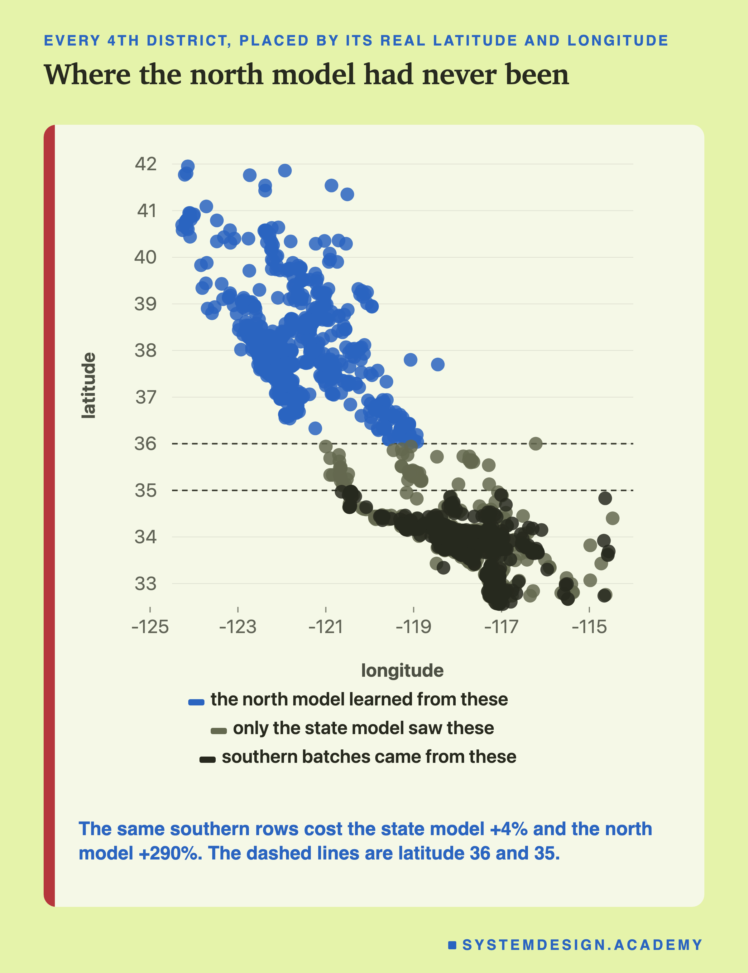
On the map, the reason is plain to see. The north model learned only from the districts above the upper dashed line. The batches came from below the lower one, a part of the state it had never seen. The input alarm rang the same for both models. Only the guesses, and the real error, told them apart.
Hurt Every Time, Not a Sound
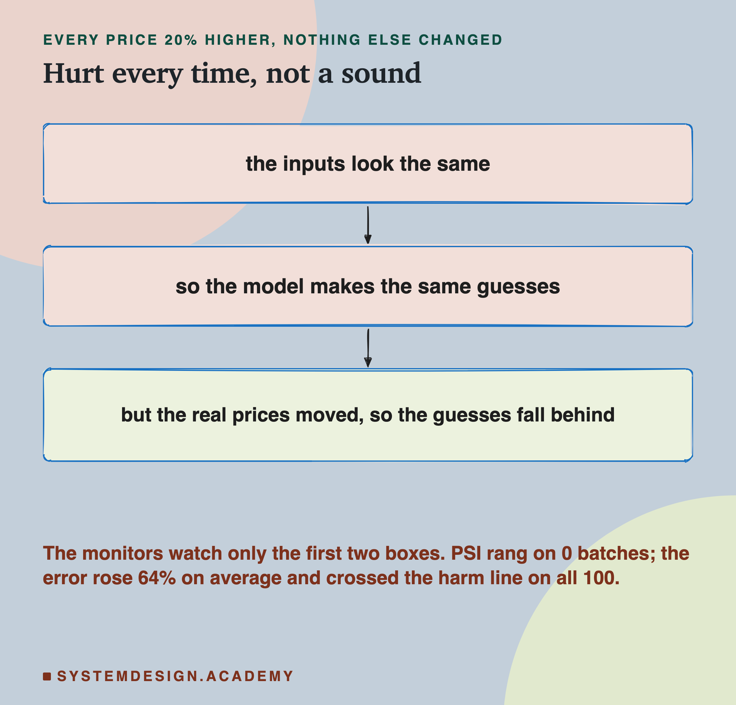
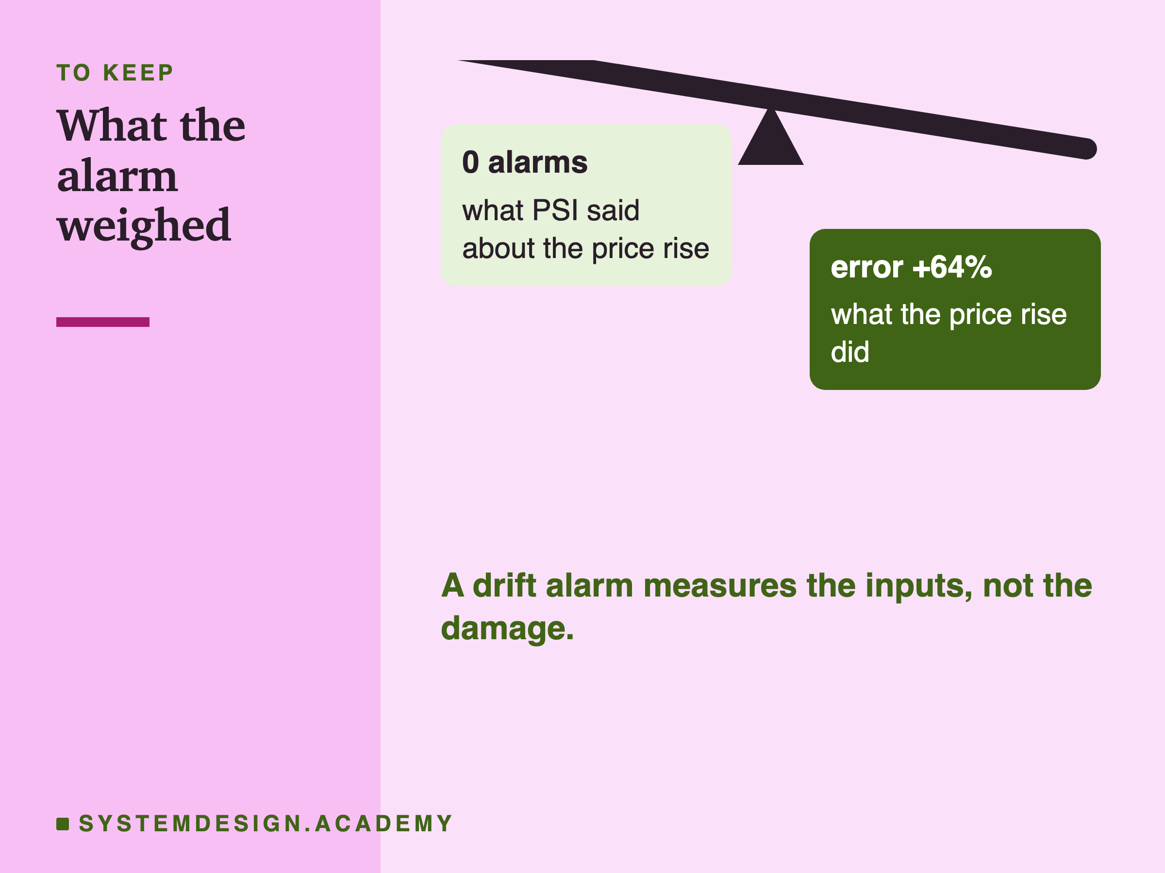
Every price in these batches was raised by 20%. The districts, and so the inputs, were exactly as usual. PSI rang on 0 batches and KS on 4, the same as on ordinary batches. The model's guesses did not move either, so the prediction monitor stayed quiet too.
But the real prices had moved, and the guesses had not. The error rose to $51,357, +64% on average, and crossed the harm line on all 100 batches.
Part of that rise in dollars is only because prices are bigger: a model that kept up with the rise would also show bigger dollar errors. So the lab also judged harm without dollars, as the typical error's share of the price. That share rose from 12.2% to 17.0%. The harm line is 10% above the usual share, about 13.5%, and 100 of 100 batches crossed it. The harm is real either way.
This kind of change, where the link between the inputs and the answer moves, is often called concept drift. An input monitor cannot see it, because nothing it watches has changed. This is the gas leak from the first slide; the busy districts were the burnt toast.
A Few Real Answers See What the Monitors Cannot
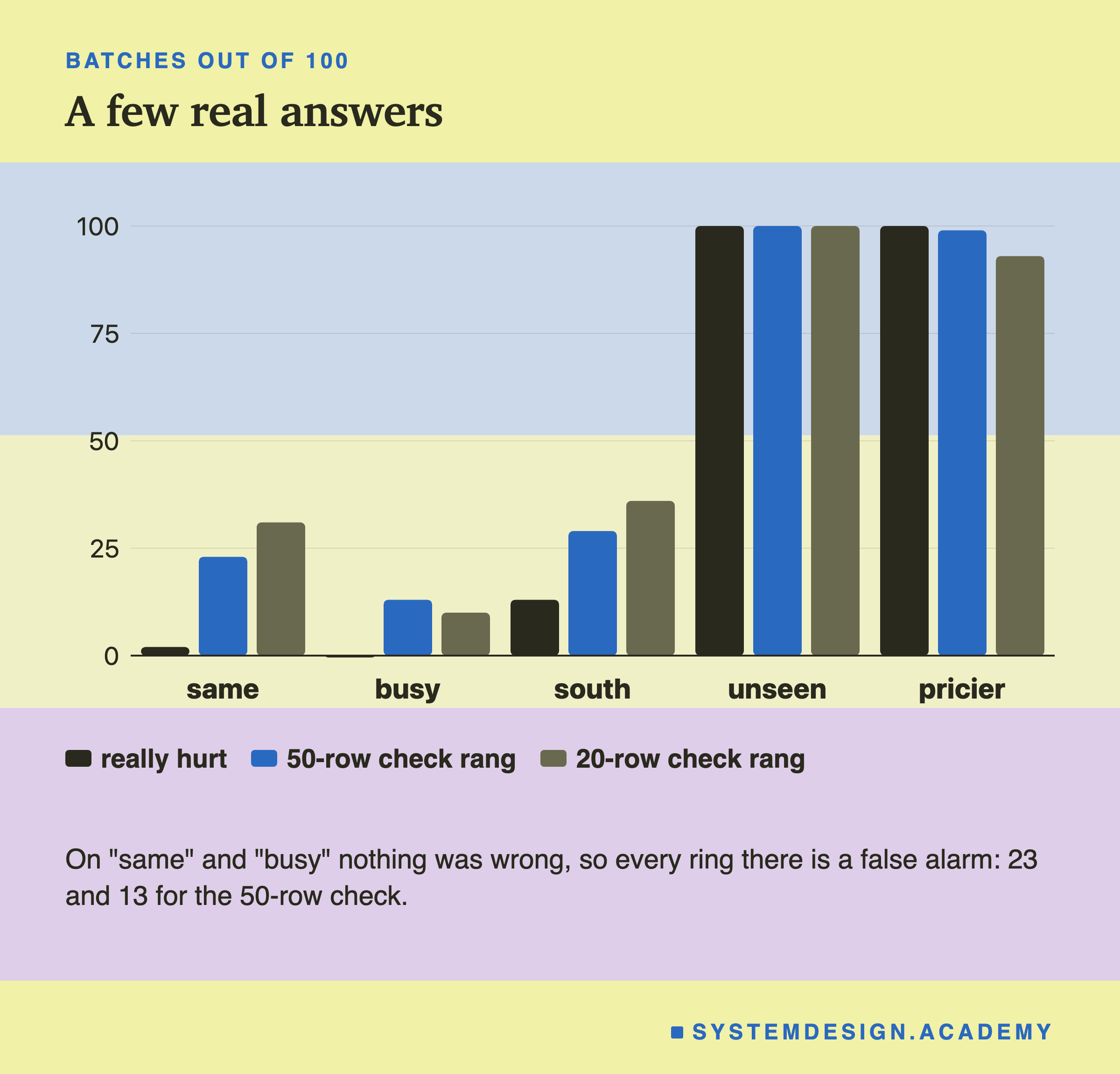
The only way to see that the answers moved is to look at some answers. So the lab added one more check. Take 50 rows of each batch and look up their real prices. Ring when the error on those 50 rows is more than 10% above usual, that is, above 1.1 times the usual error.
It caught the price rise on 99 of 100 batches, and the unseen south on 100. With only 20 labelled rows it still caught 93 and 100.
The cost is false alarms. On ordinary batches, where nothing was wrong, the 50-row check rang 23 times, and the 20-row check 31 times. The error on 50 rows wobbles by about 15% from one batch to the next, and on 20 rows by about 25%. So a 10% line sits inside the wobble.
Such a check is good at big harm and blind to small harm. The same wobble explains the south batches. The check rang on 29 of them, though only 13 were really hurt. Fifty rows from a batch a little worse than usual can look much worse. To halve the wobble you need about four times as many labelled rows.
Loosen the line and the trade gets better. At 1.2 times the usual error, the 50-row check rang on 10 ordinary batches and still caught 97 price rises. The playground below lets you try other lines.
How Much 50 Answers Wobble
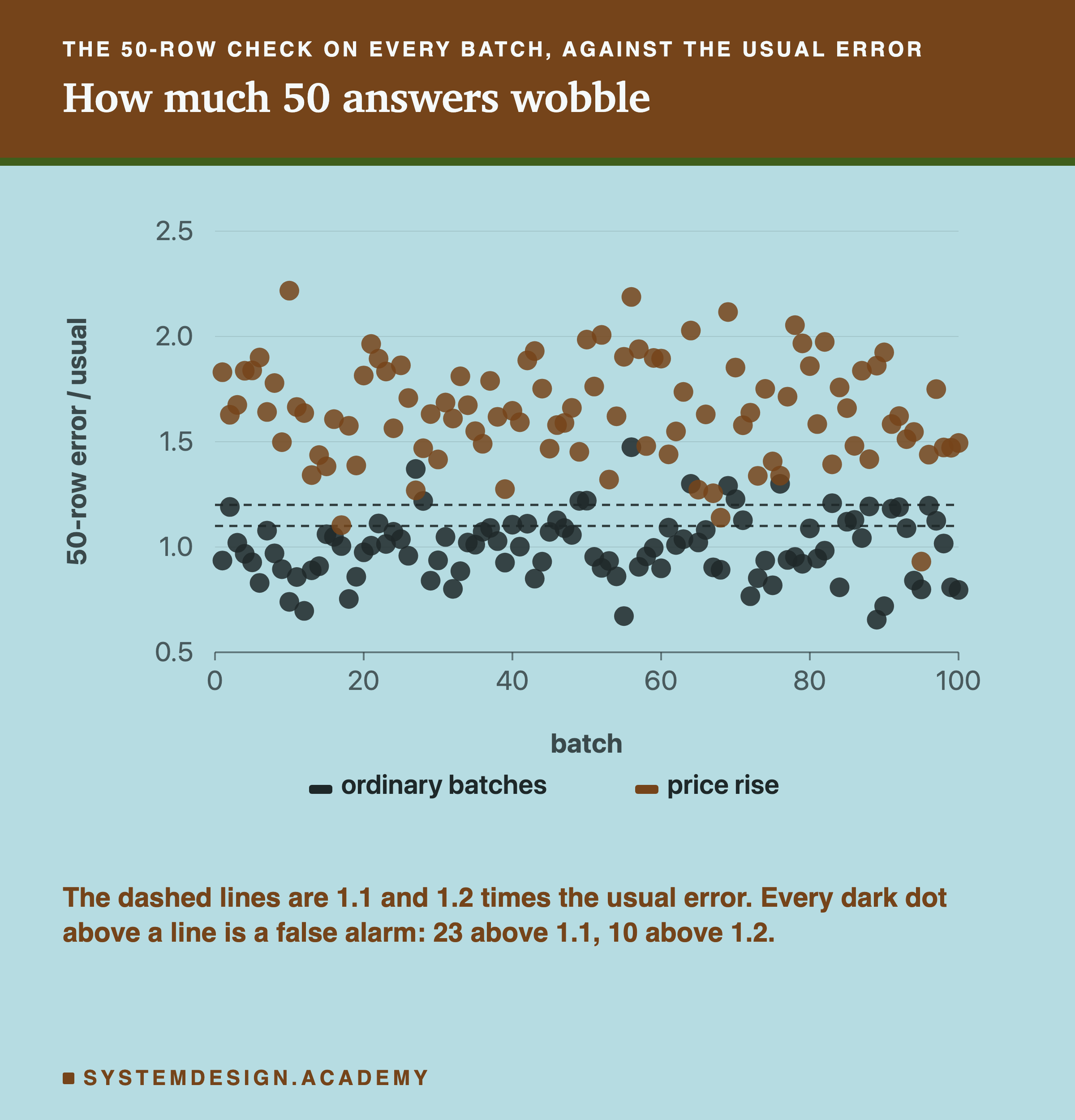
Each dot is one batch. Dark dots are ordinary batches, where nothing was wrong, so they should sit near 1. They do on average, but they scatter: some are well below, some well above. Every dark dot above a dashed line is a false alarm at that line.
The accent dots are the price-rise batches. Almost all of them sit above both lines, which is why the check caught them. A much smaller harm, say 10%, would sit inside the dark cloud, and 50 answers could not tell it from luck.
Set the Line Yourself
This box holds the lab's real results for two kinds of new data: ordinary batches ("same") and the 20% price rise ("pricier"). For each batch, it holds the error on the first 50 labelled rows. Press Run to see how often a 50-row check rings at a 10% line. On the ordinary batches every ring is a false alarm. On the pricier batches every ring is a catch.
Then find the line that starts with LINE =, near the top. Change the number, for example to 1.20 or 1.30, and press Run again.
Where the Two Checks Live in a Real System
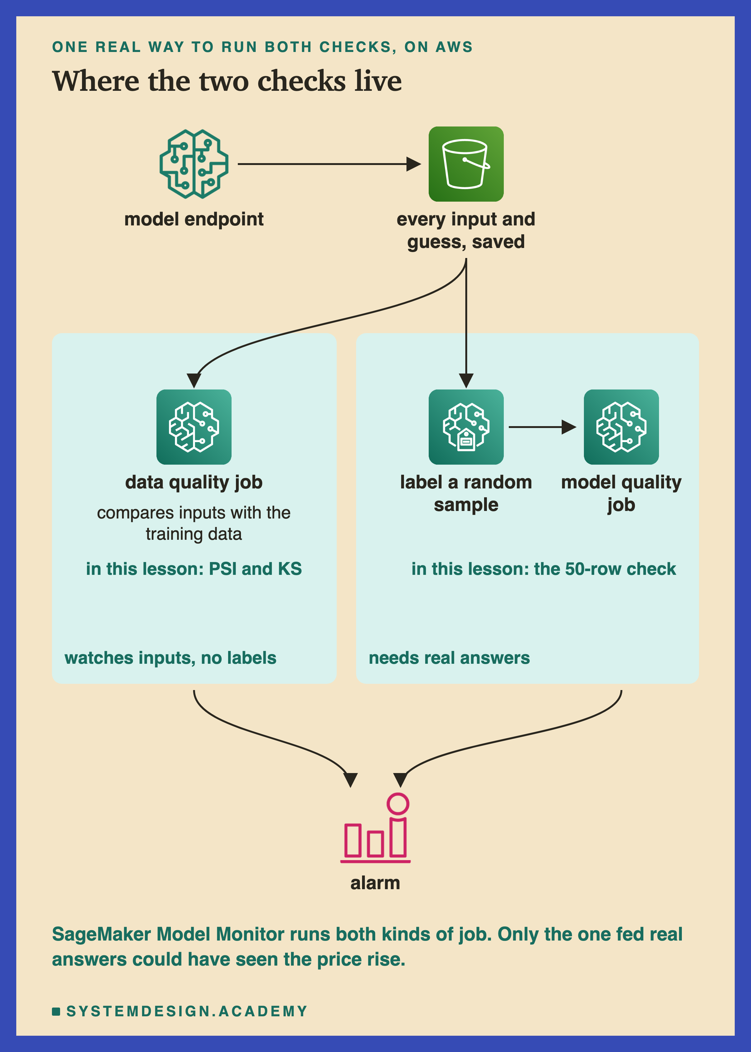
Here is how the two kinds of check look in a real deployment. This one is on AWS, Amazon's cloud; other clouds offer the same two parts under other names.
The model runs behind an endpoint, the web address the app sends its requests to, and every input and every guess is saved. SageMaker Model Monitor, AWS's monitoring service for models, can then run two kinds of job on what was saved.
A data quality job compares the new inputs with a baseline, a reference summary worked out from the training data. It needs no labels, so it can run every hour. It is the same idea as the PSI and KS alarms in this lesson. It has the same blind spot, too: it could not have seen the price rise.
A model quality job merges real answers with the saved guesses and measures the actual error. The answers have to come from somewhere, often a labelling service such as SageMaker Ground Truth, working through a random sample. It is slower and costs money per label, and it is the only one of the two that sees the harm itself.
Why the Real Answers Come Late
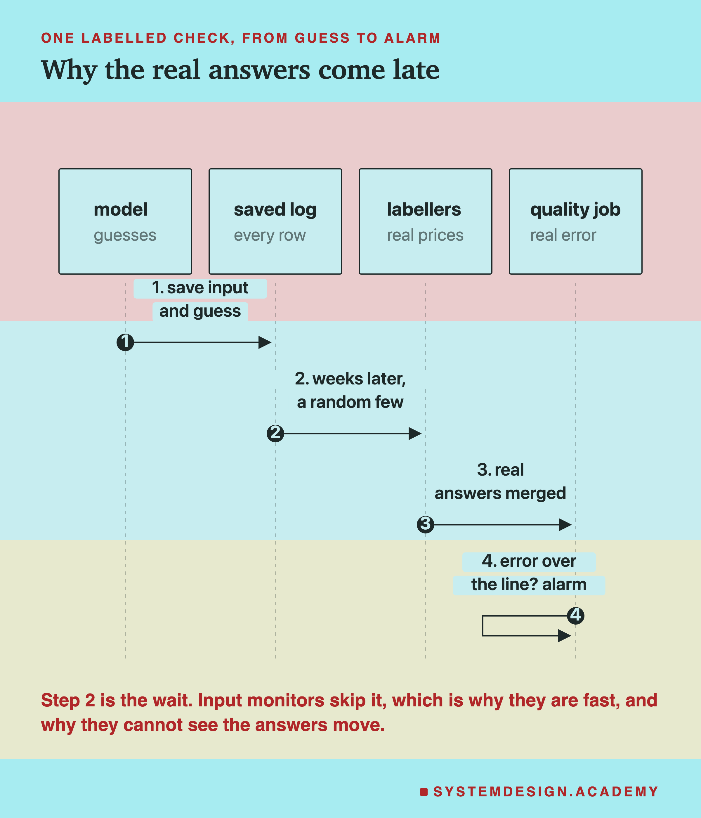
The labelled check has one step the input monitors do not: waiting for the real answers. For house prices that means waiting for sales. For fraud it means waiting for someone to report the charge. That wait is the whole reason teams watch inputs instead, and the whole reason input monitors cannot see a change in the answers.
Built From Common Parts
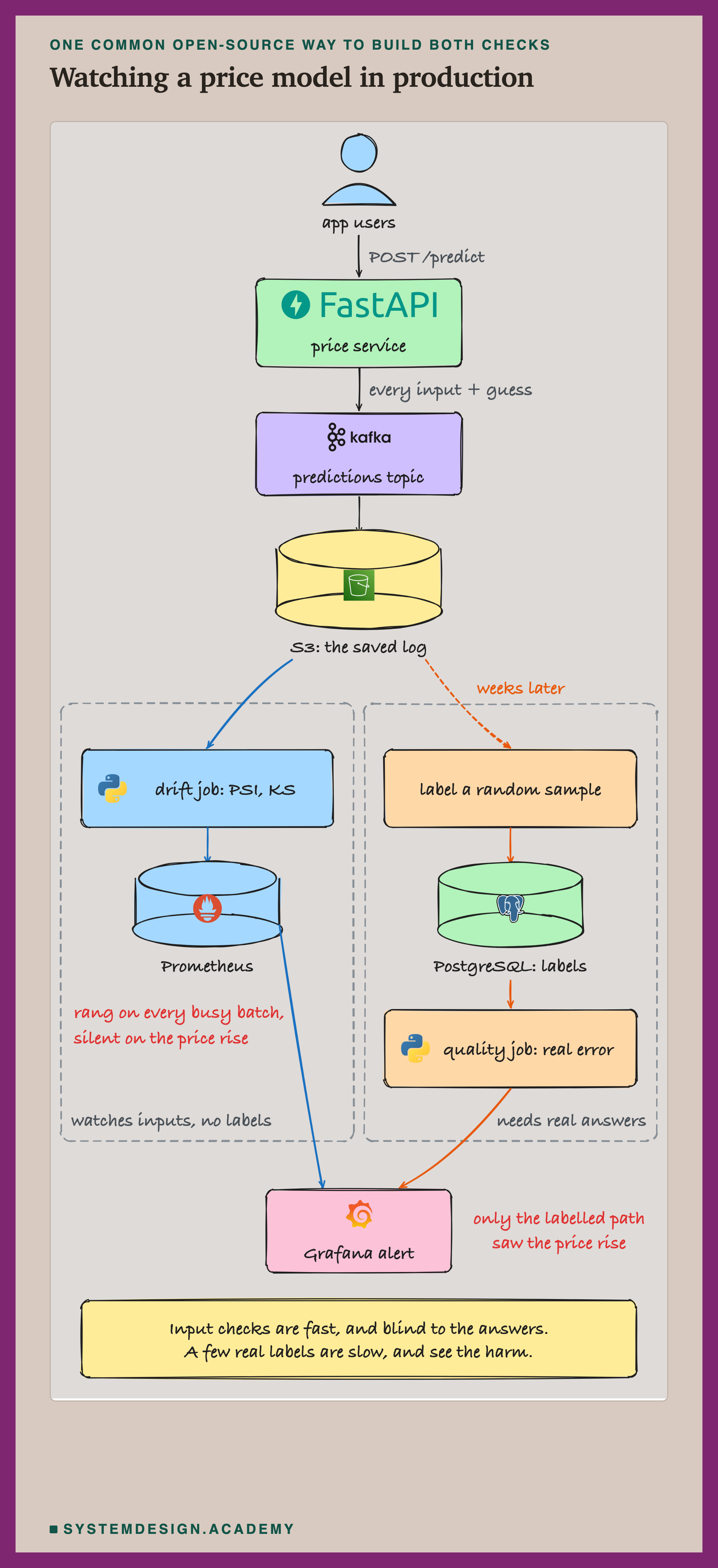
The same two checks can be built from common open-source parts. The names are real tools. FastAPI runs the service, and carries a stream of messages. S3 is cheap file storage, and Prometheus stores numbers over time. PostgreSQL is a database, and Grafana draws dashboards and sends alerts. The service writes every input and guess to a stream, and the stream lands in cheap storage. From there the two paths split. The input path is quick and cheap. The labelled path is slow, because it waits for the real answers, and it is the only one that could have seen the price rise.
The Same System, From Above
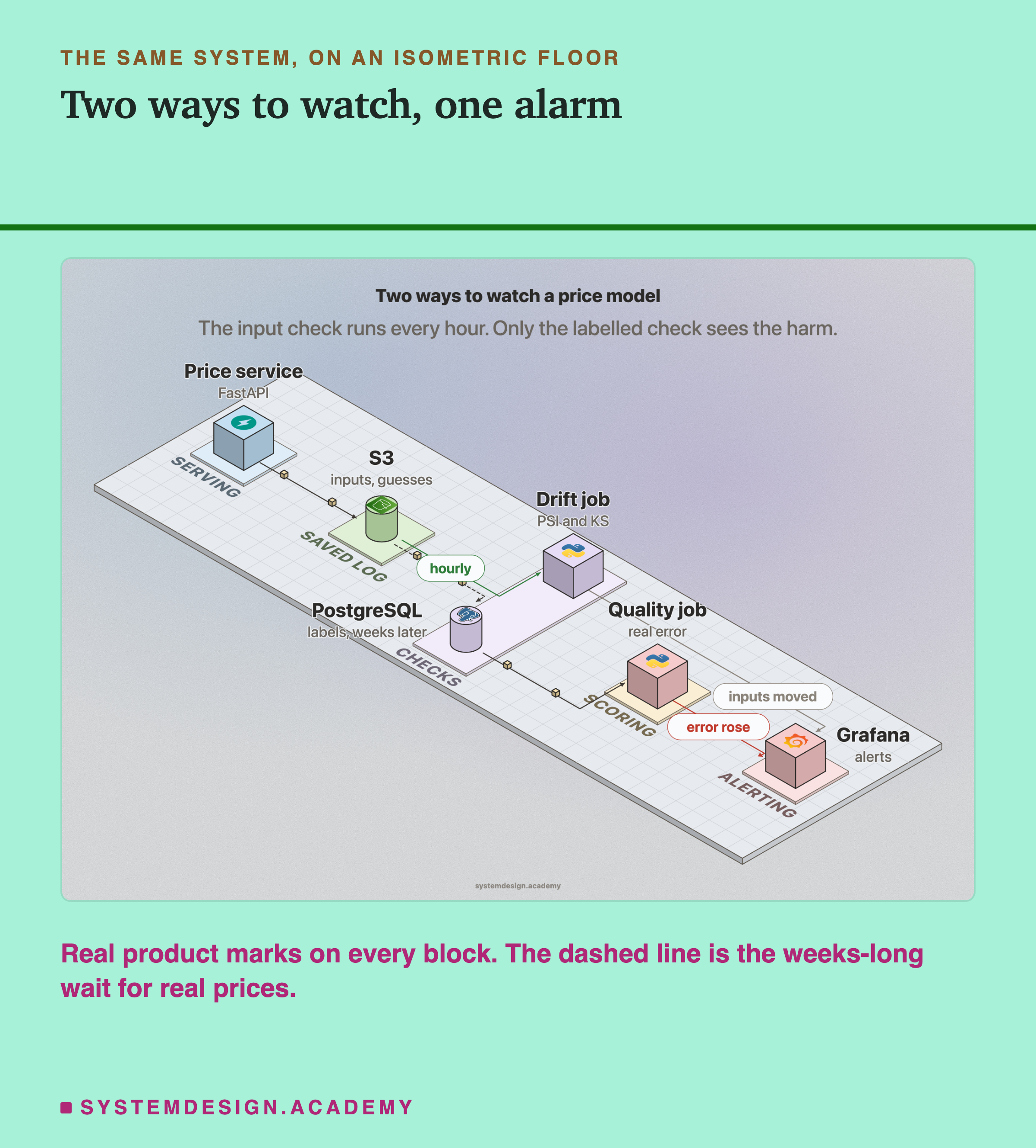
Seen from above, the two checks sit side by side on the same floor, fed by the same saved log. The difference is timing and what they read. The drift job reads inputs every hour. The labelled path waits weeks for real prices, scores them in a quality job, and is the only line into the alarm that carries the harm itself.
The Lab, Running
This is a real recording of the lab's report, printed on the laptop where the lab ran.
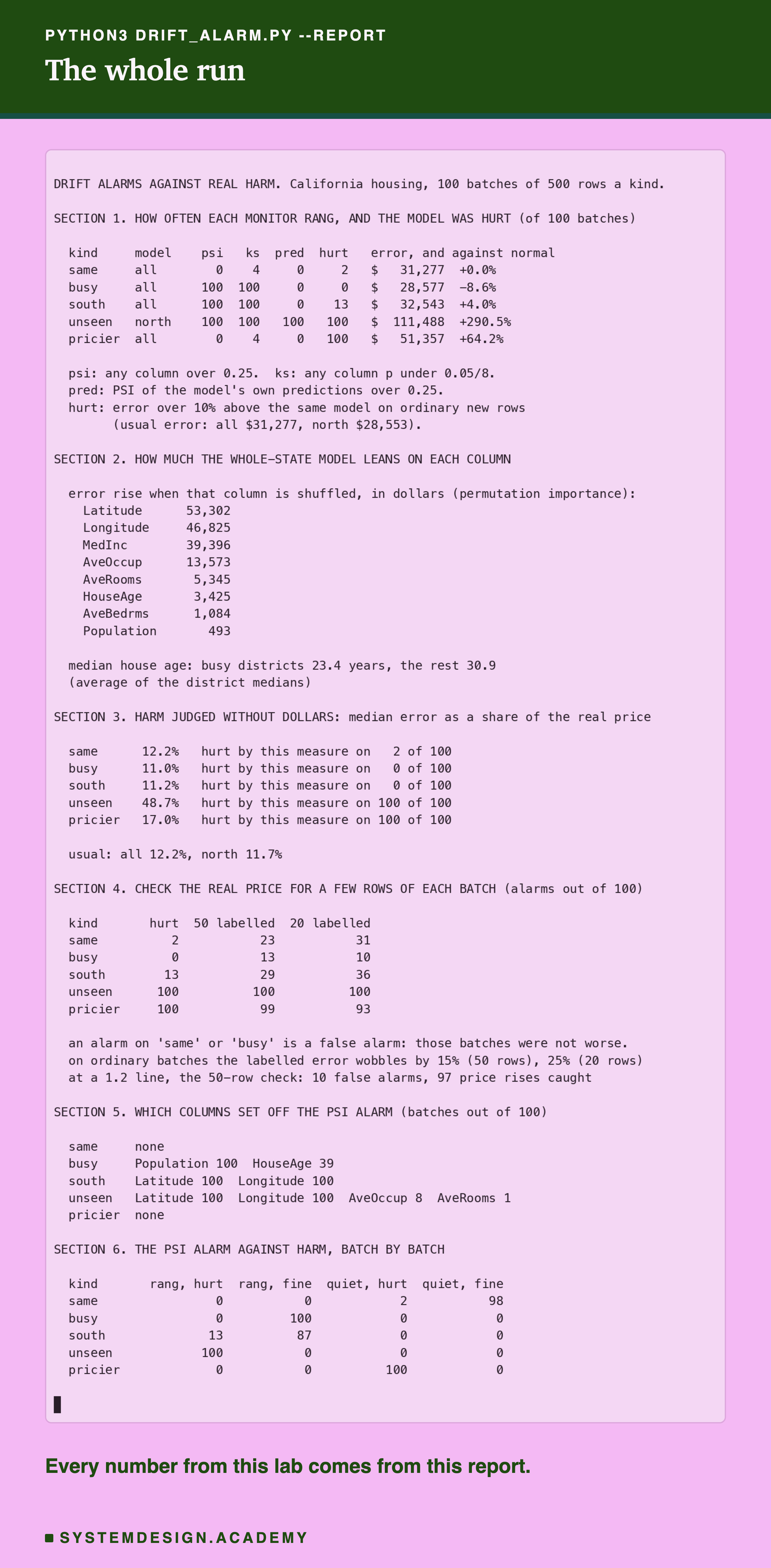
In the recording, "psi", "ks" and "pred" are the three monitors. "hurt" counts batches whose error was more than 10% above usual. "50 labelled" is the labelled check, and the section on harm without dollars is explained on the pricier slide.
What This Lab Cannot Tell You
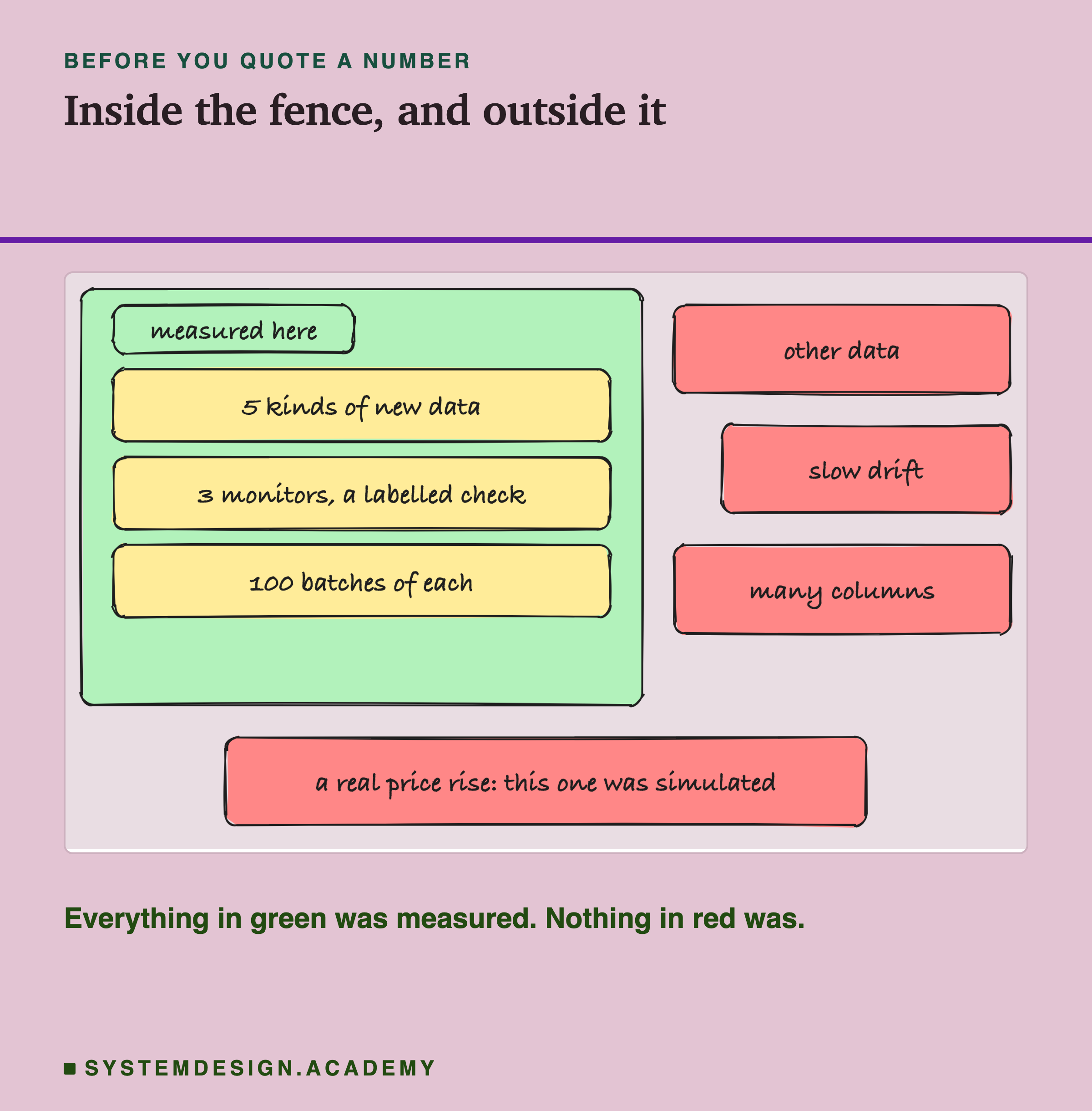
One dataset, one model. California housing and a gradient-boosted tree. Other data and other models will put the lines in different places.
The price rise was simulated. The dataset has no second year of prices, so the lab raised every price by 20%. A real rise would be uneven across districts, and would usually move incomes too, so an input monitor might see part of it. Once real prices arrive, a monitor on the prices themselves would see the rise as well.
One unseen region. "Data the model has never seen" rests on one case built here: a model that learned from the north, sent the south. Other unseen data may drift less clearly.
Slow drift. Every change here arrived all at once. Real drift often creeps in over months, and the lab did not test that.
Batches of 500, from one pool. The 100 batches reuse one set of new rows, so they are not 100 separate tests. Bigger batches make KS ring at smaller shifts; smaller ones make every monitor noisier.
Eight columns. With hundreds of columns, some will cross any line by chance, and the false alarms add up.
One line each. PSI at 0.25, KS at 5% shared across 8 columns, harm at 10%. Different lines give different counts. The pattern is what to take away.
What to Do on Monday
-
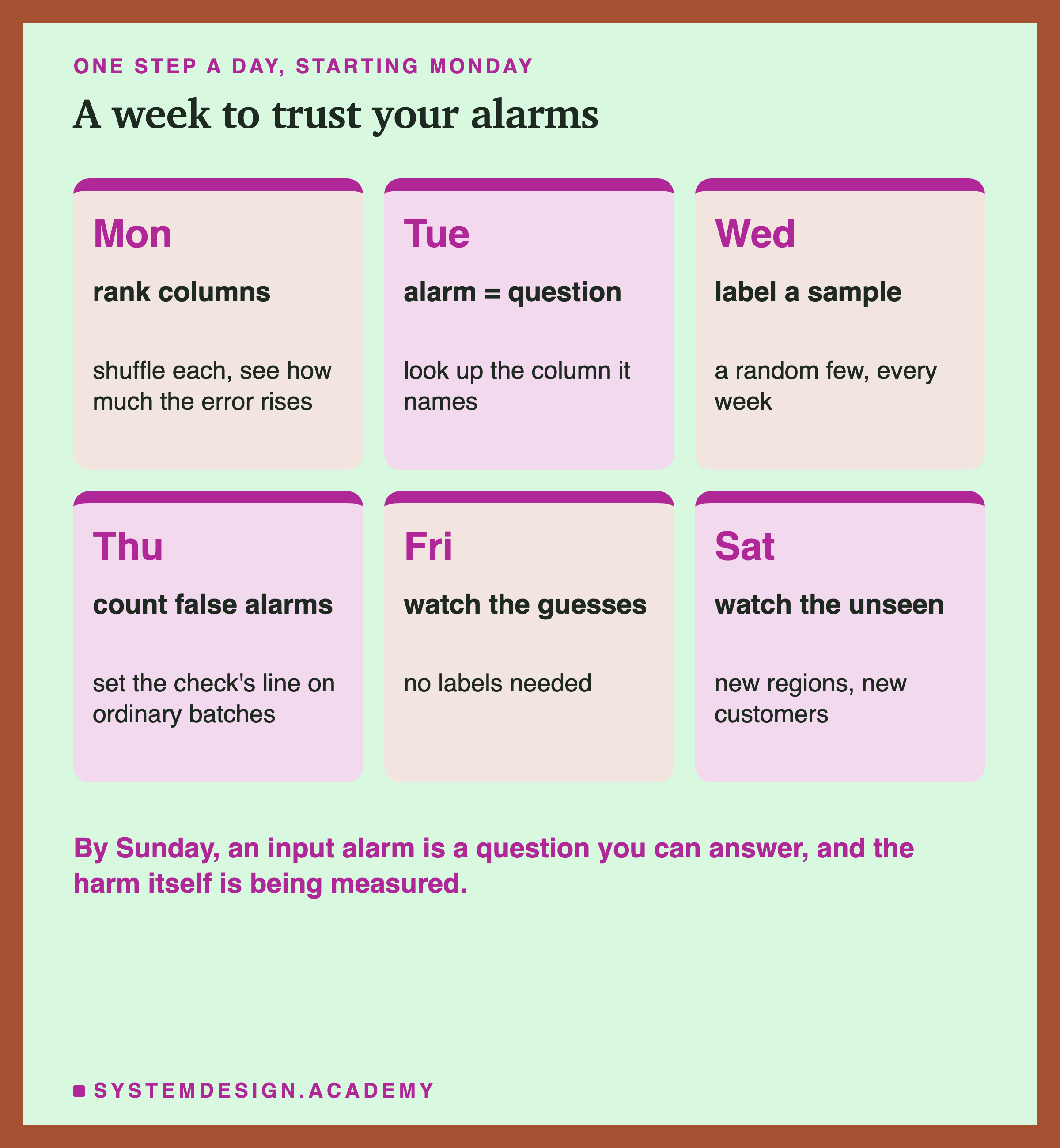
Know which columns the model leans on. Shuffle one column at a time and see how much the error rises. Scikit-learn, the most common Python library for this kind of model, calls this permutation importance. Rank your drift alarms by it.
-
Treat an input alarm as a question, not a verdict. It says the inputs moved, not that the model is worse. Look up the column it names in step 1.
-
Label a random sample every week. Even 50 rows with real answers caught what no input monitor could. Pick the rows at random: labels that arrive first are often not random, like the fraud cases reported fastest, and a check on them measures the wrong thing. Some tools estimate the error without labels, from how confident the model is. They help while labels are late, but they assume the link between inputs and answers has not changed, so they would have missed the price rise too.
-
Measure your check's false alarms before you trust it. Run it on ordinary batches first, and set its line so it rarely rings there.
-
Watch the model's own guesses too. Here that monitor rang only when the model was badly hurt. It costs nothing and needs no labels.
-
Watch hardest for data the model has never seen. A new region or a new kind of customer was the one case here where the input alarm and real harm lined up.
Knowledge Check
Knowledge Check
4 questions - Score 80% to pass
The PSI alarm rang on every batch of busy districts. What happened to the model's error on those batches?
House prices rose by 20% while the districts stayed the same. What did the input monitors do?
Which check caught the price rise?
When did the input alarm and real harm line up best?