The Model Was Never Down. It Was Just Wrong.
Picture a fraud model at a payments company. It ships at 94 percent precision and everyone moves on. For six weeks the dashboards are perfect: p99 under 40 milliseconds, zero errors, every request returns a clean 200. The on-call engineer never gets paged. And the whole time, the model is getting worse.
Nobody notices until finance does. Chargebacks are up, and they have been climbing for a month. By the time someone connects the model to the money, the company has eaten weeks of fraud it should have caught. There was no incident to point at, no alert to reference in the postmortem, just a slow bleed that every operational dashboard was blind to by design.
Here is the part that makes machine learning different from every other service you run. A normal backend fails loudly. It throws a 500, it times out, it runs out of memory, and something pages you. A model fails silently. It keeps answering, fast and confidently, and the answers are quietly wrong. There is no exception to catch because the code is doing exactly what it was told. The world just moved, and the model did not.
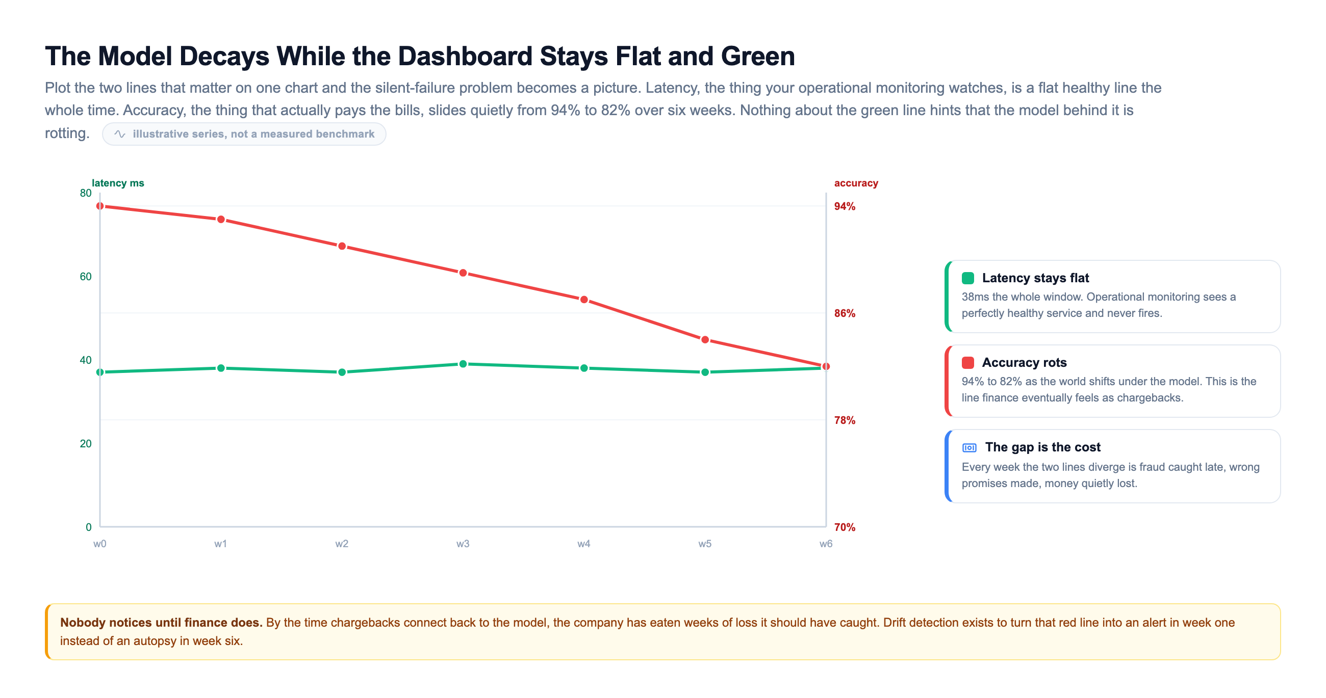
Look at the two lines that matter. The green one is what your operational monitoring watches: latency, sitting flat and healthy the entire window. The red one is accuracy, the number that actually pays the bills, sliding quietly from 94 to 82 percent as the world shifts under the model. Nothing about the green line hints that the model behind it is rotting. That gap between the two lines, week after week, is fraud caught late and money lost.
A crashed service wakes you up at 3am. A decayed model lets you sleep while it costs you money.
This is why an ML platform needs a second kind of monitoring that a normal web service never does. Watching that the endpoint is up is necessary, and it is completely insufficient. You have to watch whether the model is still right, and the entire rest of this lesson is about how you do that when the one signal you trust most is the one that arrives last.
Three Ways a Model Rots
When people say a model drifted, they usually mean one of three different things, and mixing them up leads teams to watch the wrong signal and chase the wrong fix. The clean way to pull them apart is to ask which probability actually moved.
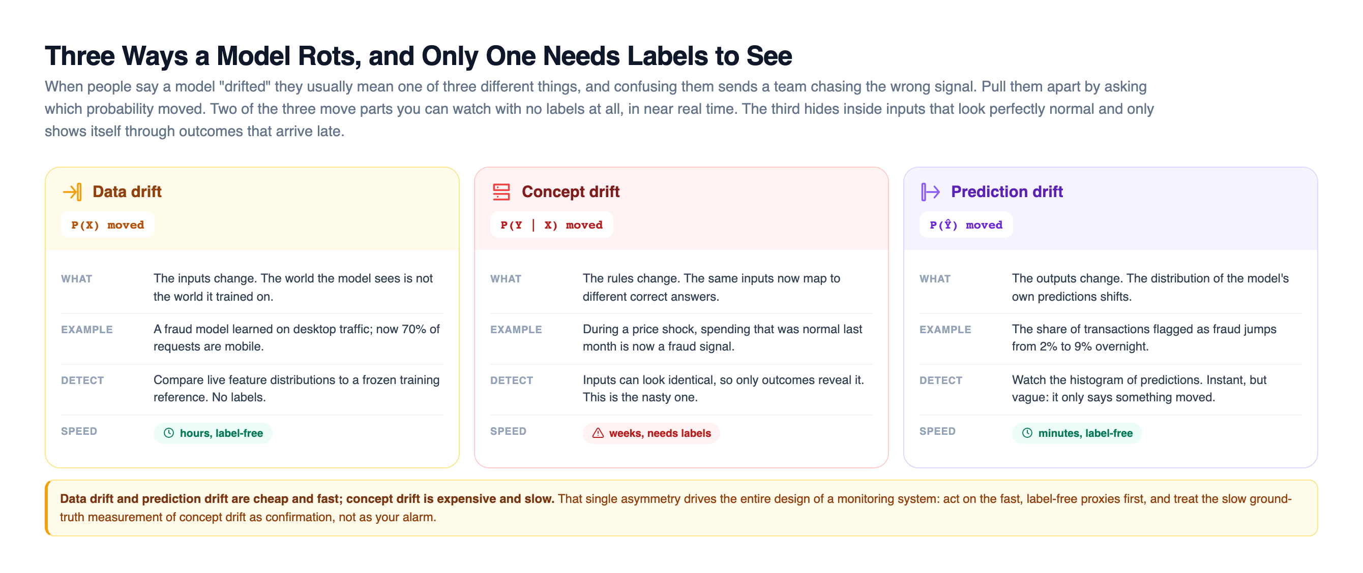
Data drift, also called covariate drift, is when the inputs change. The distribution of your features P(X) moves away from what the model trained on. The rules connecting inputs to outputs are still valid, but the model is now seeing a world it was not trained for. Your fraud model learned mostly on desktop traffic, and now 70 percent of requests are mobile. Nothing is broken about the relationship the model learned; it is just being asked about a population it never saw.
Concept drift is when the rules change. The relationship P(Y given X) shifts, so the same inputs now map to different correct answers. This is the nasty one, because the inputs can look completely normal while the model is wrong. During a price shock, spending that was perfectly ordinary last month is now a fraud signal, and no amount of staring at the input distribution will tell you, because the inputs did not move. Only the outcomes did.
Prediction drift is when the outputs change. The distribution of the model's own predictions shifts, for example the share of transactions it flags as fraud jumps from 2 percent to 9 percent overnight. It is instant to measure and it needs no labels, but it is vague: it only tells you that something moved, not what or why.
The reason this taxonomy matters is that the three cost very different amounts to detect. Data drift and prediction drift need no labels, so you can measure them in near real time. Concept drift can only be seen through outcomes, and outcomes arrive late. That single asymmetry drives the entire design of a monitoring system, so hold onto it.
It also helps to widen the lens past drift alone. Every prediction your model makes feeds four different monitoring signals, and a mature platform watches all four because each catches a failure the others miss.
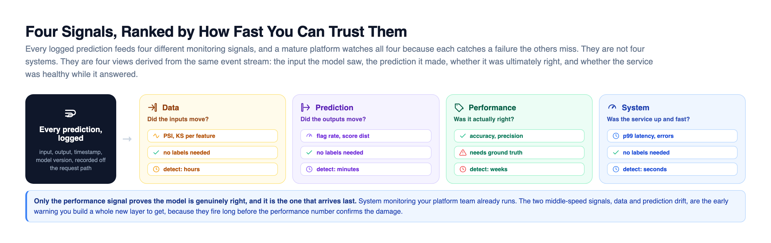
The four are not four separate systems. They are four views derived from the same event stream: the input the model saw, the prediction it made, whether it turned out to be right, and whether the service was healthy while it answered. System monitoring your platform team already runs. The performance signal, the only one that proves the model is genuinely right, is the one that arrives last. The two middle-speed signals, data drift and prediction drift, are the early warning you build a whole new layer to get, precisely because they fire long before the performance number confirms the damage.
How You Actually Measure Drift
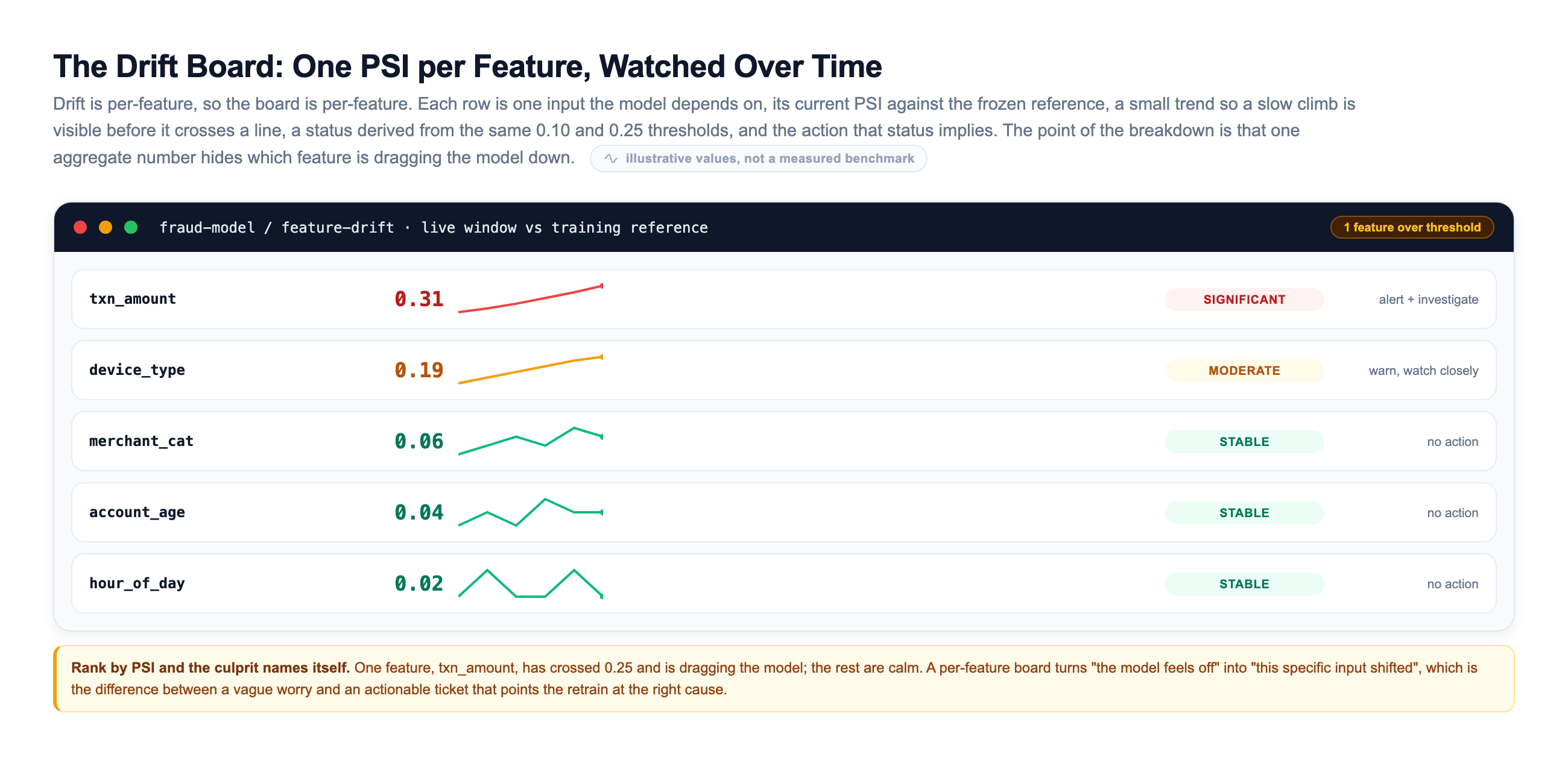
Drift detection comes down to one question asked over and over: does this week's data look like the data the model trained on? To answer it you compare two distributions, a frozen reference from training against the current window of live traffic, one feature at a time. Three tests do almost all the work in practice.
| Test | What it compares | Reach for it when |
|---|---|---|
| PSI (Population Stability Index) | Binned distributions, summed into one number | You want a single, interpretable score per feature with well-known thresholds |
| KS (Kolmogorov-Smirnov) | The full cumulative distributions of two samples | A numeric feature and you want a proper statistical test with a p-value |
| KL divergence | How much one probability distribution differs from another | You already have probability distributions and want an information-theoretic distance (note: it is asymmetric) |
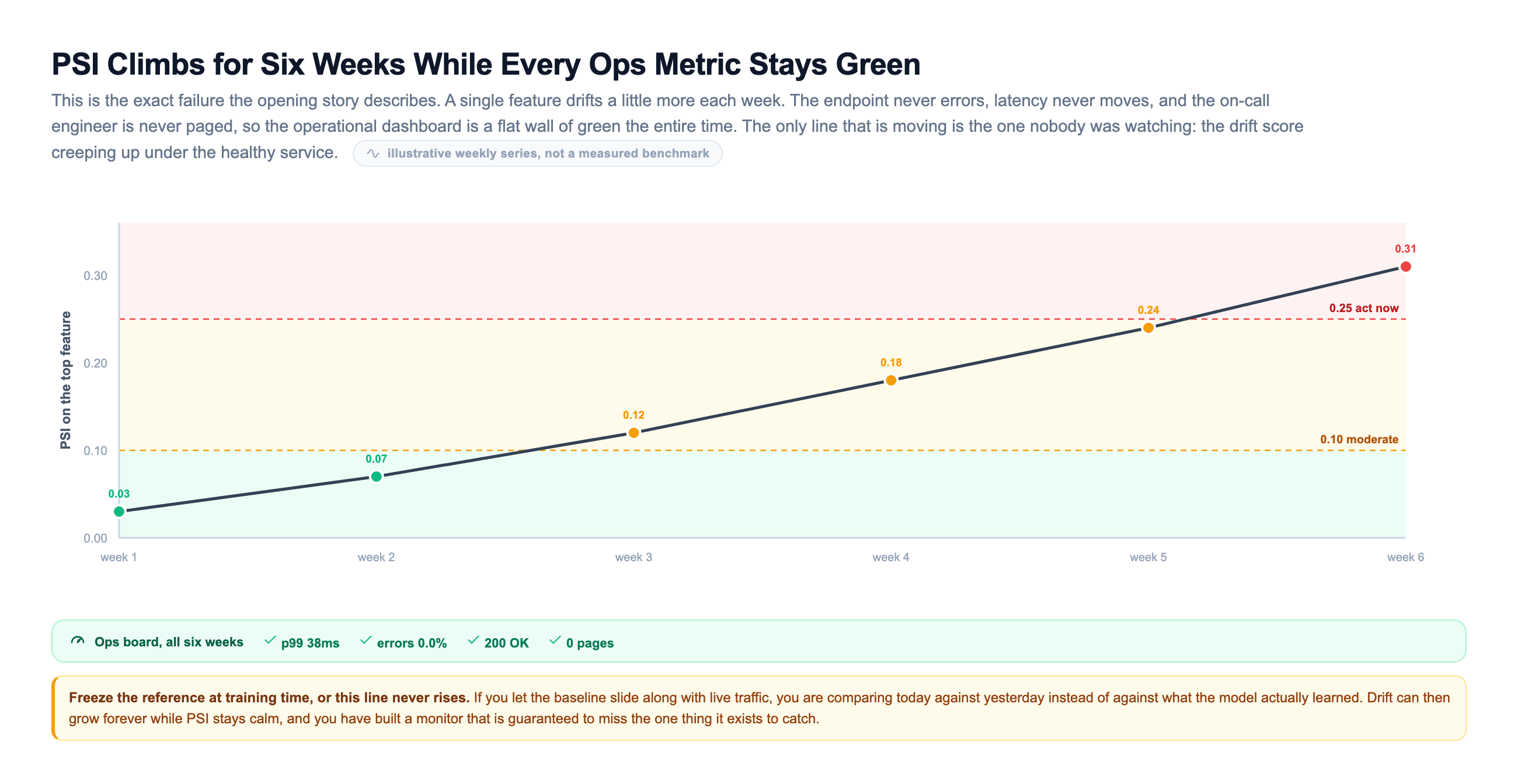
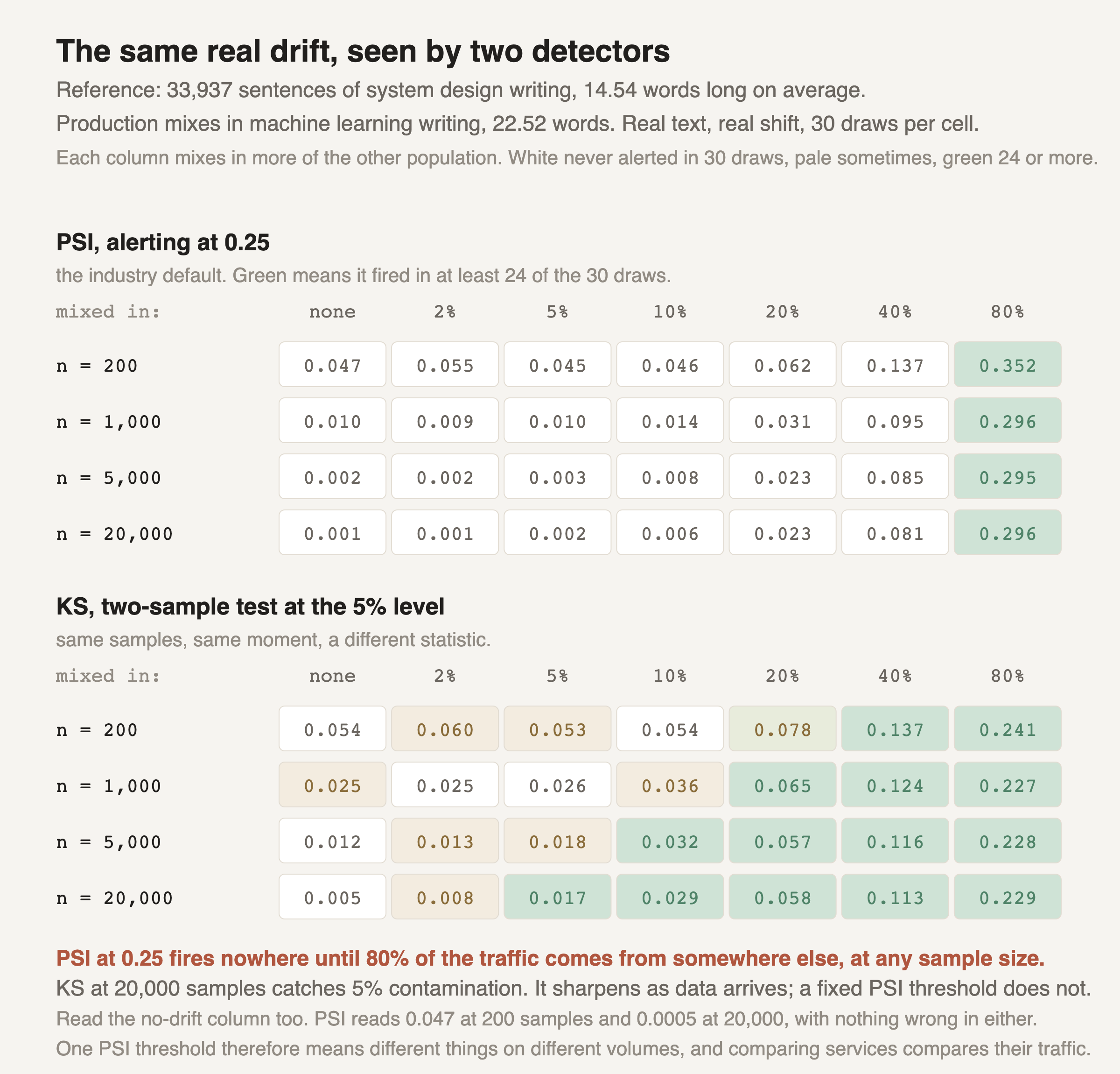
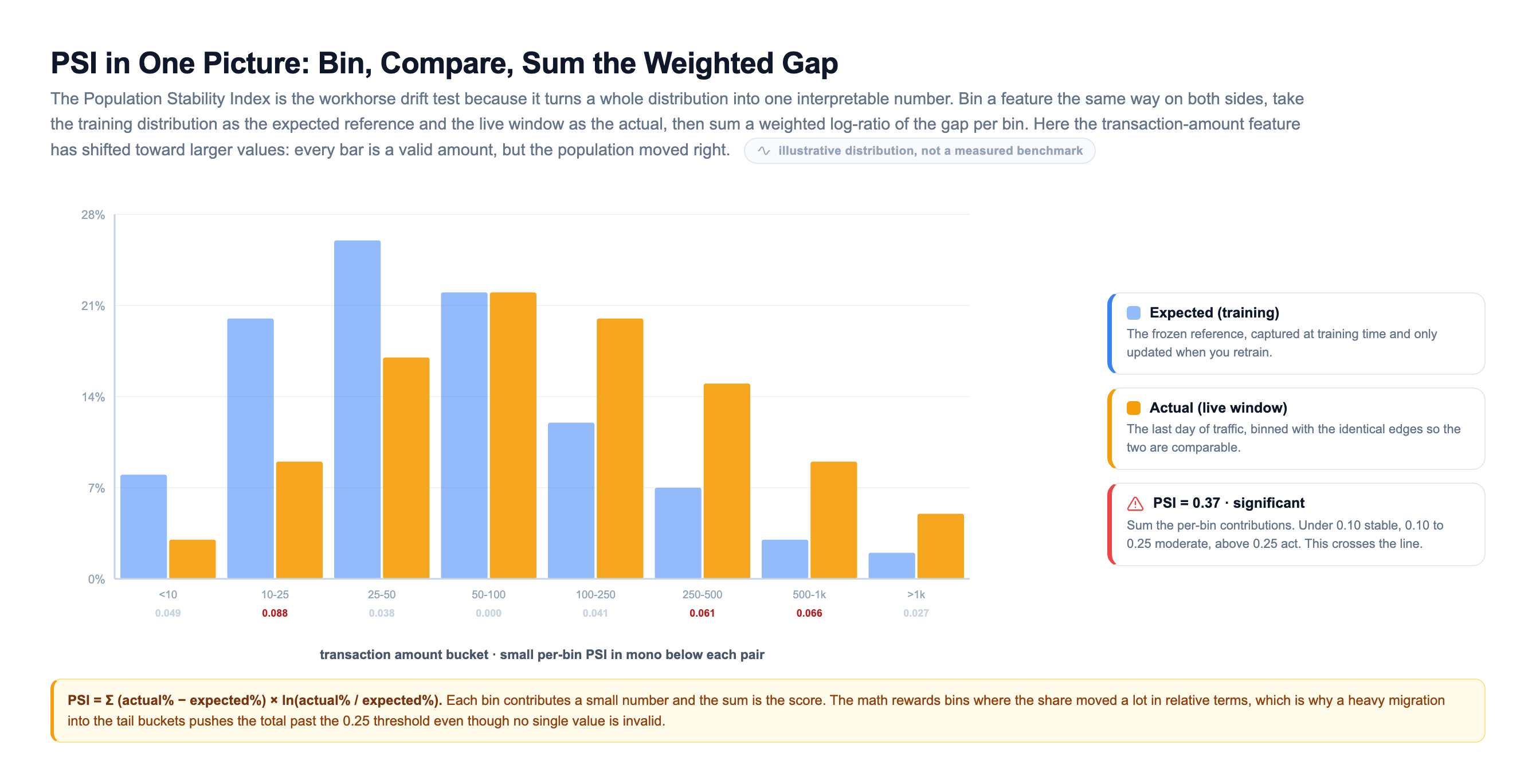
PSI is the workhorse because it gives you one number with thresholds everyone agrees on. Under 0.10 the population is stable, between 0.10 and 0.25 is a moderate shift worth a look, and above 0.25 is a significant shift you should act on. The mechanics are simple: bin each distribution the same way, then sum a weighted log-ratio of the per-bin gap.
The Ground-Truth Lag Problem
Here is the trap that catches every team new to model monitoring. The signal you trust most is the one that arrives last.
True model quality, the actual accuracy or precision, can only be computed once you know the real outcome. But the real outcome shows up on its own clock. A fraud chargeback lands 30 to 90 days after the transaction. A loan default takes months. A churn prediction is not confirmed until the customer actually leaves or stays. If you wait for labels to tell you the model decayed, you find out a quarter too late.
So you invert the problem. You monitor proxies first, and let ground truth confirm later.
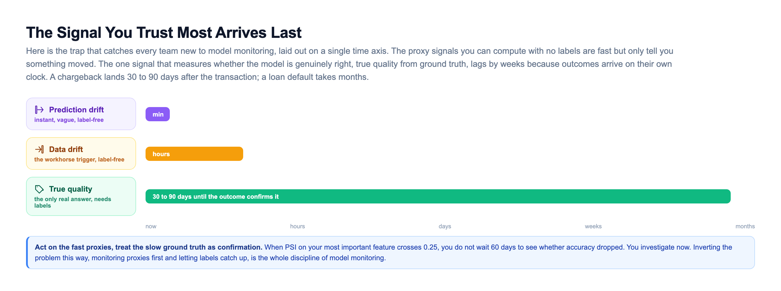
Laid out on one axis, the discipline becomes obvious. Prediction drift is instant but vague, it only tells you something moved. Data drift comes in a batch job within hours and needs no labels, so it is the workhorse trigger. True quality from ground truth is the only signal that measures whether the model is genuinely right, and it can lag by weeks. The discipline is to act on the fast signals and treat the slow ground truth as confirmation. When PSI on your most important feature crosses 0.25, you do not wait 60 days to see if accuracy dropped. You investigate now. Inverting the problem this way, monitoring proxies first and letting labels catch up, is the whole discipline of model monitoring.
Operational Monitoring Is Not Model Monitoring
A model in production is a service, so it needs everything a service needs: , throughput, error rate, resource use. That is operational monitoring, and your platform team already knows how to do it. But it answers only half the question. The other half is a question no ordinary web service ever had to ask: is the thing still correct?
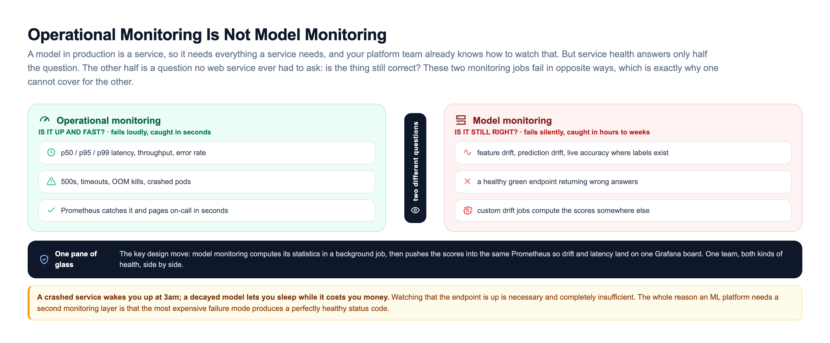
The two jobs fail in opposite ways, which is exactly why one cannot cover for the other. Operational monitoring asks: is the service up and fast? It fails loudly, with 500s and timeouts and OOM kills, and catches it in seconds. Model monitoring asks a completely different question: is the service still correct? And it fails silently, with a healthy green endpoint returning wrong answers.
| Operational monitoring | Model monitoring | |
|---|---|---|
| Question | Is it up and fast? | Is it still right? |
| Signals | p50/p95/p99 latency, , error rate, CPU/GPU, memory | Feature drift, prediction drift, live accuracy where labels exist |
The Monitoring Pipeline, End to End
Now assemble it. The rule that shapes the whole design: nothing runs on the request path. The model logs its inputs and predictions asynchronously and moves on, so watching the model never adds a millisecond of to a live request. Everything else is a background job, which means a slow drift computation can never slow down a user.
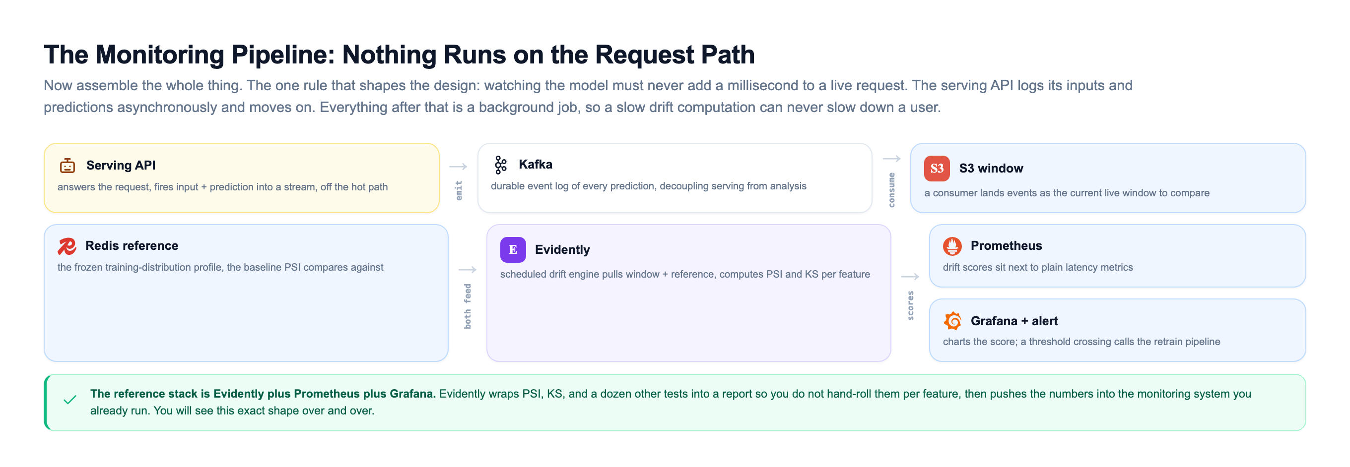
Trace the path. The serving API fires each input and prediction into Kafka, off the hot path, so the durable event log decouples serving from analysis. A consumer lands those events in S3 as the current window, and a frozen reference profile of the training distribution sits in . A scheduled drift engine, Evidently in the reference stack, pulls both and computes PSI and KS per feature. The scores land in Prometheus right next to plain latency metrics, Grafana charts them, and a threshold crossing becomes an alert that can call the retrain pipeline. That Evidently plus Prometheus plus Grafana shape is the reference architecture you will see over and over.
Here is the drift math itself, the PSI calculation Evidently runs under the hood, so you know exactly what the number means. Run it and watch the score cross into the significant band.
That is the entire idea. Bin the training feature, bin the live feature, sum the weighted log-ratio of the gaps, and threshold the result. Evidently wraps this (and KS, and a dozen other tests) into a report so you do not hand-roll it per feature, but the number underneath is exactly this. Change the scale on the live distribution and you can watch the score climb from stable to significant, which is the same story the timeline chart told, now under your own hands.
From Alert to Retrain Without Crying Wolf
An alert that fires on every wiggle is worse than no alert, because people learn to ignore the pager. So the last piece is a decision layer that stacks independent signals before it wakes anyone up.
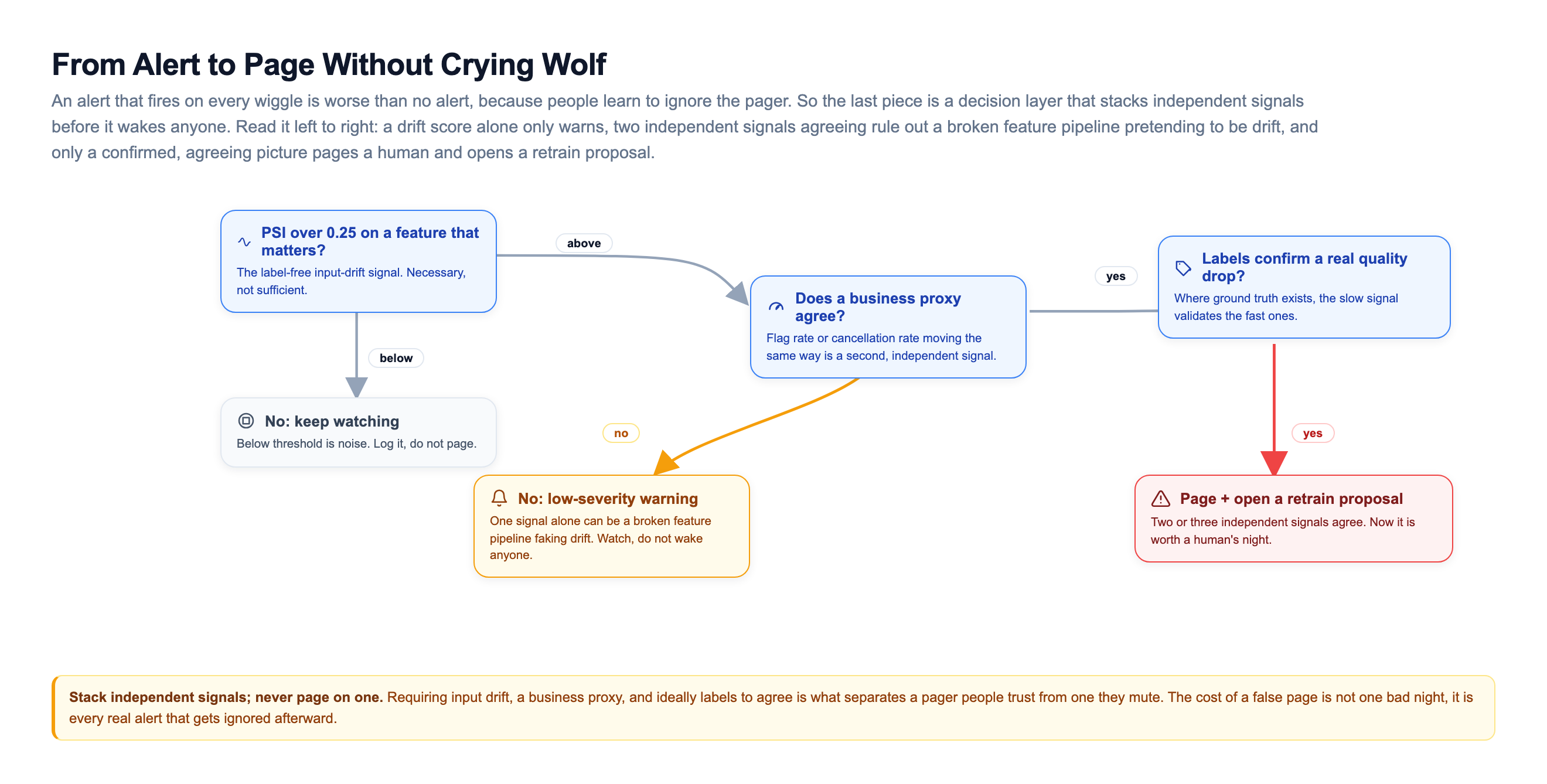
First, is the label-free input drift actually significant, PSI over 0.25 on a feature that matters. Below that threshold is noise: log it, do not page. Then, does an independent business agree, like flag rate or cancellation rate moving the same way. Two independent signals agreeing rules out a broken feature pipeline pretending to be drift, which is a real and common false alarm. Only when they line up, ideally with labels confirming a real quality drop, do you page someone and open a retrain proposal. Everything short of that is a low-severity warning you keep watching. Requiring input drift, a business proxy, and ideally labels to agree is what separates a pager people trust from one they mute, and the cost of a false page is not one bad night, it is every real alert that gets ignored afterward.
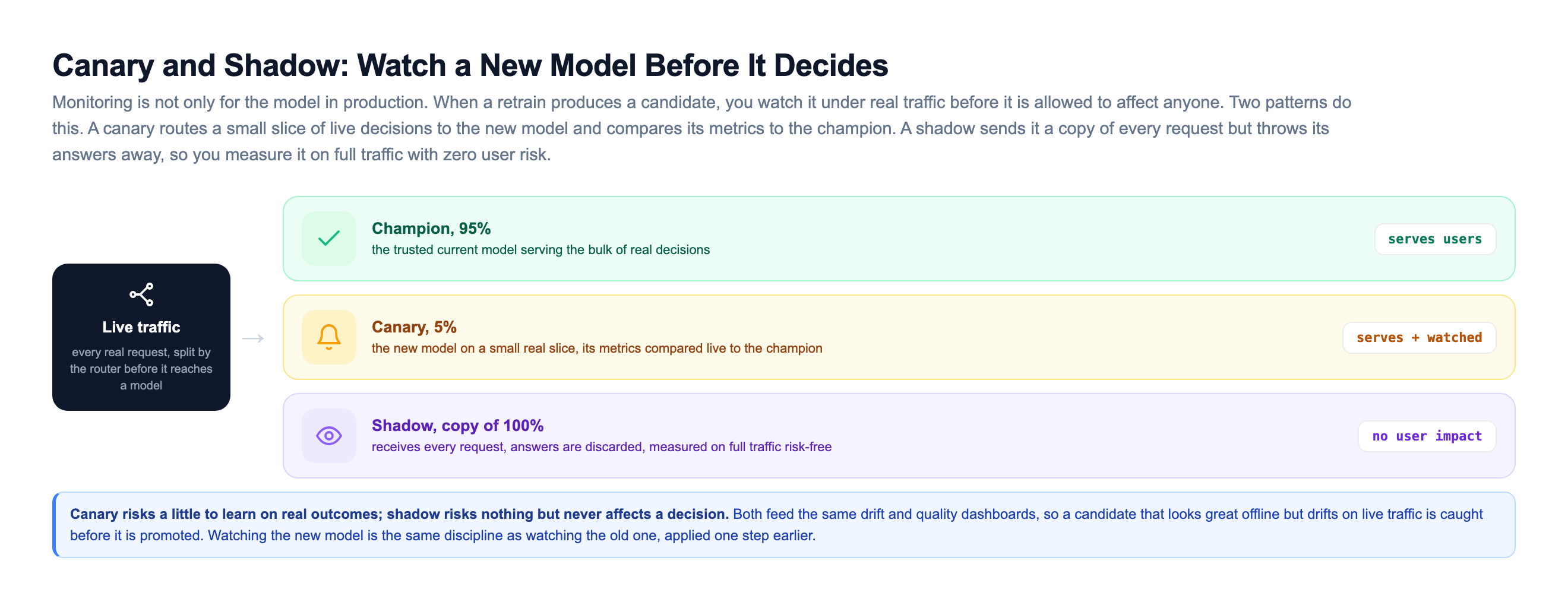
And notice the one thing the alert does not do: it does not silently auto-retrain. A retrain fired from a noisy signal can ship a worse model than the one you have.
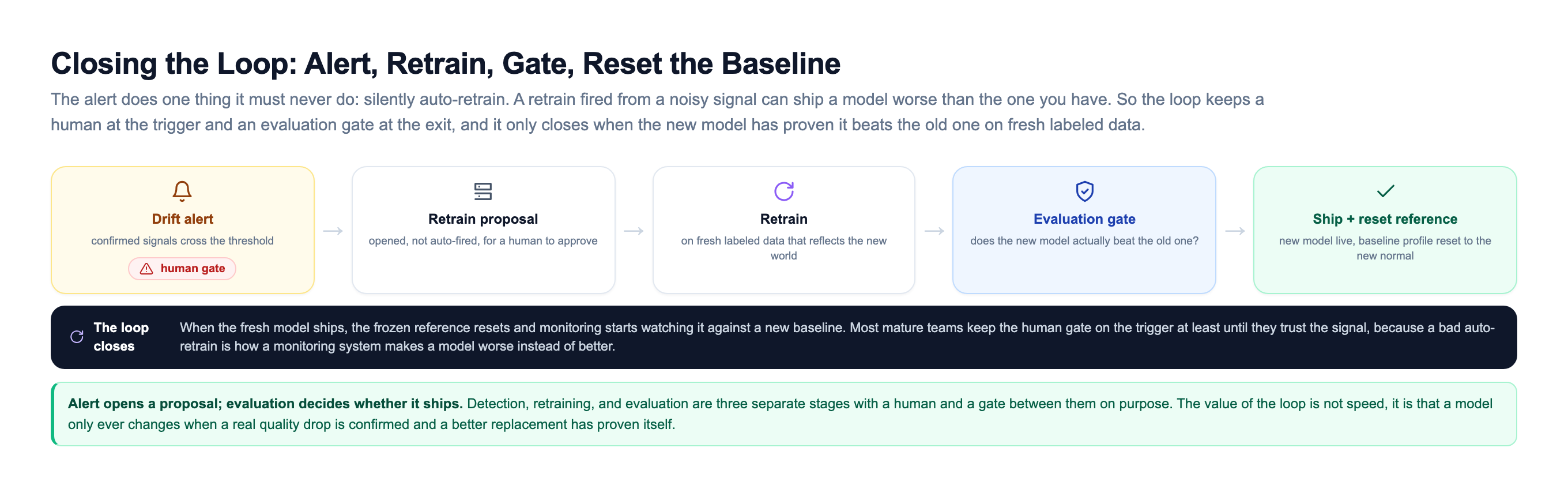
Most mature teams keep a human gate on the trigger, at least until they trust the signal. The alert opens a proposal, the pipeline retrains on fresh labeled data that reflects the new world, the evaluation gate decides whether the new model actually beats the old one, and only then does it ship. When it ships, the reference profile resets to the new normal and monitoring starts watching the fresh model against a new baseline. Detection, retraining, and evaluation are three separate stages with a human and a gate between them on purpose. The value of the loop is not speed, it is that a model only ever changes when a real quality drop is confirmed and a better replacement has proven itself.
How the Giants Watch Their Models
None of this is theoretical. Every company running models at scale ends up building this exact layer.
Uber built its monitoring directly into Michelangelo, its ML platform. Every model that ships logs its predictions and gets automatic quality tracking, so a fraud or ETA model that starts drifting is caught by the platform rather than by a customer complaint. Standardizing monitoring across hundreds of models is only possible because it is part of the platform, not something each team bolts on.
DoorDash monitors its delivery-time and demand models closely because those predictions drive real dispatching decisions. Feature and prediction distributions are watched continuously, since a quiet shift in how long deliveries take feeds straight into wrong promises to customers. They have written publicly about tracking prediction distributions as an early , exactly the fast signal we covered.
Evidently became the open-source default for this work precisely because most teams do not want to hand-roll PSI and KS for every feature. You point it at a reference frame and a current frame, it computes the drift report, and you push the scores into and chart them in next to your graphs. That Evidently plus Prometheus plus Grafana stack is the reference architecture you will see over and over.
The pattern under all of them is identical. Log every prediction. Compare live distributions to a frozen baseline with a statistical test. Alert on the proxy signals because ground truth is too slow. Stack independent signals so the pager stays trustworthy. Gate the retrain on a human and an evaluation. Do that, and a model that would have rotted silently for a month gets caught in a day.
Knowledge Check
Knowledge Check
3 questions - Score 80% to pass
A fraud model's inputs look completely normal, but the same transactions that were legitimate last month are now fraudulent. Which kind of drift is this?
Why do mature platforms monitor prediction drift and data drift before they rely on measured accuracy?
A feature's PSI against the frozen training reference comes back at 0.31. What does that tell you?