The Baker Whose Notebook Was Always Right
Imagine a man who runs a small bakery on a busy street. Every evening he decides how many loaves to bake for the next morning. To decide, he opens his notebook, where he writes down how many loaves he sold each day. If the notebook says he sold about 60 on Tuesdays, he bakes about 60 for next Tuesday.
One spring, a new office opens across the road. On Tuesday morning a queue forms. By nine o'clock all 60 loaves are gone, and for the rest of the morning people come in, see the empty shelf, and walk out. That evening he writes in his notebook: sold 60. It is true. He did sell 60.
Next Tuesday he looks at the notebook, sees 60, and bakes 60 again. The shelf empties again, the same people walk out again, and the notebook says 60 again. Nothing in the notebook is wrong. Every number in it is a real sale. But the notebook can never say more than the number of loaves he baked, because nobody writes down the customer who found an empty shelf. His own decision about how much to bake has set a ceiling on what he can ever learn.
Now imagine a second baker on another street with the same notebook habit, except that she always bakes a few more loaves than the notebook says. Some mornings she throws a few away. But on the morning the office opens, her extra loaves sell, her notebook says 70, and the next week she bakes a little more. Her extra loaves are how she finds out that the street changed. This lesson measures both bakers, with bikes instead of bread.
Where This Lesson Starts
This is the sixth lesson of the chapter, and it uses the same public data and the same kind of program as the first five: two years of hourly bike rentals from Washington, D.C., and a program that guesses how many bikes will be rented in an hour. Lesson 2 showed that a program trained on 2011 and never updated fell far behind in 2012, because many more people rode, and that retraining it every month on the newest real counts kept it close. Lesson 5 showed that the real counts, even a few of them, were the best alarm.
Both lessons made one quiet assumption: that the real counts are there to learn from. In the bike data they are, because every rental was written down. But many programs do more than guess. They decide something, and the decision changes what gets written down. A guess about bike demand can decide how many bikes are put out, and nobody can rent a bike that is not there.
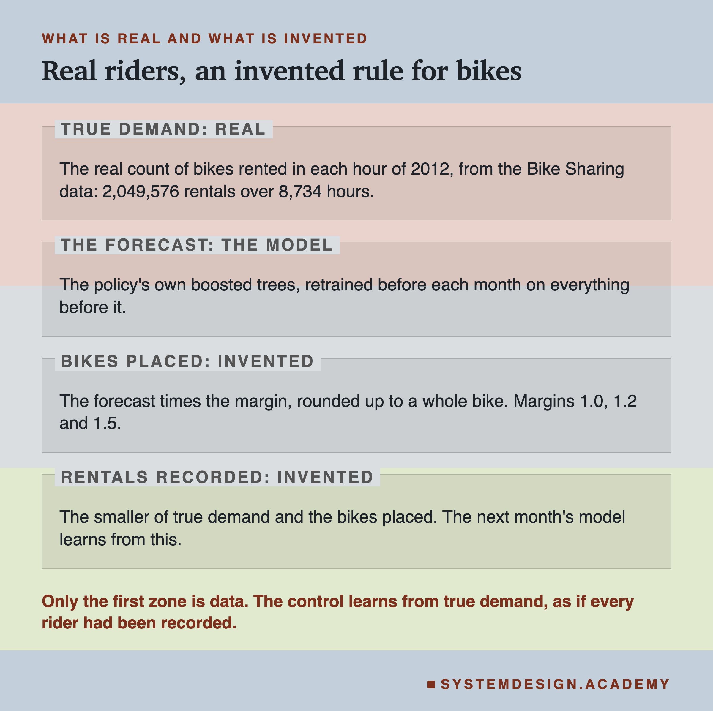
This lesson is a simulation, and I want to say that plainly before anything else. The hourly counts in the data are real, and I treat them as the true demand: the number of people who wanted a bike in that hour. The rule that turns a guess into bikes on the street is invented by me. No bike-share system in the data worked this way. Everything in this lesson measures what that invented rule does to a real program learning from real demand. The riders who were "turned away" are riders the simulation turned away, not riders who really left.
Eight Words for This Lesson
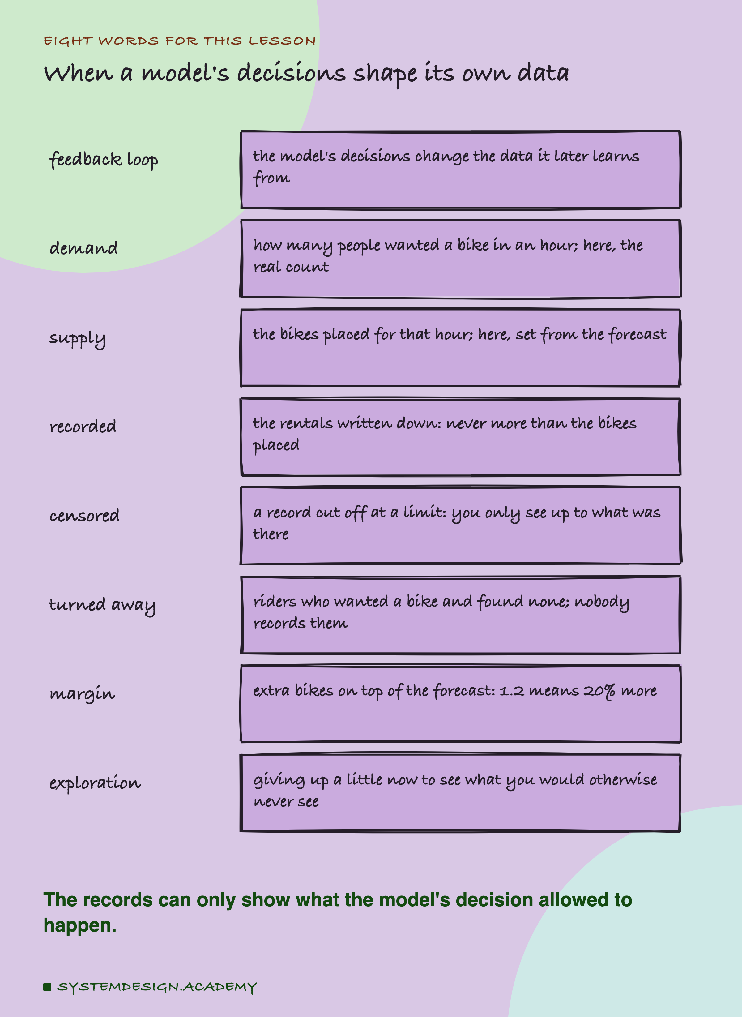
A bike-share system is a city service where people rent a bike from a street rack and return it later; the data in this chapter comes from one in Washington, D.C. The operator is whoever runs it and decides how many bikes to put out. A policy here is one fixed way of running the loop, set by one number, the margin; the lab compares four policies. A model is the program that guesses; here it guesses bikes rented in an hour, and its guess is called the forecast. A feedback loop is what happens when the model's decisions change the data it will later learn from: today's forecast shapes tomorrow's training rows.
Demand is how many people wanted a bike in an hour. Supply is how many bikes were there. The recorded rentals are what gets written down, and they can never be more than the supply, because a rider cannot rent a bike that is not there. When demand is bigger than supply, the extra riders are turned away, and nobody writes them down.
A record cut off at a limit like that is called censored. In plain words: you only see rentals up to the number of bikes that were there. If 568 people wanted a bike and 417 bikes were there, the record says 417, the same number it would say if exactly 417 people had wanted one.
A margin is extra supply on top of the forecast. A margin of 1.2 means 20% more bikes than the forecast. More generally, exploration means giving up a little now (some bikes stand unused) so that you can see what you would otherwise never see (whether more people would have come). The , from the earlier lessons, is the mean absolute error: the average size of the miss, in bikes an hour.
How the Loop Closes
The loop runs once a month in the simulation. The sketch draws it as a cycle of five boxes; the sequence diagram further down splits the same month into seven steps.
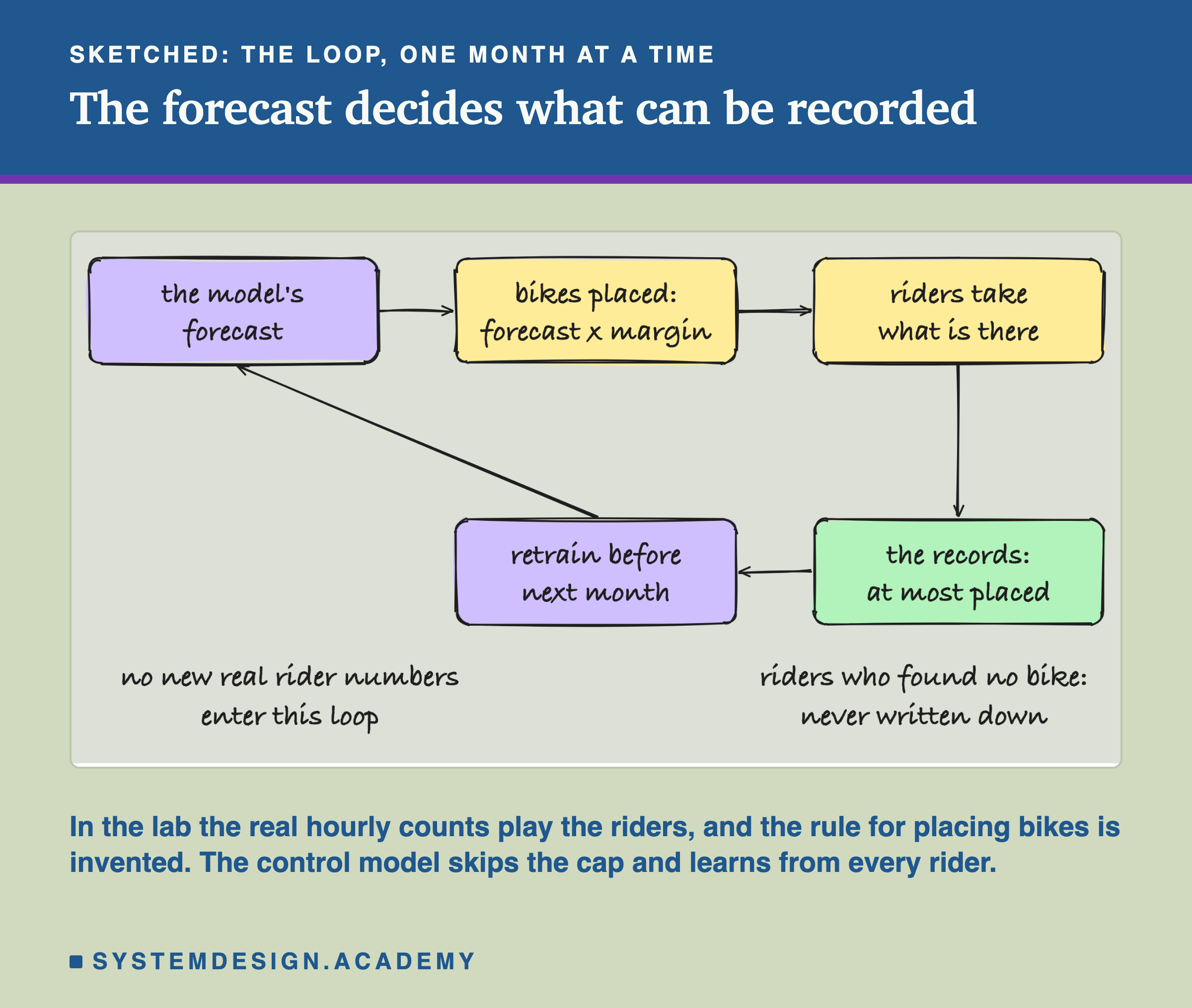
The model makes a forecast for every hour of the coming month. The operator places bikes to match: the forecast times the margin, rounded up to a whole bike. Riders come, and each one who finds a bike rents it. The rentals are written down. Before the next month, the model is retrained on everything recorded so far, and the loop begins again.
Look at what enters the loop from the outside world. The true 2011 rows stay in training, but nothing new about real demand comes in: only the recorded rentals. And the recorded rentals are capped by the bikes placed, which were set by the forecast. So the model is, in part, learning from its own earlier guesses. If it guessed too low, the records come back too low, and it learns that the low guess was right.
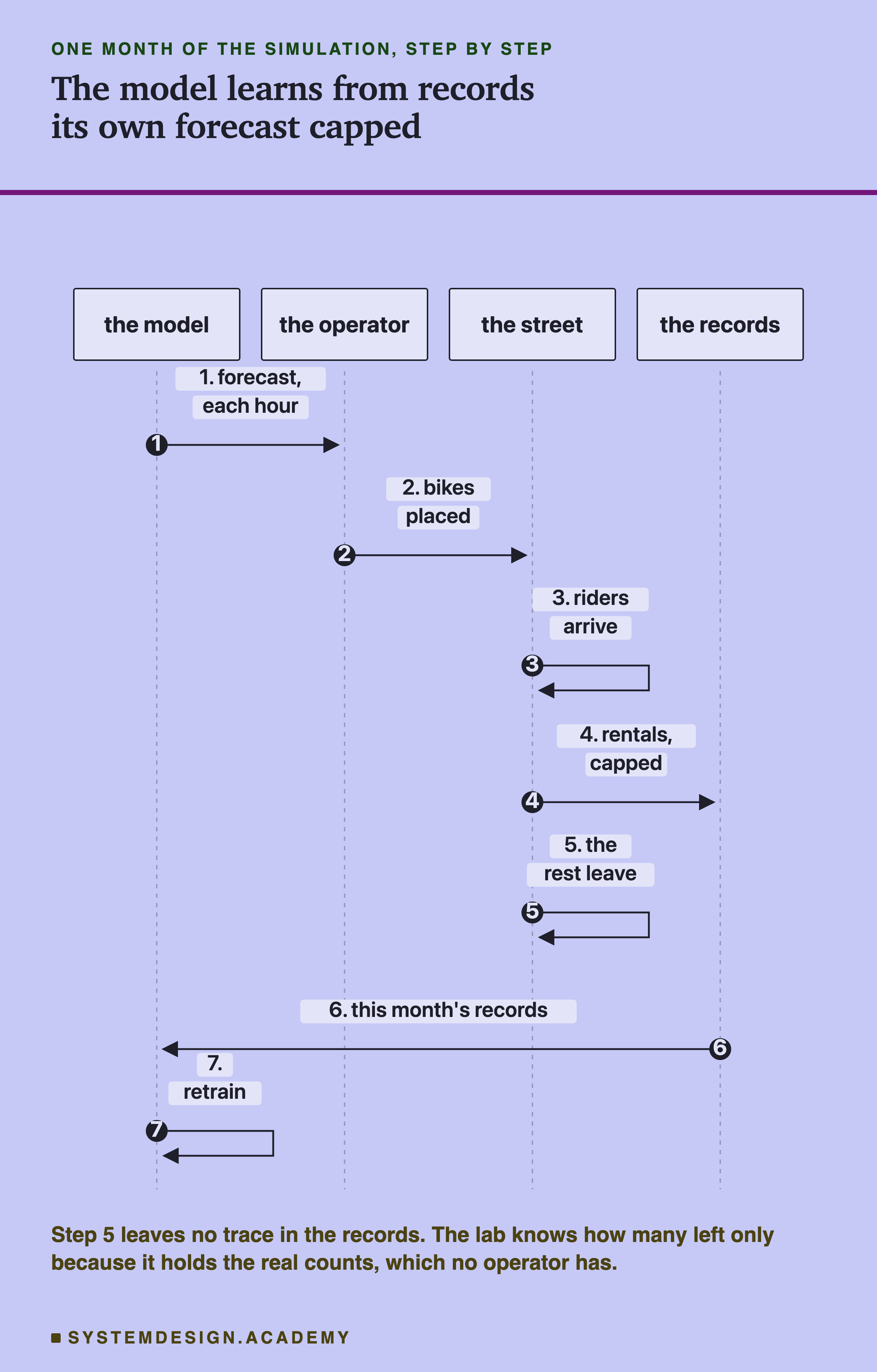
The sequence diagram lays out the same month step by step. Step 5 is the important one, and it is the one nobody sees: the riders who find no bike simply leave. In a real system there is no row for them. The lab can count them only because it holds the real hourly counts from the data, which in the simulation play the part of what riders wanted. A real operator would have only the records.
What the Lab Ran
I wrote the design at the top of the lab file, loop_lab.py, before I ran it, and the chapter plan, CHAPTER-PLAN.md, records it the same day ("LOOP LAB (batch 6, a SIMULATION on real demand) designed before running").
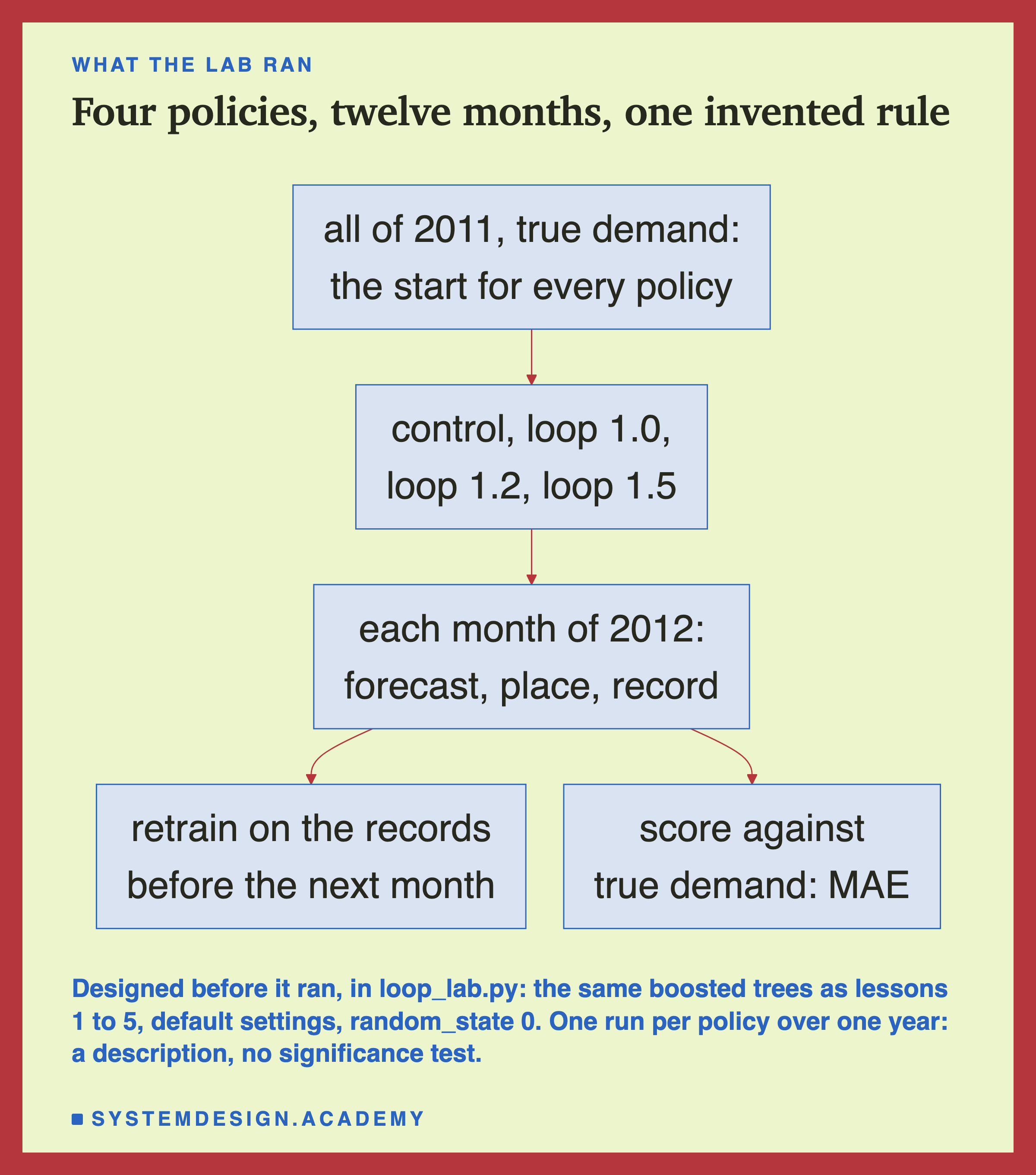
The model is the chapter's: scikit-learn's boosted trees (HistGradientBoostingRegressor, default settings, random_state=0), many small decision trees that each ask yes-or-no questions about the inputs and each correct the ones before. Every policy starts from the same place: a model trained on all of 2011 with the true counts. Then, before each month of 2012, each policy's model is retrained on every earlier hour.
The four policies differ only in what the 2012 rows they have already served hold. The control keeps the true demand, as if every rider had been recorded; it is exactly lesson 2's monthly model, and the report checks that its errors match lesson 2's stored ones. Its mean monthly MAE is 43.6 (lesson 2 quoted 43.7, its error over all hours). Loop 1.0 keeps what was recorded when bikes were placed at the forecast with no margin. Loop 1.2 and loop 1.5 do the same with 20% and 50% more bikes.
What a Censored Record Looks Like
Before the results, it helps to see the censoring on a real day. This is Monday 2 July 2012 under loop 1.0, the loop with no margin, at three hours.
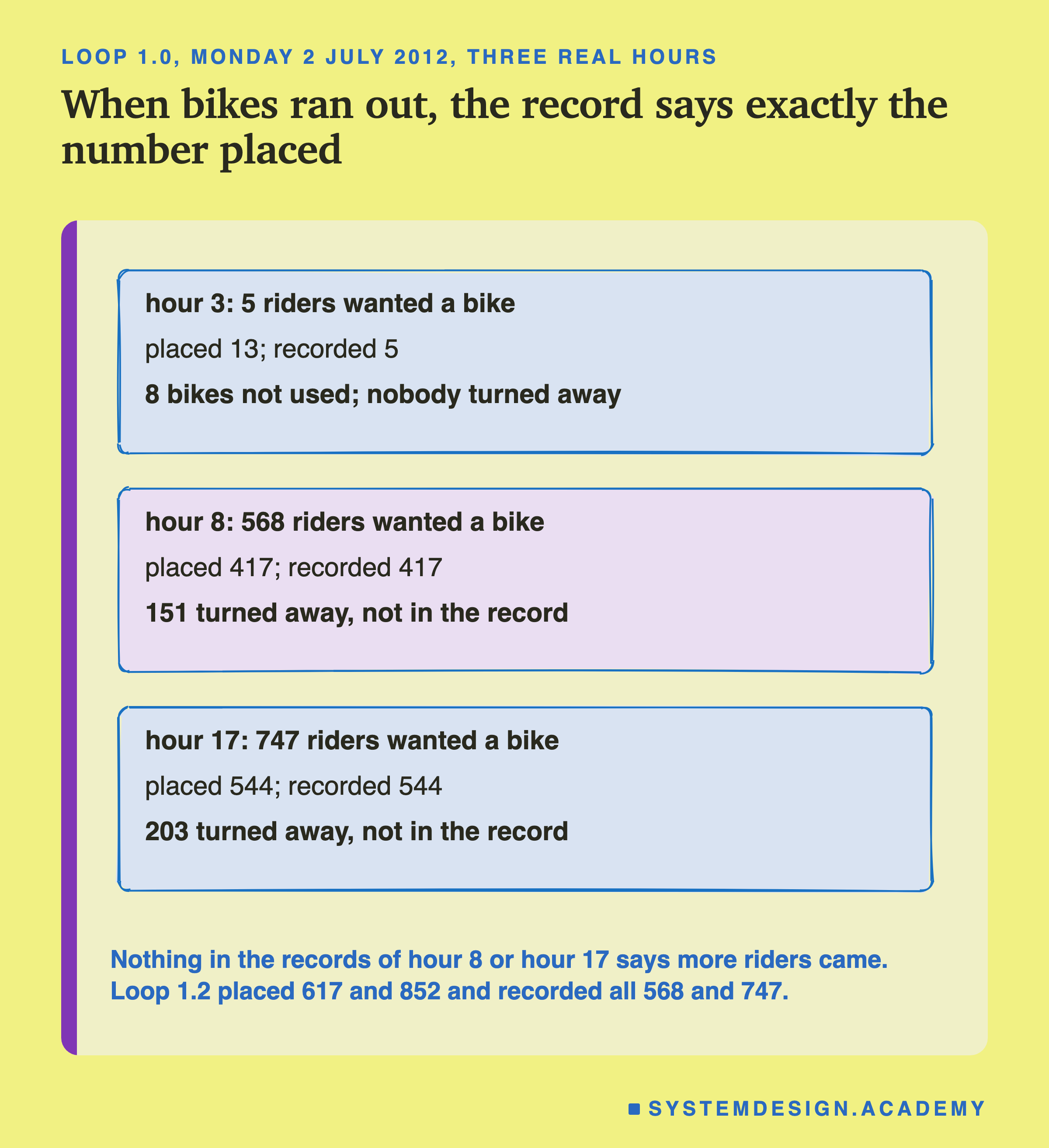
At 3 in the morning, 5 people wanted a bike and 13 were there. All 5 rode, and the record says 5: the truth. At 8 in the morning, 568 people wanted a bike, the loop had placed 417, and the record says 417. The 151 who found an empty rack are not in it. At 5 in the afternoon, 747 wanted a bike, 544 were placed, and the record says 544.
Now read those records the way the next model will. Hour 8: 417 rentals, and the model had guessed 416.1. Hour 17: 544 rentals, and the model had guessed 543.7. The guesses look almost perfect. The records hold no sign that anything was wrong, because the only thing that could show it, the riders who left, was never written down.
Loop 1.2, with 20% more bikes, had its own forecast for the same hours (the loops' forecasts drift apart over the months) and placed 617 at hour 8 and 852 at hour 17. Both were more than the demand, so its records hold the true 568 and 747. That is what a margin gives the model: the hours where the record is not cut off are hours where the model can learn the truth.
The Loop Missed by Twice as Much
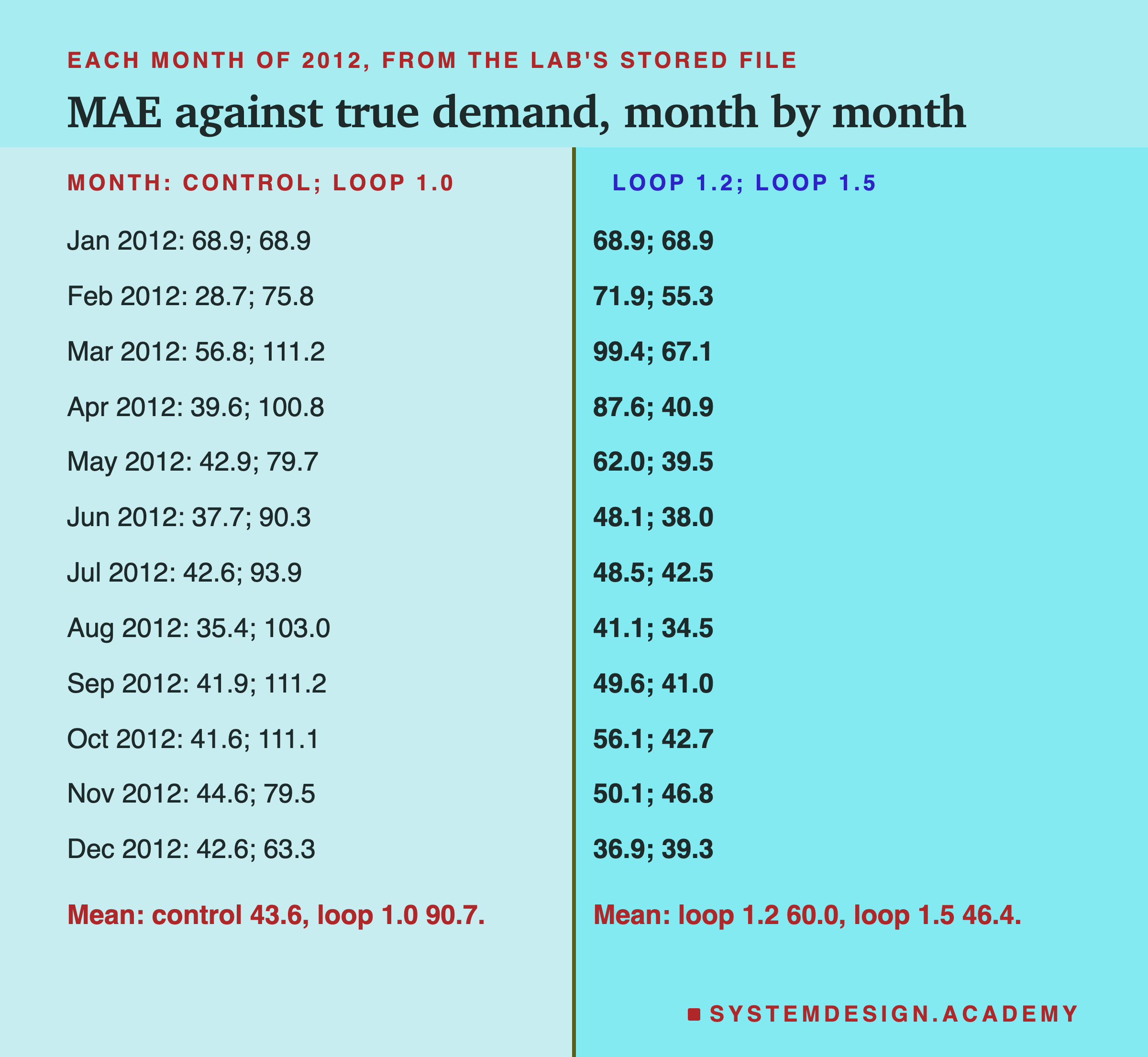
Here is the headline, from the lab's stored file, results/loop.json. Every number is scored against the true demand.
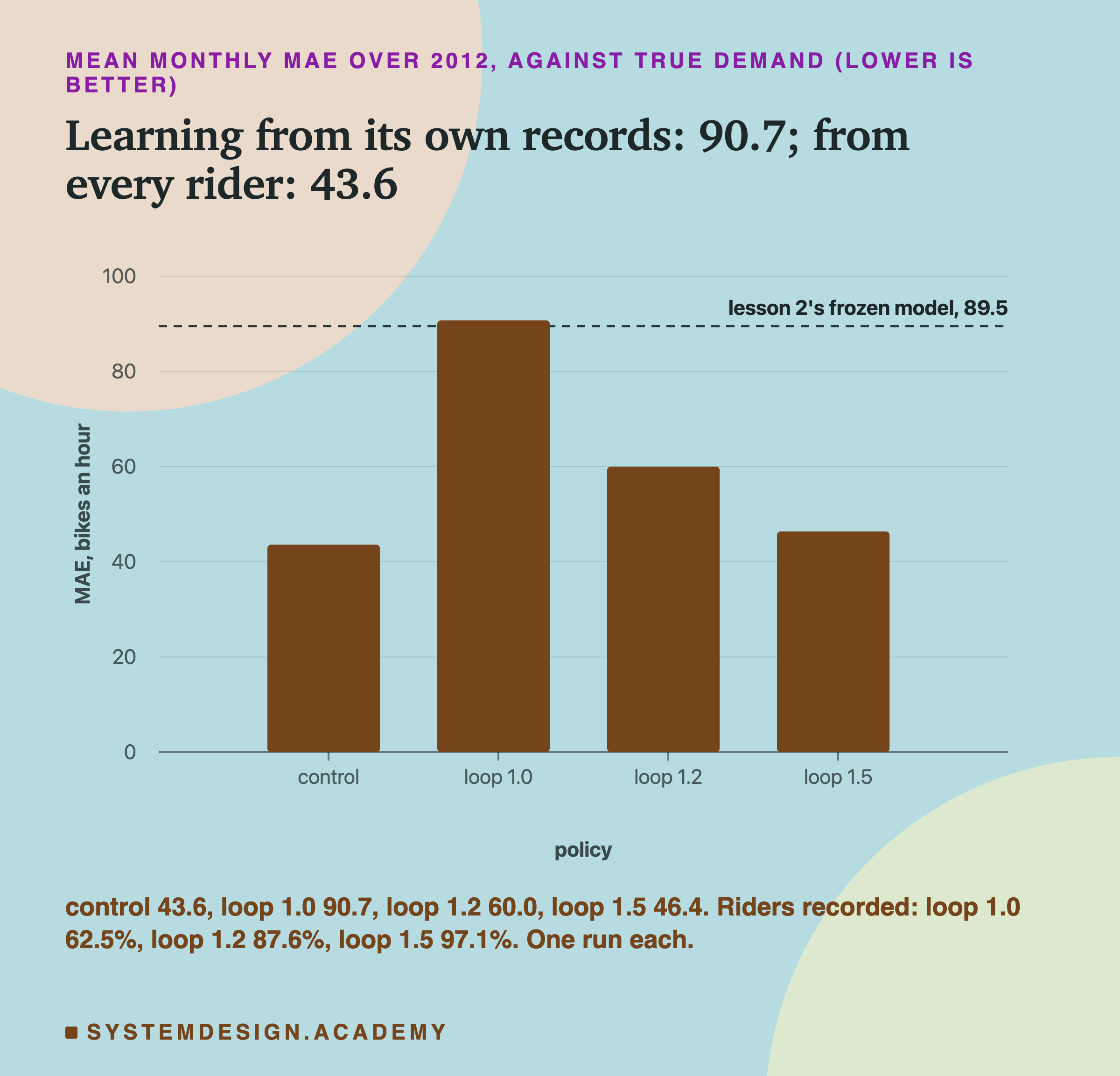
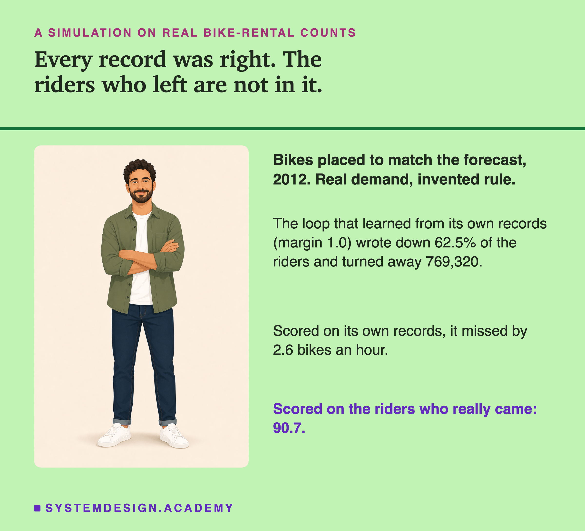
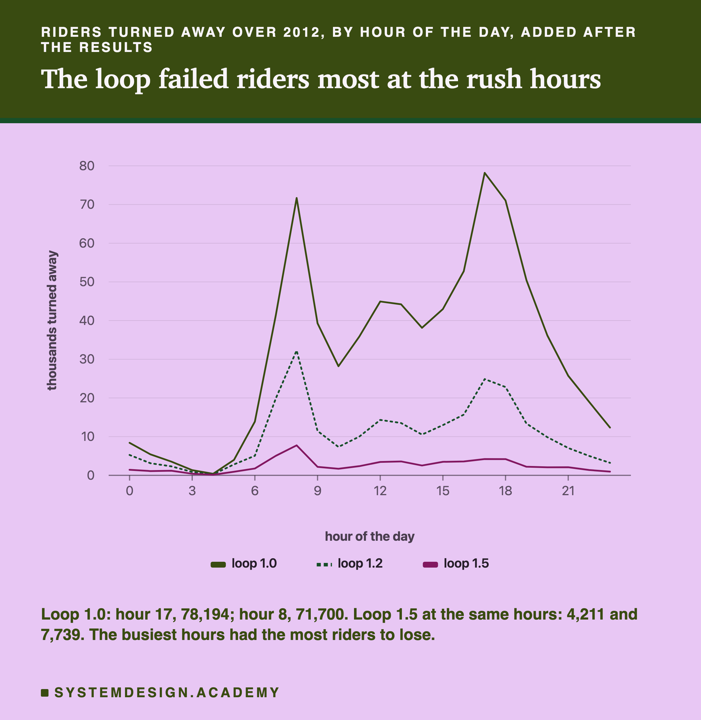
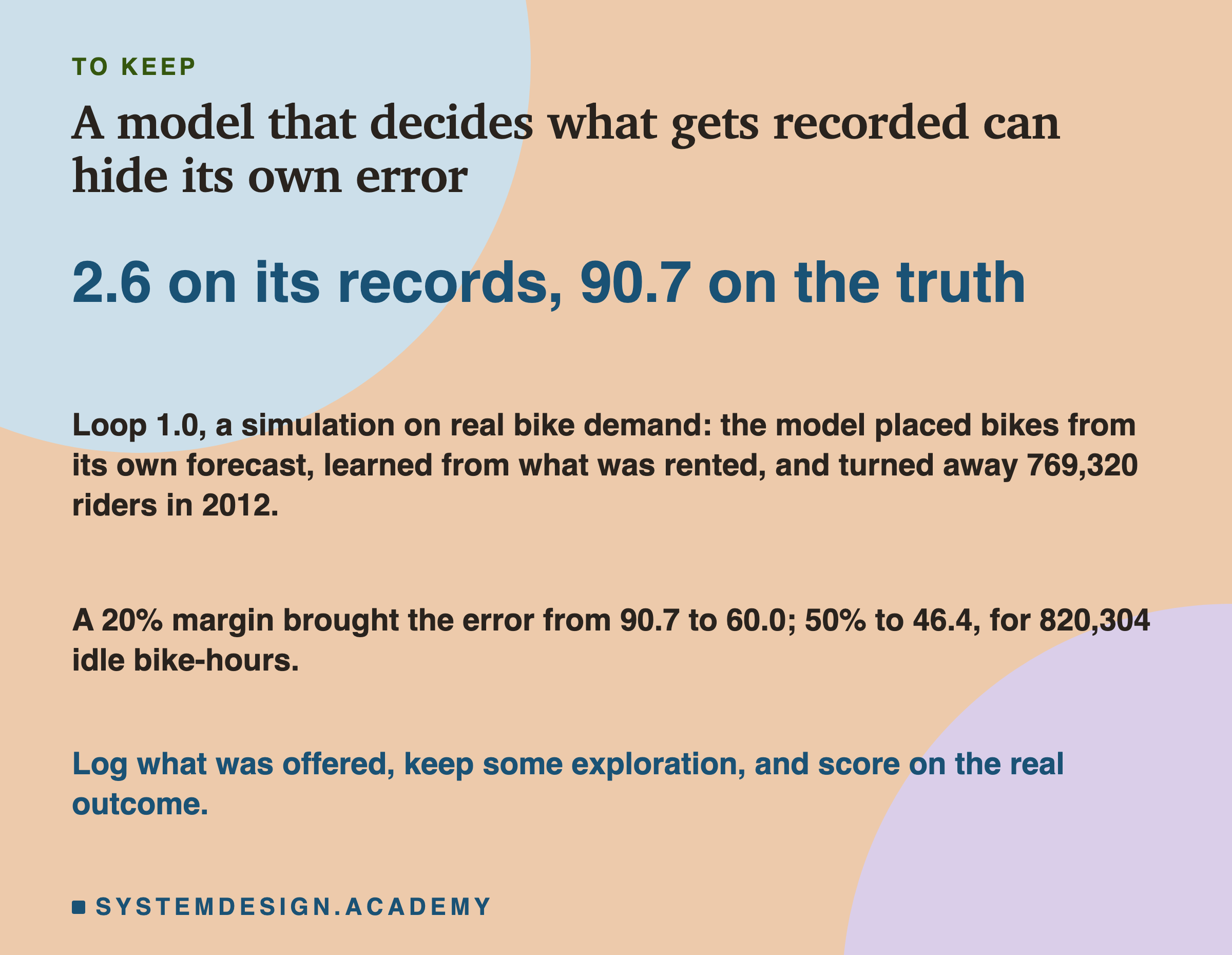
Over the 12 months of 2012, the control missed true demand by 43.6 bikes an hour on average. Loop 1.0, the same model retrained just as often but on its own capped records, missed by 90.7: more than twice as much. It recorded 62.5% of the 2,049,576 riders who wanted a bike, and turned away 769,320. Demand was bigger than supply in 84.7% of its hours.
A margin helped a lot. Loop 1.2 missed by 60.0, recorded 87.6% of riders and turned away 254,040. Loop 1.5 missed by 46.4, close to the control, recorded 97.1% and turned away 59,804. These are single runs over one year, so they describe this simulation; they are not estimates of what a margin does in general.
The dashed line on the chart is lesson 2's frozen model, trained on 2011 and never updated, at 89.5 (its mean of the 12 monthly errors; its error over all hours of 2012 also rounds to 89.5). Loop 1.0 was retrained twelve times and ended up almost exactly where a model that never saw 2012 was. The next slides ask why.
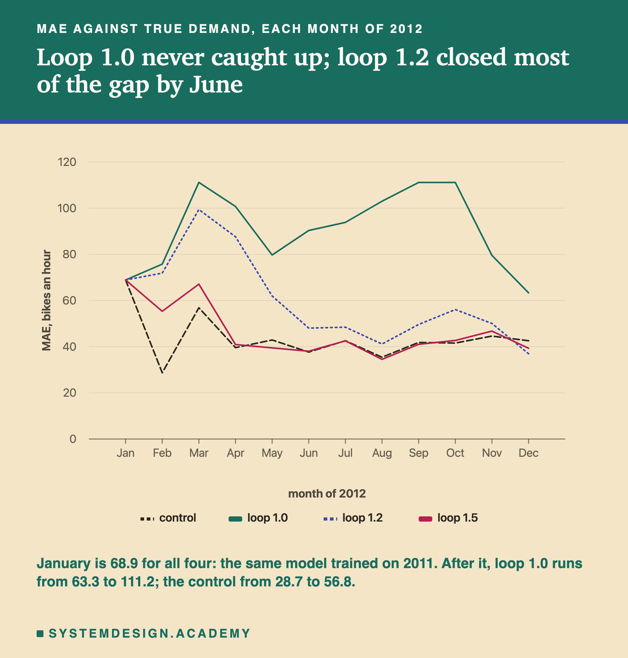
Month by month the picture has three shapes. January is 68.9 for all four, because all four used the same model, trained on 2011, before any 2012 record existed. After that, loop 1.0 never came close to the control. Loop 1.2 stayed far behind until April, closed most of the gap by June, and from then on stayed within 15 bikes an hour of it (5.4 to 14.5 worse, and 5.6 better in December). Loop 1.5 reached the control by April.
Why Nobody Would Notice
The lab could score every policy against the true demand, because it holds the real counts. A real operator could not. The operator has only the records. So I asked, after the results, what the error looks like when each model is scored the only way an operator could score it: against the rentals it recorded.
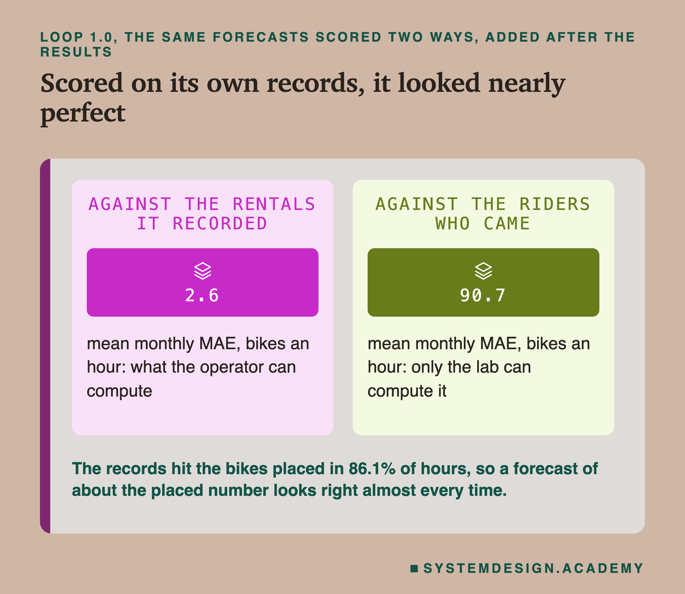
Scored on its own records, loop 1.0 missed by 2.6 bikes an hour. Scored on the riders who came, it missed by 90.7. It is the same model and the same forecasts; only what they were compared with changed. In 86.1% of hours the record equals the bikes placed, and the bikes placed are the forecast rounded up. So the record is, most of the time, just the forecast again, and a forecast compared with itself looks excellent.
A feedback loop is invisible in the recorded data. Every recorded number is right. None of them is a mistake that a data check could find, and none of them is missing in a way that shows up as an empty cell. The error lives entirely in what was never written down.
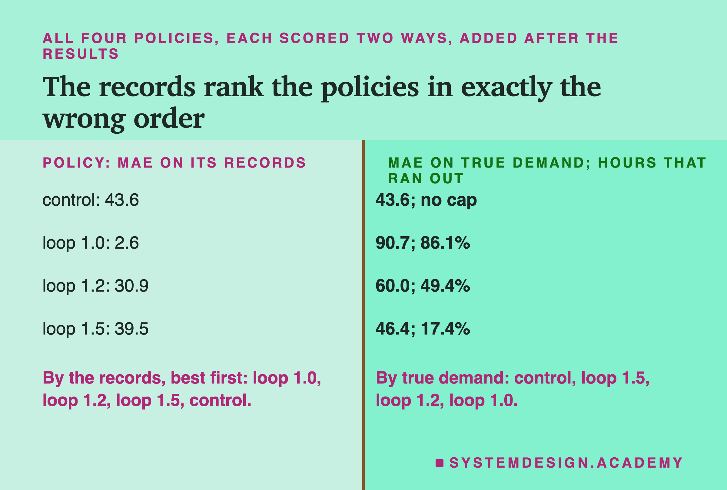
Now compare the policies. Ranked by the error against their own records, the four policies come out in the order loop 1.0 (2.6), loop 1.2 (30.9), loop 1.5 (39.5), control (43.6). Ranked by the error against true demand, the order is control, loop 1.5, loop 1.2, loop 1.0: exactly reversed. A team that picked its policy by the error on its own records would have picked the worst one here. That is my reading of these four numbers, not a test of how teams choose.
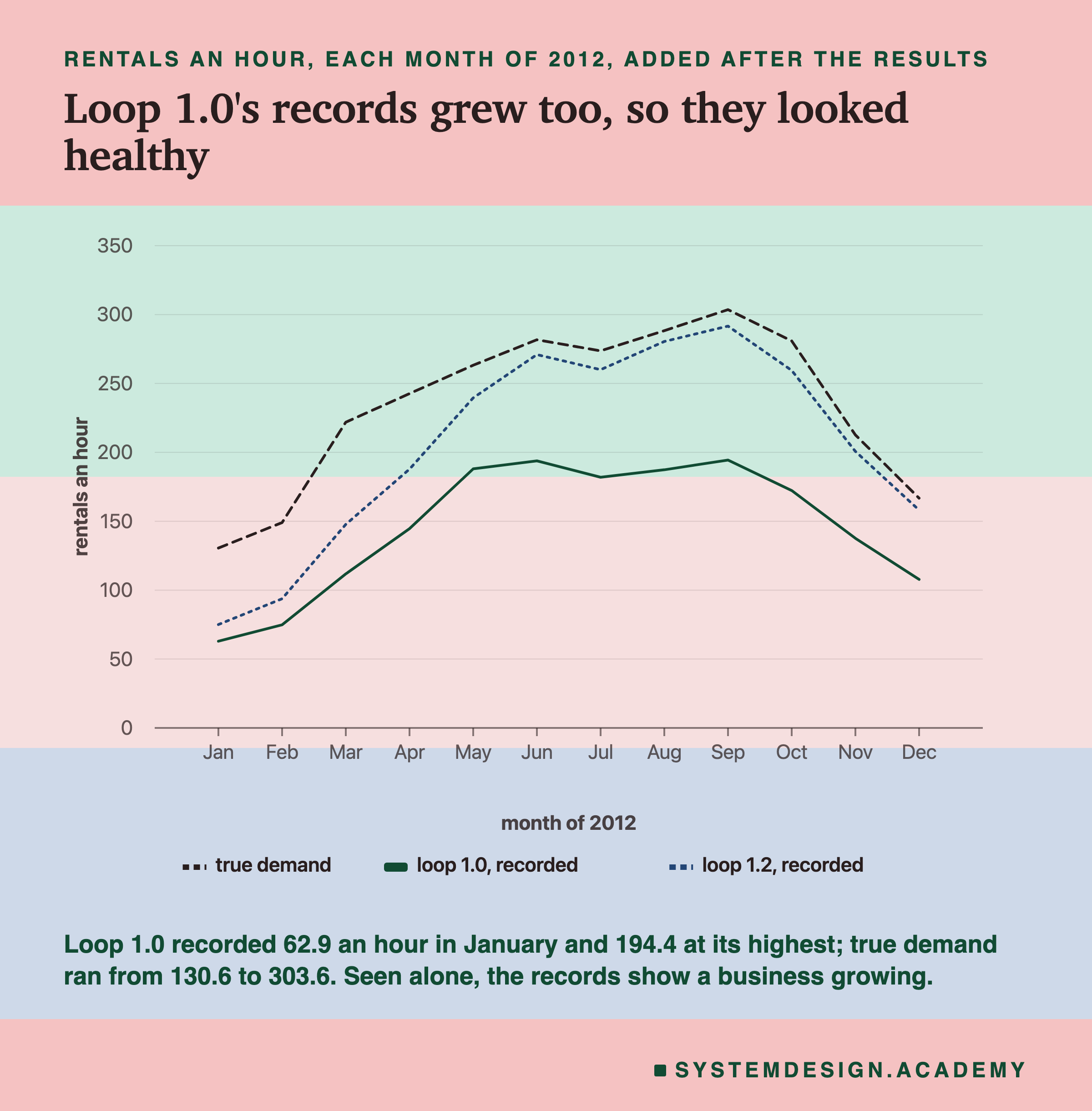
Why Loop 1.0 Stayed Stuck
Loop 1.0 was retrained every month on the newest data, like the control. Yet it ended where lesson 2's frozen model was. I compared the two month by month, after the results, using lesson 2's stored guesses (results/drift.json).
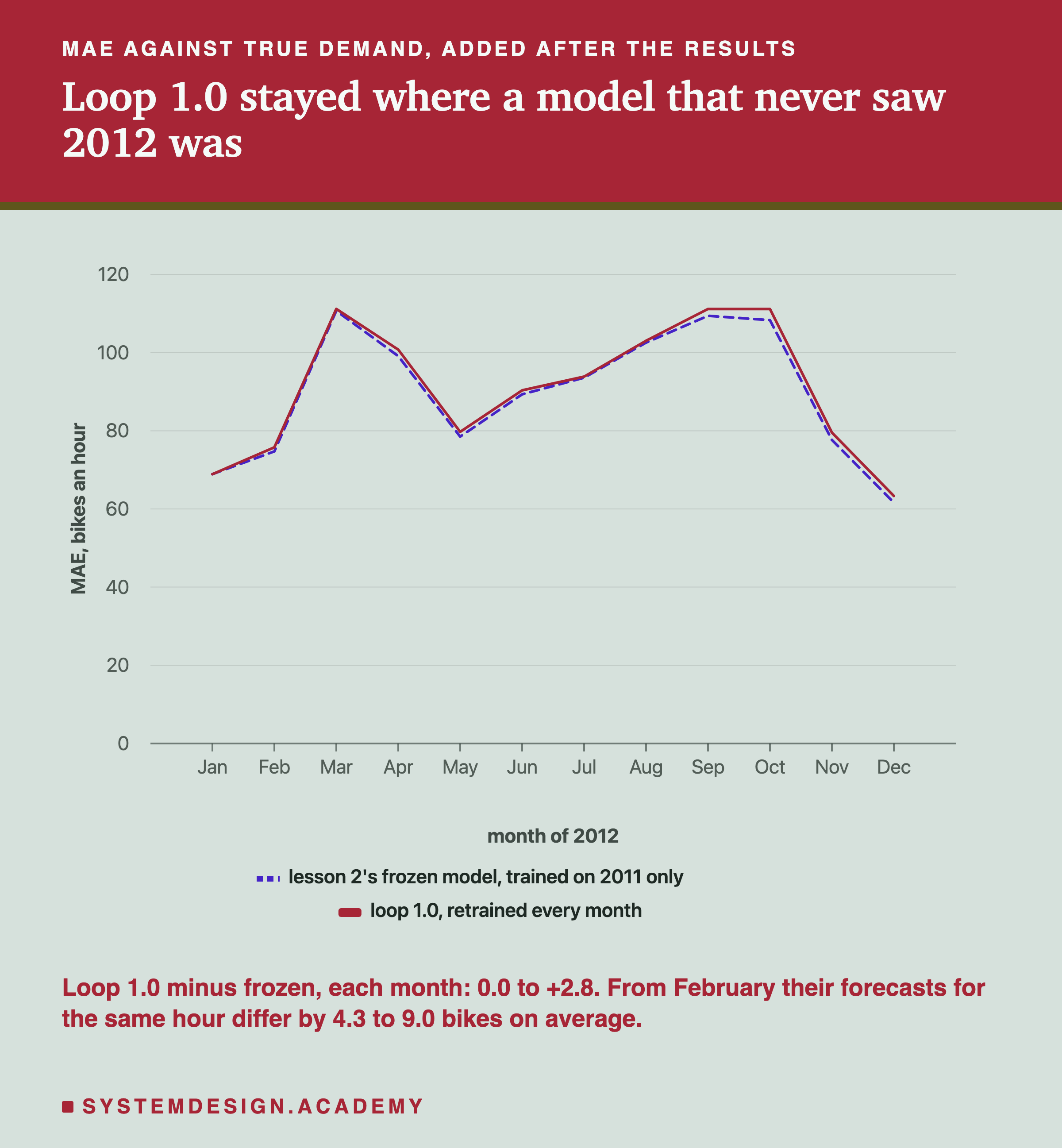
The two lines lie almost on top of each other. In every month, loop 1.0's error was between 0.0 and 2.8 bikes an hour above the frozen model's. Their forecasts for the same hour differed by 4.3 to 9.0 bikes on average from February on, and over 2012 the frozen model's forecasts averaged 149.7 an hour and loop 1.0's own forecasts 148.2, while true demand averaged 234.7 (loop 1.0's records averaged 146.6). All of that is measured.
Why? The measured part: in all 8,734 hours of 2012, loop 1.0 never recorded more rentals than its own forecast rounded up (the report counts 0 such hours; the rule makes it impossible). So every 2012 row the loop learned from said "demand was at most what I guessed". My explanation, which the report labels a guess: a model retrained on rows like that is taught its own old level again. The only true rows it ever saw were from 2011, and 2011 was quieter, so they pulled its guesses down, not up. Retraining could not help, because the new rows only repeated what the model already believed.
This is the same result as lesson 2's frozen model, reached a different way. The frozen model never saw 2012 because nobody retrained it. Loop 1.0 saw 2012 every month, but only the part of 2012 its own forecast let through. Retraining on the wrong data is, here, no better than not retraining.
How a 20% Margin Let the Model Climb
Loop 1.2 also started far behind. It then closed most of the gap by June. I read the month-by-month data after the results to see when and why. To compare forecasts with demand in one number, I use the forecast level: the mean forecast of a month divided by the mean true demand. 1.00 means the forecasts were right on average; 0.60 means they were 40% too low.
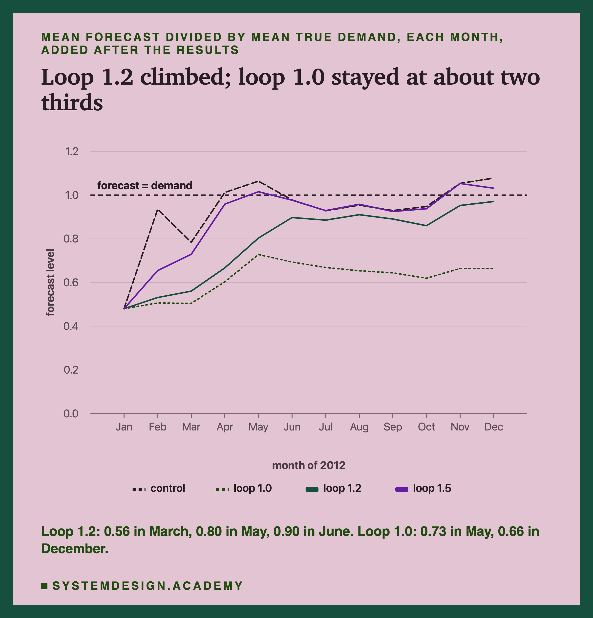
In January every policy's forecast level was 0.48: the 2011 model guessed about half of 2012's demand. The control, which learned January's true counts, jumped to 0.94 in February. Loop 1.0 rose slowly with the seasons, like the frozen model, to 0.73 in May, and fell back to about two thirds. Loop 1.2 climbed a little each month, 0.53, 0.56, 0.67, then 0.80 in May and 0.90 in June.
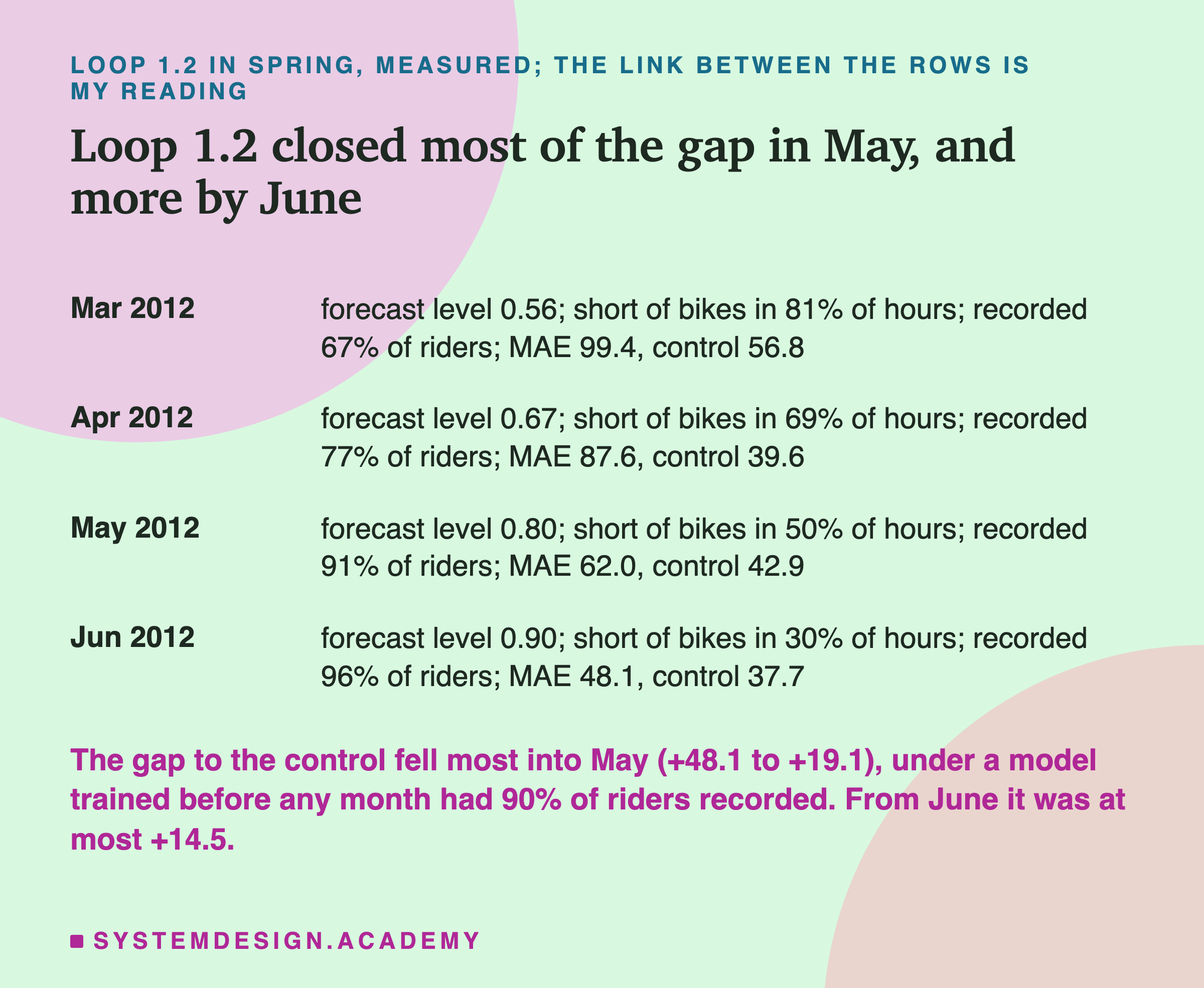
The measured chain for loop 1.2 is this. In March its forecast level was 0.56, it was short of bikes in 81% of hours, and it recorded 67% of the riders. In April, 0.67, short in 69% of hours, 77% recorded. In May, 0.80, short in 50% of hours, and 91% of the riders recorded: the first month over 90%. In June, trained on those May records among the rest, its level was 0.90 and its MAE 48.1, against the control's 37.7. From June on, its gap to the control was at most 14.5 bikes an hour; from February to May it had been 43.2, 42.6, 48.1 and 19.1. In December it was even 5.6 below the control.
What the Margin Cost
A margin is not free. Bikes placed for riders who never come stand idle. I counted them after the results from the stored hourly values: for every hour, the bikes placed minus the rentals recorded.
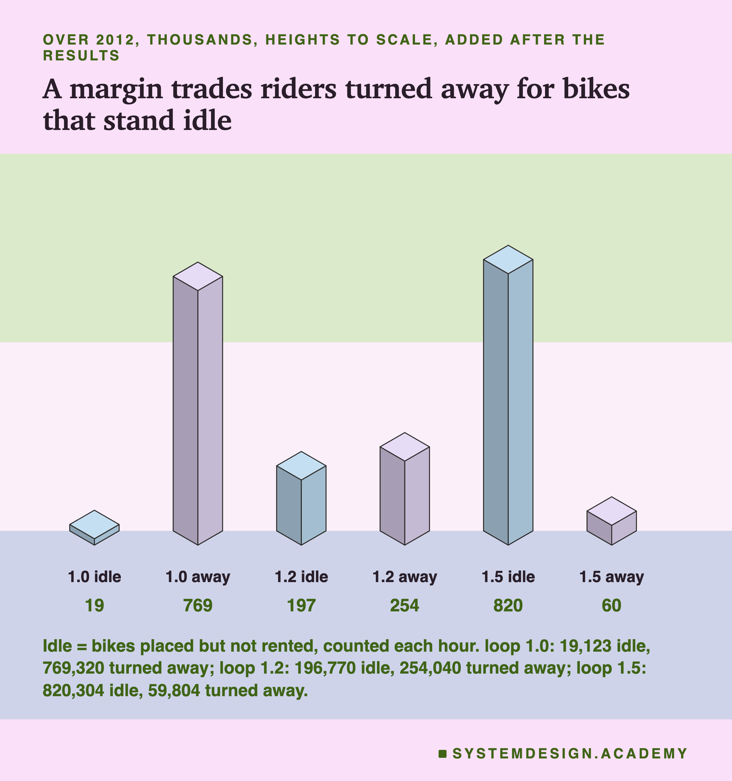
Loop 1.0 placed 1,299,379 bikes over the year's hours and 19,123 of them were not rented: 1.5%. It wasted almost nothing, and turned away 769,320 riders. Loop 1.2 placed 1,992,306 and left 196,770 idle, 9.9%. Loop 1.5 placed 2,810,076, more than the 2,049,576 riders who wanted one, and left 820,304 idle, 29.2%, while turning away 59,804.
There is an important caveat, and it comes from the invented rule. The rule places bikes hour by hour, as if each hour were a new day. A bike unused at 3 in the morning is counted as idle at 3 and placed again at 4. A real bike-share system would not work like that: the bike would still be in the rack. So "idle bike-hours" is a cost unit of this simulation, not a count of bikes a real operator would have bought.
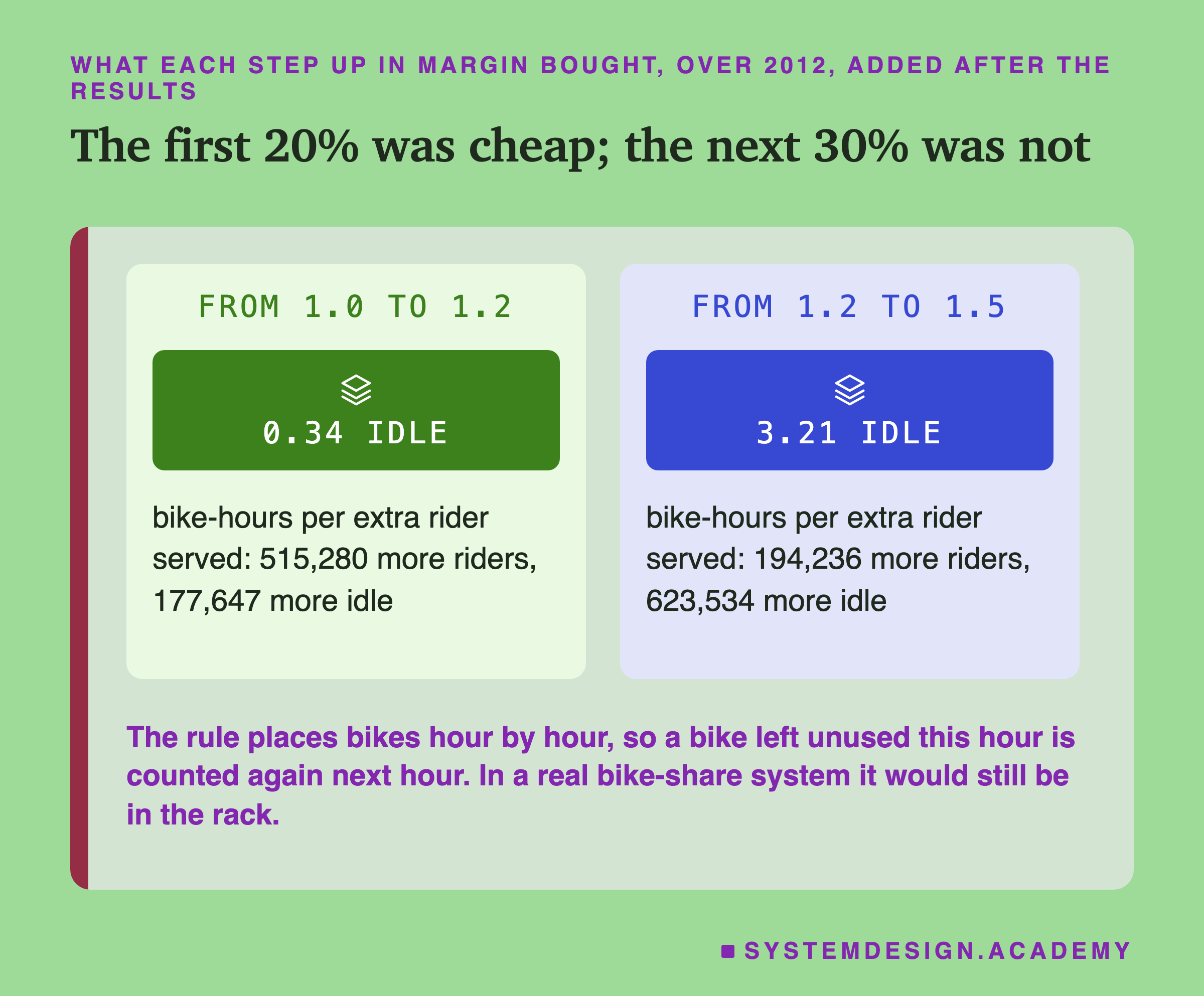
The trade is uneven. Going from no margin to 20% served 515,280 more riders for 177,647 more idle bike-hours: 0.34 idle bike-hours for each extra rider. Going from 20% to 50% served 194,236 more for 623,534 more idle: 3.21 for each extra rider, almost ten times the price. In this simulation, the first bit of margin did most of the work. Which margin is "right" depends on what an idle bike and a lost rider cost, which the lab did not measure.
The Same Shape in Other Systems
Bikes are a small example of a common shape. What follows is general knowledge about how such systems are built, not something this lab measured, and I make no claim about any particular company.
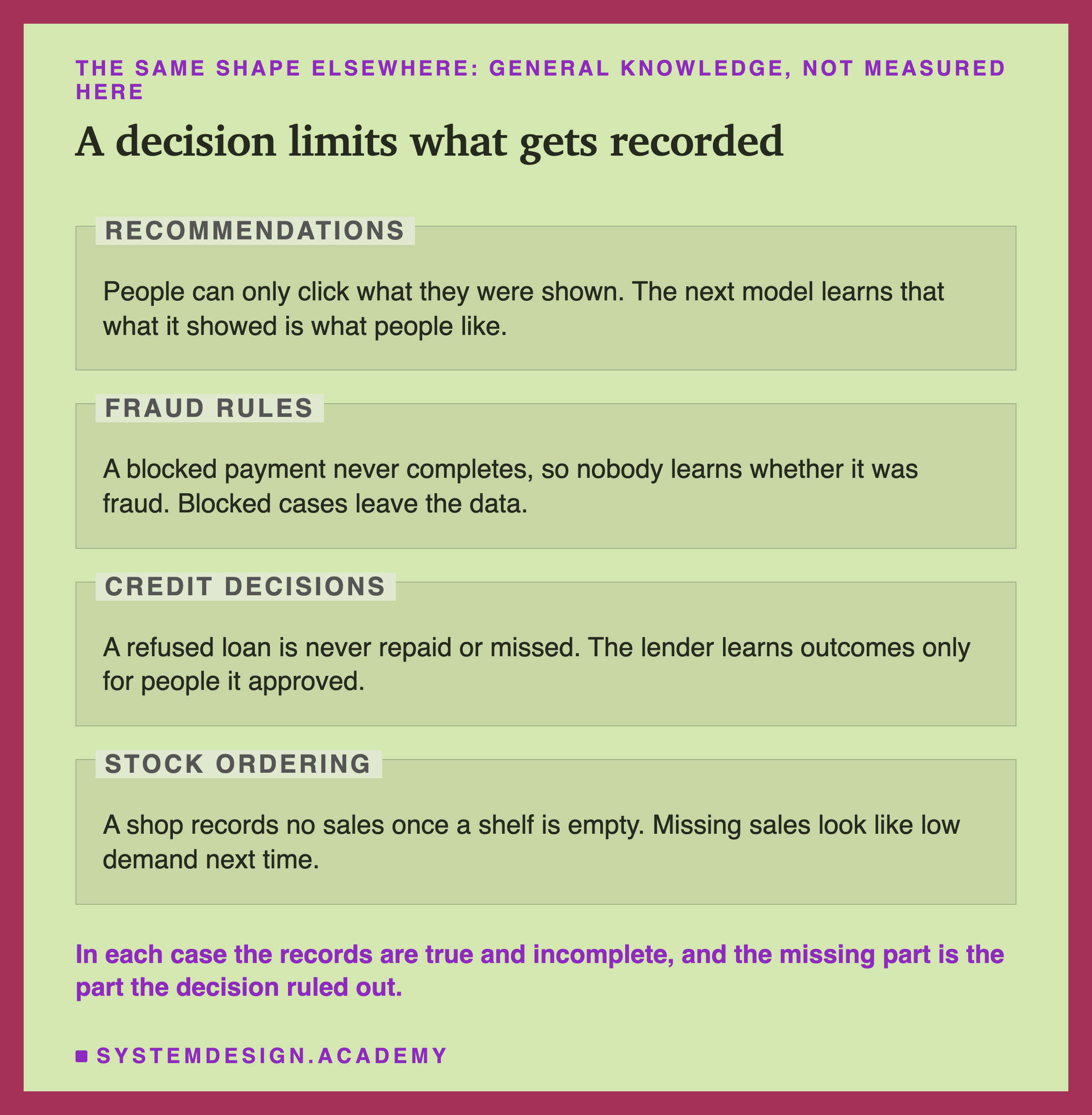
Recommendations. A shop's website or a video app shows each person a short list chosen by a model. People can only click what they were shown. The clicks are recorded, the next model is trained on them, and it learns that the things it showed are the things people like. Things it never showed never get a click, so it never learns they were good. This is the bike loop with "shown" in place of "bikes placed".
Fraud rules. A rule or model blocks payments that look risky. A blocked payment never completes, so nobody finds out whether it was really fraud. If the next model is trained only on completed payments, the cases the old rule blocked are missing, and the new model knows least about exactly the kind of payment the old one was worried about.
Credit decisions. A lender approves some loan applications and refuses others. It learns who repaid and who did not only for the people it approved. A refused applicant who would have repaid leaves no record of it. A model trained on approved loans alone learns about a narrower group of people than it will be asked about.
Stock ordering. A shop orders stock from a forecast of sales. When a shelf runs empty, sales stop, and the sales record shows a quiet afternoon rather than a busy one. The next forecast, trained on those sales, orders less. This one is the closest to the bike simulation, and it is the baker from the first slide.
In all four, every recorded number is true. What is missing is the outcome of the choice the system did not make. That is why the loop cannot be found by checking the data that exists; it has to be found by asking what data the decision prevented.
Try It Yourself
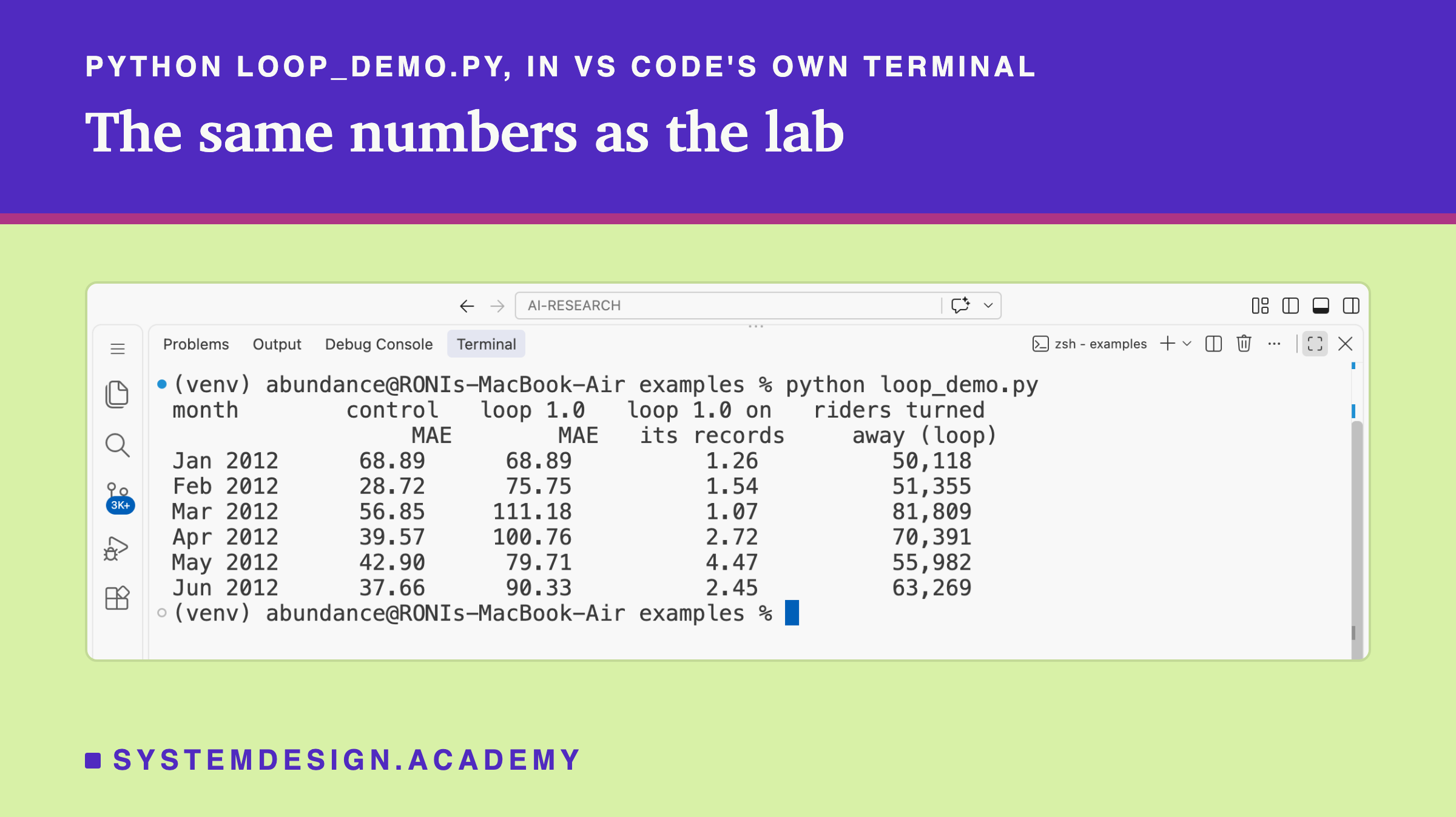
This script is the lab made small. It downloads the same data, and for January to June 2012 it runs the control and loop 1.0 side by side: it trains both, places bikes at loop 1.0's forecast, records the capped rentals, and feeds them into the next month's training. It prints both models' real error, loop 1.0's error on its own records, and the riders it turned away. It does not need a GPU.
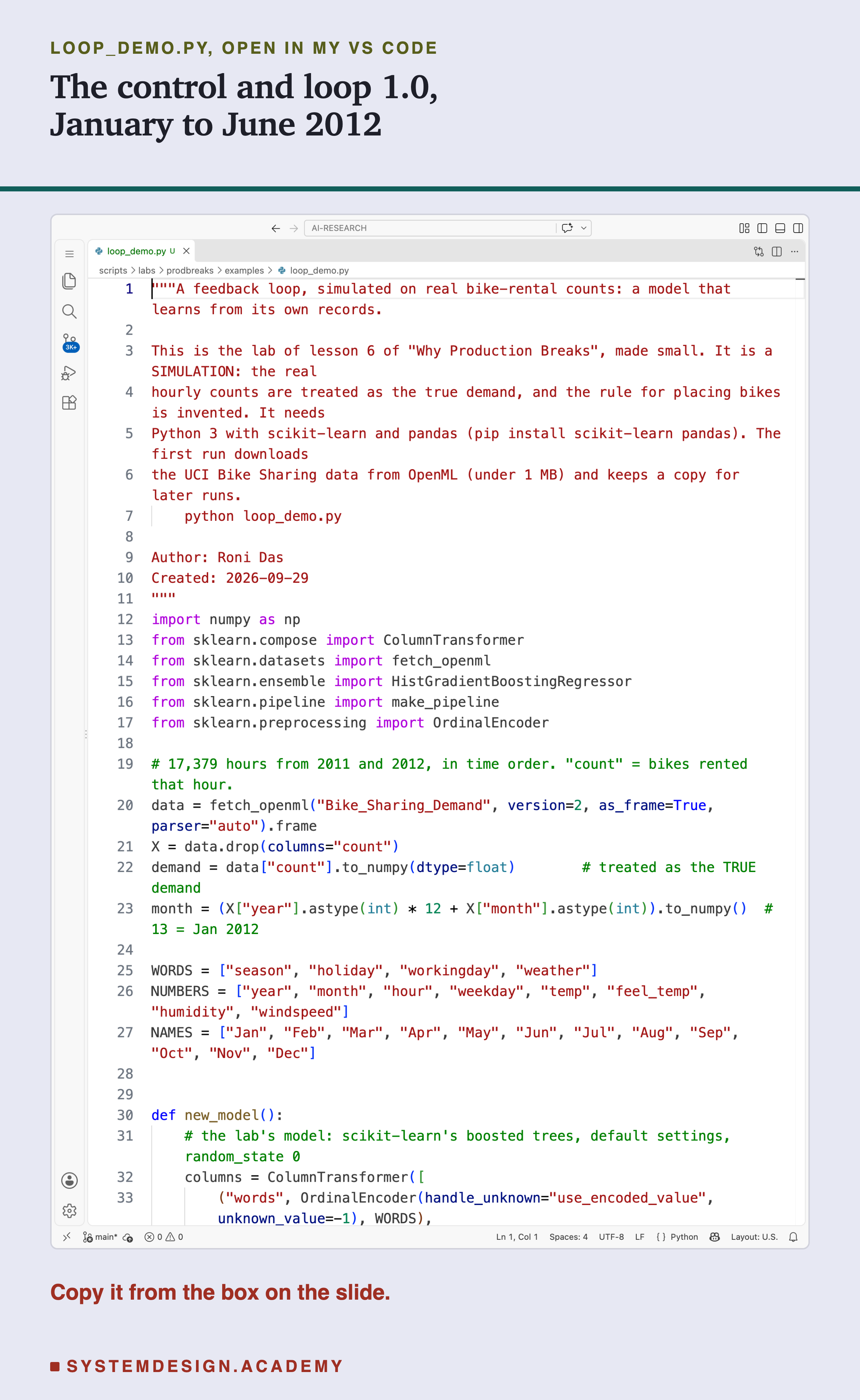
Before you run this lab. You need Python 3 and two libraries: pip install scikit-learn pandas. scikit-learn holds the model and the download, and pandas holds the table. The first run downloads the Bike Sharing data from OpenML, so it needs an internet connection once; scikit-learn keeps a copy in a folder in your home directory (scikit_learn_data) for later runs. I ran it with scikit-learn 1.9.1 on a Mac. scikit-learn runs the same way on Windows and Linux, but I have not checked the numbers there, and another version of scikit-learn may give slightly different decimals.
"""A feedback loop, simulated on real bike-rental counts: a model that learns from its own records.

This is the lab of lesson 6 of "Why Production Breaks", made small. It is a SIMULATION: the real
hourly counts are treated as the true demand, and the rule for placing bikes is invented. It needs
Python 3 with scikit-learn and pandas (pip install scikit-learn pandas). The first run downloads
the UCI Bike Sharing data from OpenML (under 1 MB) and keeps a copy for later runs.
    python loop_demo.py

Author: Roni Das
Created: 2026-09-29
"""
import numpy as np
from sklearn.compose import ColumnTransformer
from sklearn.datasets import fetch_openml
from sklearn.ensemble import HistGradientBoostingRegressor
from sklearn.pipeline import make_pipeline
from sklearn.preprocessing import OrdinalEncoder

# 17,379 hours from 2011 and 2012, in time order. "count" = bikes rented that hour.
data = fetch_openml("Bike_Sharing_Demand", version=2, as_frame=True, parser="auto").frame
X = data.drop(columns="count")
demand = data["count"].to_numpy(dtype=float)        # treated as the TRUE demand
month = (X["year"].astype(int) * 12 + X["month"].astype(int)).to_numpy()  # 13 = Jan 2012

WORDS = ["season", "holiday", "workingday", "weather"]
NUMBERS = ["year", "month", "hour", "weekday", "temp", "feel_temp", "humidity", "windspeed"]
NAMES = ["Jan", "Feb", "Mar", "Apr", "May", "Jun", "Jul", "Aug", "Sep", "Oct", "Nov", "Dec"]


def new_model():
    # the lab's model: scikit-learn's boosted trees, default settings, random_state 0
    columns = ColumnTransformer([
        ("words", OrdinalEncoder(handle_unknown="use_encoded_value", unknown_value=-1), WORDS),
        ("numbers", "passthrough", NUMBERS)])
    return make_pipeline(columns, HistGradientBoostingRegressor(random_state=0))


control = demand.copy()   # what the control model learns from: every rider
loop = demand.copy()      # what the loop learns from: 2012 rows become its own records

print("month        control   loop 1.0   loop 1.0 on   riders turned")
print("                  MAE        MAE   its records     away (loop)")
for m in range(13, 19):                                  # January to June 2012
    before, now = month < m, month == m
    c = new_model().fit(X[before], control[before]).predict(X[now])
    f = new_model().fit(X[before], loop[before]).predict(X[now])
    bikes = np.ceil(np.clip(f, 0, None) * 1.0)           # bikes placed: the forecast
    seen = np.minimum(demand[now], bikes)                # riders can only take bikes that are there
    loop[now] = seen                                     # next month, the loop learns from this
    true_c = np.abs(c - demand[now]).mean()
    true_f = np.abs(f - demand[now]).mean()
    own = np.abs(f - seen).mean()                        # the error the operator would see
    away = np.clip(demand[now] - bikes, 0, None).sum()
    print(f"{NAMES[m - 13]} 2012  {true_c:9.2f}  {true_f:9.2f}  {own:12.2f}  {away:14,.0f}")
The Lab Report
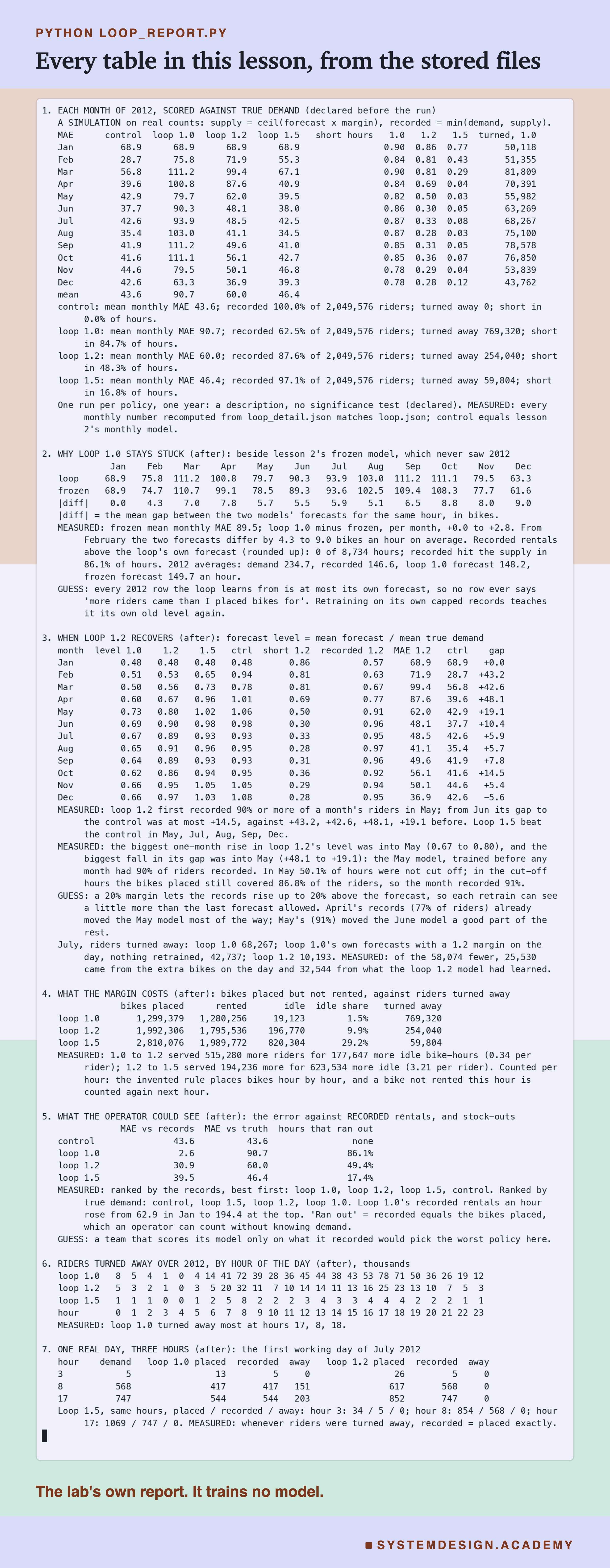
The report lives in scripts/labs/prodbreaks/loop_report.py. It reads the lab's stored file, results/loop.json, the hourly rerun in results/loop_detail.json, lesson 2's stored guesses in results/drift.json, and the Bike Sharing data itself from scikit-learn's local copy. It trains no model.
Before it prints anything, it checks the files against the data and against each other. The stored demand must be the data's 2012 counts. Every monthly MAE, signed error, share of short hours, riders turned away and rentals recorded is recomputed from the hourly file and must match loop.json (the error to 0.001, because the hourly forecasts are stored to four decimals; the counts exactly). Every recorded count must be the smaller of demand and bikes placed, and the control must equal lesson 2's monthly model. If anything differs, the report stops. Every explanation it prints starts with MEASURED or GUESS.
What came before the run, in loop_lab.py: the four policies, the rule, the monthly retraining, the error against true demand, the short hours and the riders turned away, and the statement that one run per policy allows no significance test. What came after I saw the results: the rerun, the comparison with the frozen model, the forecast level, the idle bikes and the price per rider, the error against the records and the hours that ran out, the hour-of-day view, the example day and the July split of the margin's benefit. The mode writes the numbers to , which the figures read.
Run the Loop's Numbers Yourself
This box has no model in it. It holds, for every hour of 2012, the true demand, the hour of the day, and for loops 1.0 and 1.2 the stored forecast (to two decimals) and the bikes placed, plus the lab's monthly MAE for all four policies. It runs in your browser.
As it is, the box prints loop 1.0's year month by month: the MAE against true demand (68.9 in January up to 111.2 in March and September), the MAE against its own records (1.1 to 4.5), the riders turned away, the idle bike-hours and the share of hours that ran out (80% to 92%). The report's box mode checks every month's riders turned away, idle bikes and ran-out share against the stored files, and every printed MAE against loop.json.
Try table('loop_1.2') to watch the change: the share of hours that ran out falls from 88% in January to 31% in June, and the idle bike-hours rise from 813 to 23,728. Try compare() for all four policies side by side, and by_hour('loop_1.2') for the hour-of-day view.
Then try offer. It takes one month's stored forecasts and places bikes with a different margin, without retraining anything, so it is not the loop; it shows only the cost of that month's decision. offer('loop_1.0', 1.2, 6) puts a 20% margin on loop 1.0's July forecasts: 42,740 riders turned away and 2,967 idle bike-hours. Loop 1.2 itself, whose forecasts had climbed through the loop, turned away 10,193 that July. The report does the same sum from the unrounded forecasts: of the 58,074 fewer riders turned away in July, 32,544 (a little more than half) came through what the model learned and 25,530 through the extra bikes on the day. That is one month of one run. Because offer rounds up the stored two-decimal forecasts, at a loop's own margin it can differ from the lab's count by a few riders: at most 5 in a month, which the report measures.
The Code, Part by Part
Loading. fetch_openml("Bike_Sharing_Demand", version=2, as_frame=True) downloads the data (or reads the local copy). demand holds the real hourly counts, which the simulation treats as the true demand. The line month = X["year"].astype(int) * 12 + X["month"].astype(int) numbers the months 1 to 24, so January 2012 is 13.
The model. new_model() is the pipeline from the earlier lessons: an OrdinalEncoder turns the four word columns (season, holiday, working day, weather) into number codes, the eight number columns pass through, and HistGradientBoostingRegressor(random_state=0) is the boosted trees.
Two copies of the answers. control and loop both start as copies of the true demand. The control's copy is never changed. The loop's copy gets its 2012 rows replaced, month by month, with what the loop recorded. That one difference is the whole experiment.
The month. For each month from January to June 2012, both models are trained on every earlier row of their own copy and forecast the month. bikes = np.ceil(np.clip(f, 0, None) * 1.0) places bikes at the forecast, rounded up and never below zero; change 1.0 to 1.2 to add a margin. seen = np.minimum(demand[now], bikes) is the censoring: riders can only take bikes that are there. writes the records into the loop's copy, so the next month's model learns from them.
How to Run a Model Whose Decisions Shape Its Data
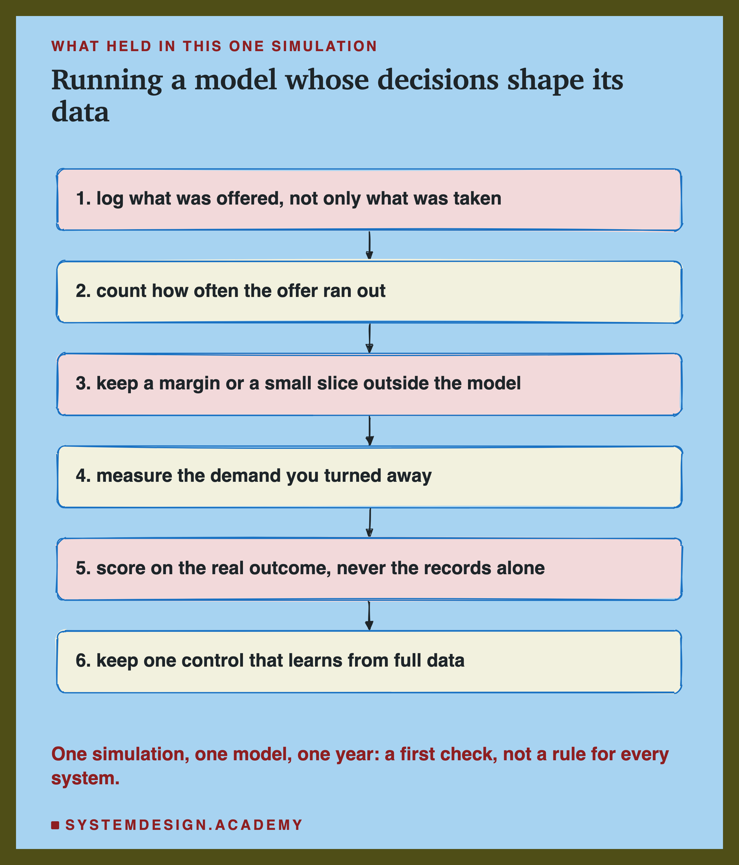
Log what was offered, not only what was taken. Write down the bikes placed, the items shown, the payments allowed, the stock ordered. Without the offer, a record of 417 rentals cannot be told apart from a quiet hour. With it, you can see that 417 were placed and 417 went.
Count how often the offer ran out. The share of hours when every bike went needs no knowledge of demand. Here it was 86.1% for the loop with no margin. If most of your records sit exactly at the limit your own decision set, your data is censored most of the time.
Keep a margin or a small slice outside the model. Some supply above the forecast, or a small random share of decisions made without the model, keeps some records uncut. Here a 20% margin took the yearly error from 90.7 to 60.0.
Measure the demand you turned away, where you can. Some systems can: a rider who opens the app and sees no bike, a search that found nothing in stock, a queue that grew. Those are signs of the riders who left, and they are worth logging even when they are rough.
Score on the real outcome, never on the records alone. An error computed against censored records can look perfect: 2.6 here, against 90.7 on the truth.
Keep one control that learns from full data. Where you can get the full outcome for a slice (a random sample of decisions made generously, or a region where supply is never short), train or score a model on it too. If the two drift apart, the loop is doing it.
When a Margin or Exploration Helps, and When It Does Not
Use a margin or exploration when the model's decision limits what gets recorded. Supply set by a forecast, items shown by a ranking, applications approved by a score. Here, without a margin, the model learned almost nothing the frozen model did not already know (0.0 to 2.8 bikes an hour worse each month).
Use it early, when the model is most likely to be wrong. A new model, a new market, a change in the world. Here every policy started at half of 2012's demand, and in this run, as far as I can tell, the margin was what let loop 1.2 close most of the gap by June.
Use a small amount first. In this simulation, going from no margin to 20% cost 0.34 idle bike-hours per extra rider served, and going from 20% to 50% cost 3.21. The first step bought the most.
You do not need it when the decision does not limit the record. If every rider is counted whether or not a bike was there (for example, because riders book ahead and every booking is logged), the records hold the full demand and the model can learn it directly, as the control did.
You do not need it when you already log the demand you turned away. If the lost riders are counted, the censoring can be undone in the data, and the model can learn from demand rather than from records.
Do not judge a margin by the idle cost alone. Loop 1.0 had the lowest idle share, 1.5%, and the worst error and the most riders turned away. Low waste can be the sign of a loop that stopped learning.
What These Numbers Can and Cannot Tell You
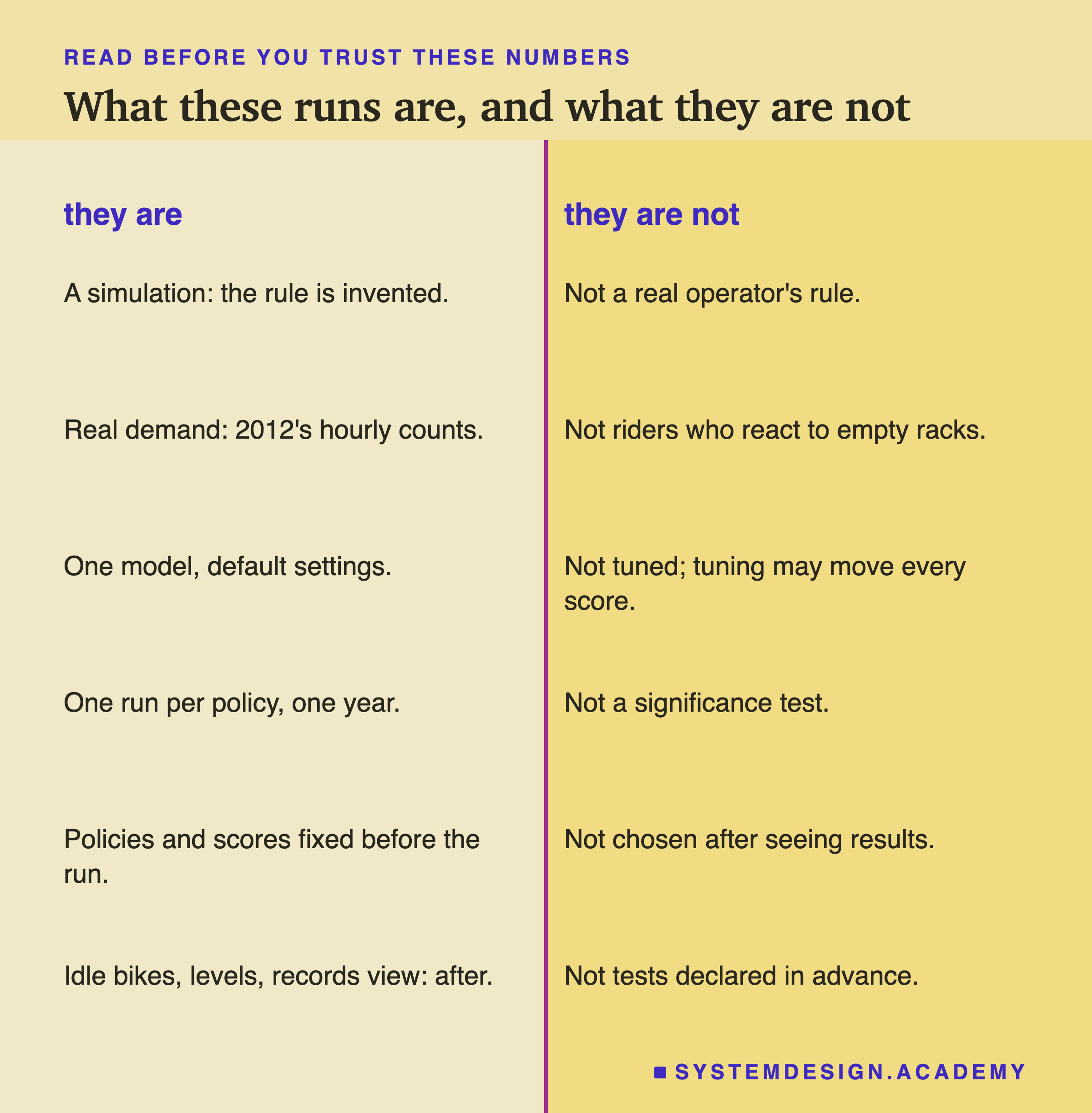
It is a simulation. The real hourly counts are the demand, and the rule for placing bikes is mine. A real bike-share system moves bikes between stations, keeps unused bikes in the rack, and has riders who walk to the next station. None of that is here. The numbers describe what this rule does to this model on this demand.
The demand does not react. In the simulation, a rider turned away at 8 in the morning does not come back at 9, and does not give up on bike-share next week. Real riders might. That could make a real loop worse (demand shrinks to match the supply) or milder (riders wait), and the lab cannot say which.
One model, default settings, one run per policy, one year. The boosted trees of the earlier lessons, not tuned, each policy run once. The design declared no significance test, so 90.7, 60.0 and 46.4 describe this run. A different model, or a different start, might climb faster or slower.
The design was declared; the reading was not. The four policies, the rule and the scores were written in loop_lab.py before the run. The hourly rerun, the comparison with the frozen model, the forecast level, the idle bikes, the error against the records, the hours that ran out and the example day were chosen after I saw the results.
The reasons are partly guesses. That loop 1.0's records never exceeded its forecast is measured, and so is how close it stayed to the frozen model. That this is why it stayed stuck is my explanation. The chain of numbers for loop 1.2 in spring is measured; the claim that one caused the next is my reading. Why loop 1.5 beat the control in five months, I do not know.
The real-world examples are general knowledge. Recommendations, fraud rules, credit and stock ordering share the shape of this loop; none of them was measured here.
What to Do Next
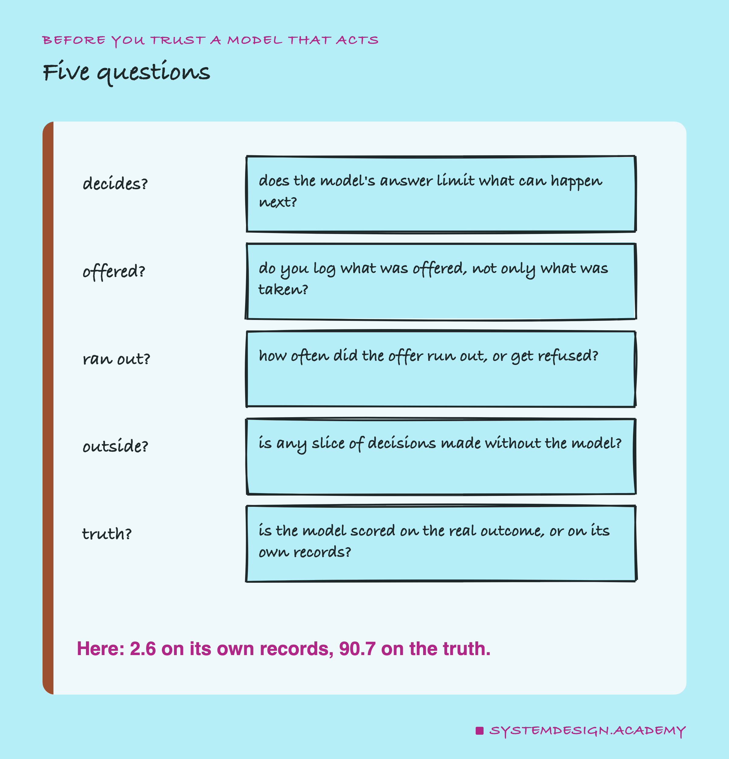
Take a model that you or your team runs, and ask the first question: does its answer limit what can happen next? If it only predicts, and nothing is decided from the prediction, the loop does not exist. If it sets stock, ranks a list, approves or refuses, or places anything, the loop may exist, and the rest of the questions matter.
Then look at what is logged. If you find only what was taken (rentals, clicks, completed payments), add what was offered (bikes placed, items shown, payments blocked). With both, you can count how often the offer ran out, which is the one number here that an operator could see and that pointed straight at the problem.
The next lesson in this chapter wraps it up: a production readiness check, run against everything the chapter broke, from the flattering test split in lesson 1 to the loop in this one.
Knowledge Check
Knowledge Check
4 questions - Score 80% to pass
Loop 1.0 missed true demand by 90.7 bikes an hour. Why did its error on its own records look so small, only 2.6?
Why did retraining every month not help loop 1.0 catch up?
Which number could a real operator see, without knowing demand, that pointed at the censoring?
What did going from a 20% to a 50% margin cost in this simulation?