Watching the Sky Instead of the Sales
Imagine a woman who owns three coffee carts in a city. Staff run the carts, and the sales figures go to a bookkeeper, who sends her the accounts once a month. Every week she orders milk and cups for each cart. To decide how much, she uses a notebook from last year that says how much sold on cold mornings, warm mornings and rainy ones.
She cannot see this month's sales until the accounts arrive, so she watches what she can see: the weather. Each morning she compares it with the same week of last year. This spring it looks almost the same as last spring, so she feels safe and orders what the notebook says.
The accounts arrive at the end of May, and they are a shock. The carts sold far more than last year, and ran out of cups on most afternoons. A new tram line had opened, and it stopped next to two of her carts. Nothing about the weather could have told her that. The weather was fine. The customers had changed.
Two more things are worth noticing. One morning in June she compared the week's weather with her whole notebook, all twelve months, and it looked alarming: only warm days, no cold ones. Of course. It was June. And what would have warned her early was not the sky. It was a phone call to one cart at closing time, on a few days, asking how many cups were sold. This lesson measures all three of those ideas on the chapter's bike-rental data.
Where This Lesson Starts
This is the fifth lesson of the chapter, and it uses the same public data and the same kind of program as the first four: two years of hourly bike rentals from Washington, D.C., and a program that guesses how many bikes will be rented in an hour. Lesson 2 trained that program on 2011 and scored it month by month through 2012. The version that was never updated missed by 89.5 rentals an hour over the year, almost always too low, because many more people rented bikes in 2012. Lesson 2 ended with a rule: the error on the newest month whose real answers have arrived is the number to decide on.
Lesson 4 looked at the time before the real answers arrive and tested simple checks on the inputs. One of them, a measure of how far the mix of weather values had moved (it is called psi, and the words slide explains it), fired on every clean day. Its follow-up found why: a day is too small a batch, and one day's weather against a year and a half of training always looks different.
This lesson asks the question psi is really built for. Take whole months, big enough batches, and measure how far the inputs moved. Does that rise and fall with the real error, so that it could warn about the error until the answers arrive?
Eight Words for This Lesson
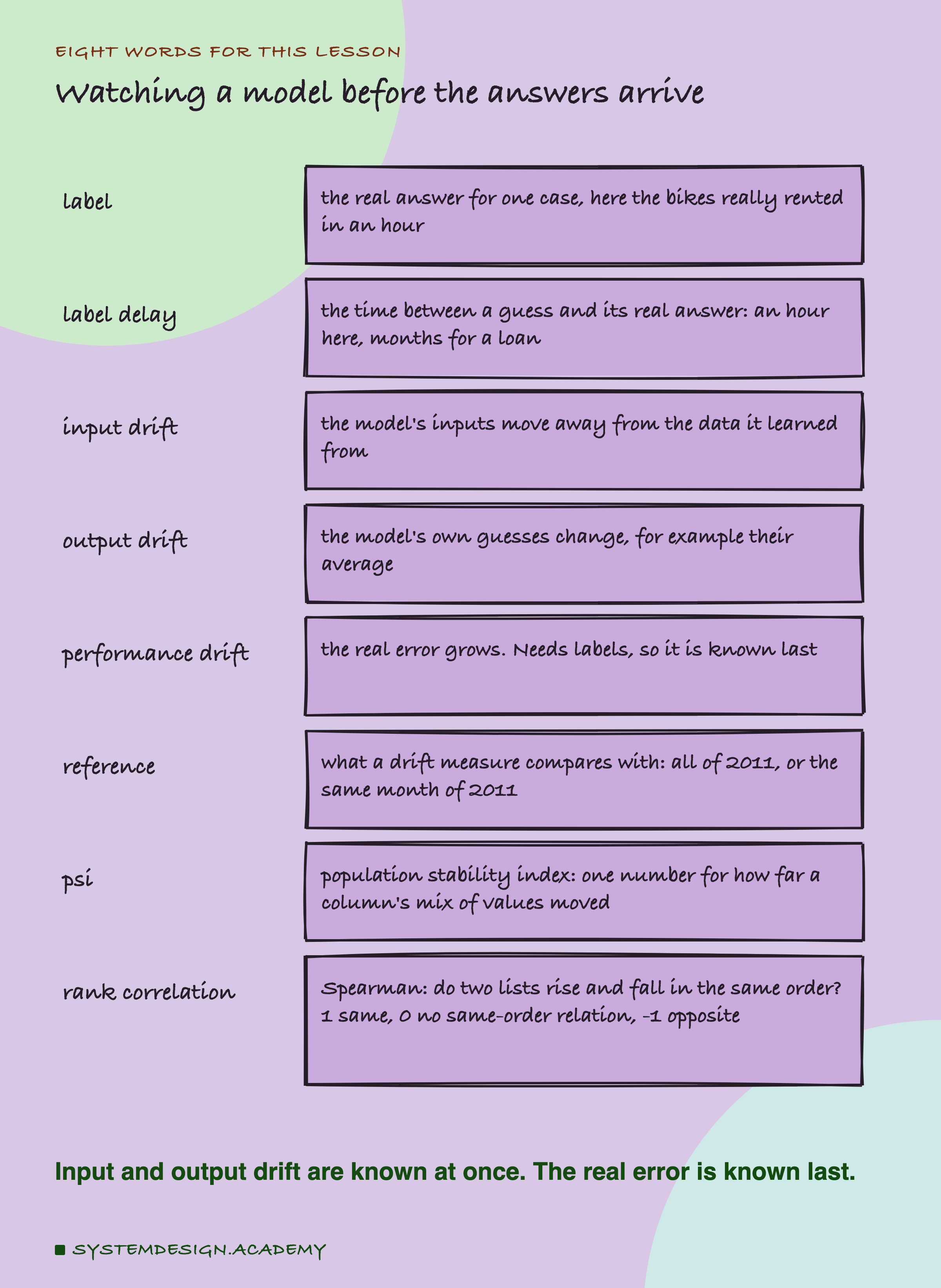
A label is the real answer for one case: here, the number of bikes really rented in an hour. The label delay is the time between a guess and its label. For bikes it is one hour. For a loan, whether it is repaid can take years; for a fraud check, a customer may dispute a payment weeks later. When labels are late, teams watch other things in the meantime.
Drift means something moving away from what the model learned from. It comes in three places. Input drift is the model's inputs moving: this month's weather is not like the training weather. Output drift is any change in the model's own guesses, for example their average rising or falling. Performance drift is the real error growing, and it needs labels, so it is known last.
Every drift measure compares today with a reference: here, either all of 2011 or only the same month of 2011. psi, from lesson 4, is one number for how far the mix of values in a column moved. Last, a rank correlation (the kind called Spearman) says whether two lists rise and fall in the same order: 1 means exactly the same order, 0 means no same-order relation, and -1 means the opposite order.
Three Kinds of Drift, and When Each One Speaks
The three kinds of drift sit in three different places, and they become known at three different times.
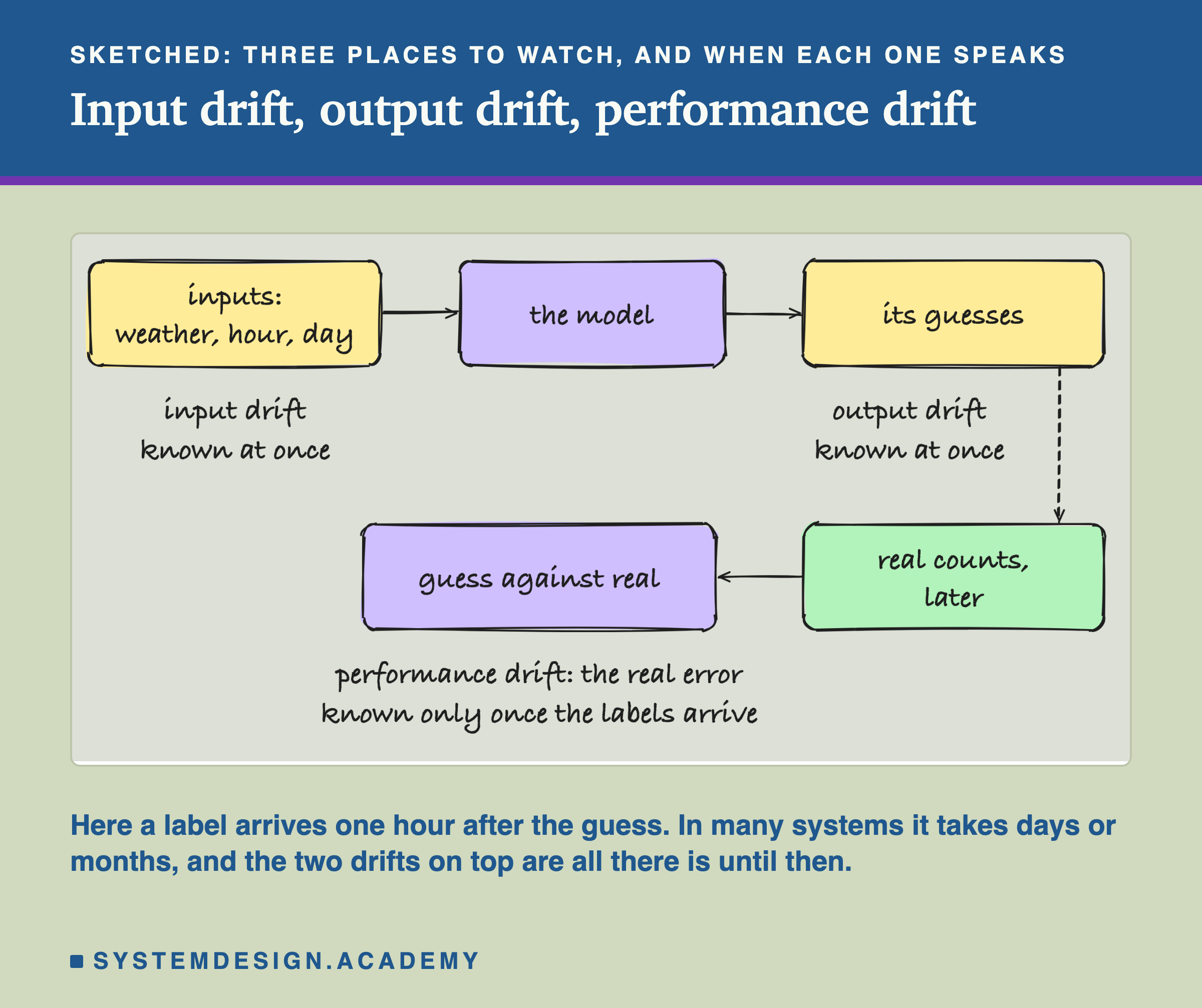
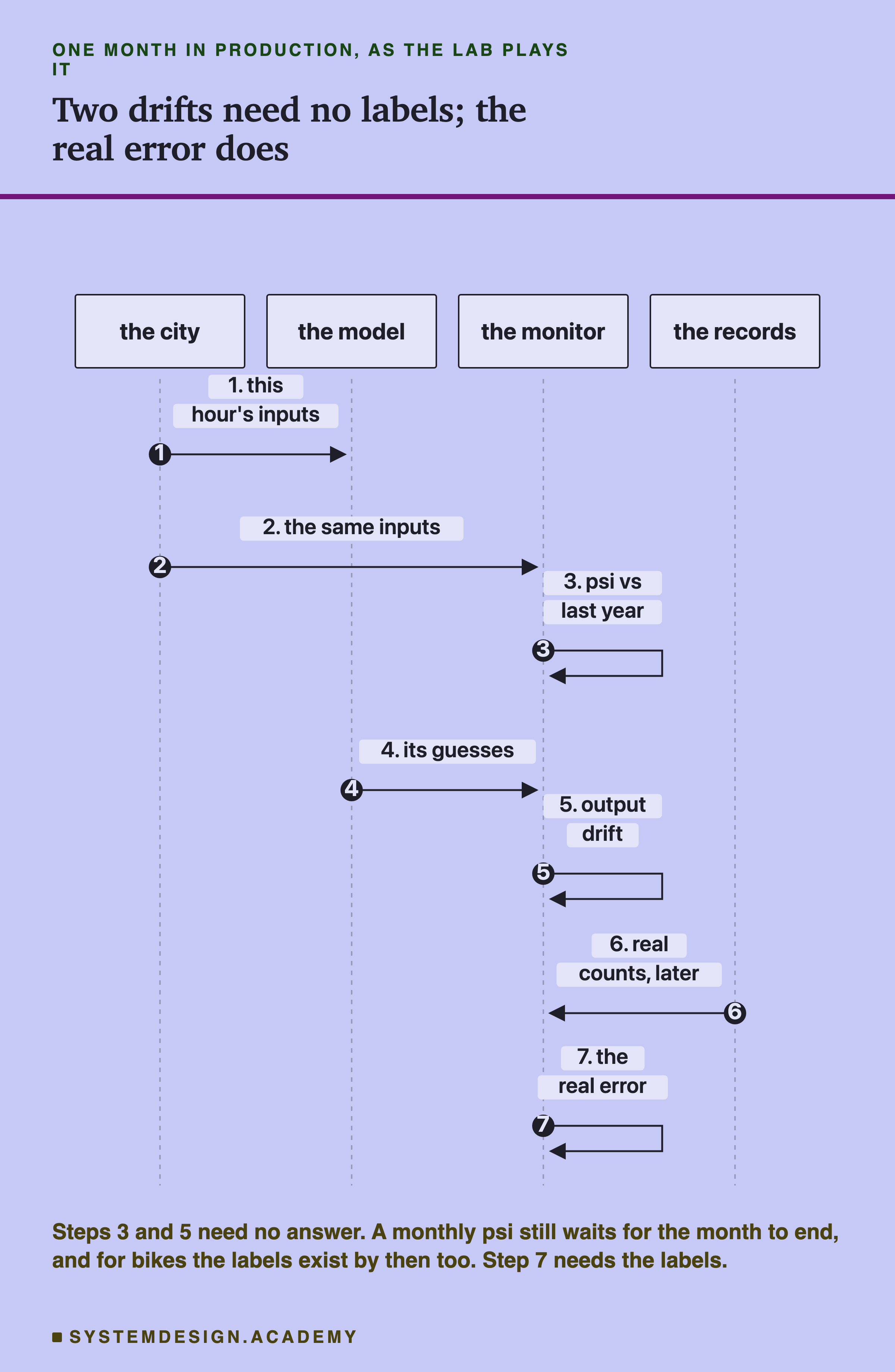
Input drift can be measured without any labels: you have this hour's weather, you have last year's, and you can compare them. Output drift needs no labels either, because the model answers at once. Performance drift needs the labels. Until they arrive, nobody knows the real error. One catch: a measure over a whole month, like the ones in this lab, still has to wait for the month to end, and for bikes the labels exist by then too. The early warning is real only when labels take much longer than the batch you measure.
That timing is the whole reason teams watch inputs. If input drift always rose when the real error rose, you would have an early warning for free. But the three can come apart, and it helps to see why before looking at any numbers. The inputs describe what the model is asked about. The error depends on the answer too. If the answers change while the inputs stay the same (more riders on days with the same weather), the error grows and the inputs say nothing. And if the inputs change in a way the model already knows how to handle (a warm month, which it has seen before), the inputs move a lot and the error need not move at all.
You will also meet two older names for the same ideas. Many guides call a change in the inputs , and a change in how the inputs relate to the answer : the same weather, hour and day now bring a different number of riders. With the year column set aside (the frozen model could not use it), concept drift is what happened in 2012. The same kind of hour brought more riders than it did a year before. Data drift can be measured from inputs alone. Concept drift, by its definition, needs the answers.
What the Lab Ran
I wrote the design at the top of the lab file, watch_lab.py, before I ran it, and the chapter plan, CHAPTER-PLAN.md, records it the same day ("WATCH LAB (batch 5) designed before running").
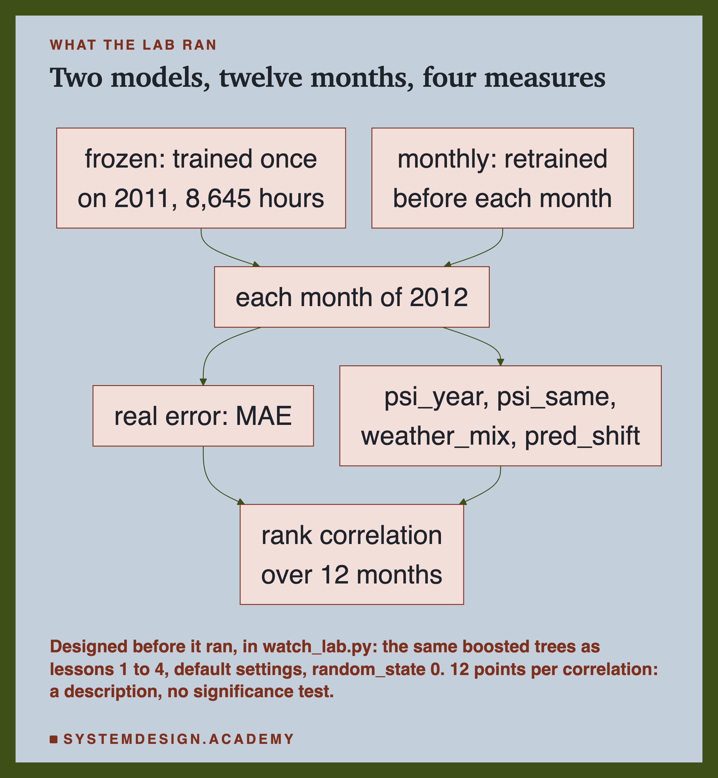
The two models are lesson 2's, and both are scikit-learn's boosted trees (HistGradientBoostingRegressor, default settings, random_state=0): many small decision trees, each asking yes-or-no questions about the inputs and each correcting the ones before. The frozen model was trained once on all of 2011, 8,645 hours, and never again. The monthly model was retrained before each month of 2012 on every hour before that month. Each month's real error, the MAE (mean absolute error: the average size of the miss, in rentals an hour), was computed again here the same way as in lesson 2, and the report checks it matches lesson 2's stored number exactly.
The four drift measures, fixed before the run, are explained on the next slide. For each one, the lab computed the rank correlation with the monthly MAE across the 12 months, once for each model.
What the design said about the result. A significance test is a calculation of how likely a pattern this strong would be by luck alone. Twelve points are far too few for one. So the design declared, in writing, that the lesson would describe the pattern and nothing more. Everything after the headline, from the weather comparison to the labelled hours, was chosen after I saw the results, and each figure says so.
Four Ways to Say the Inputs Moved
Each measure compares one month of 2012 with 2011.
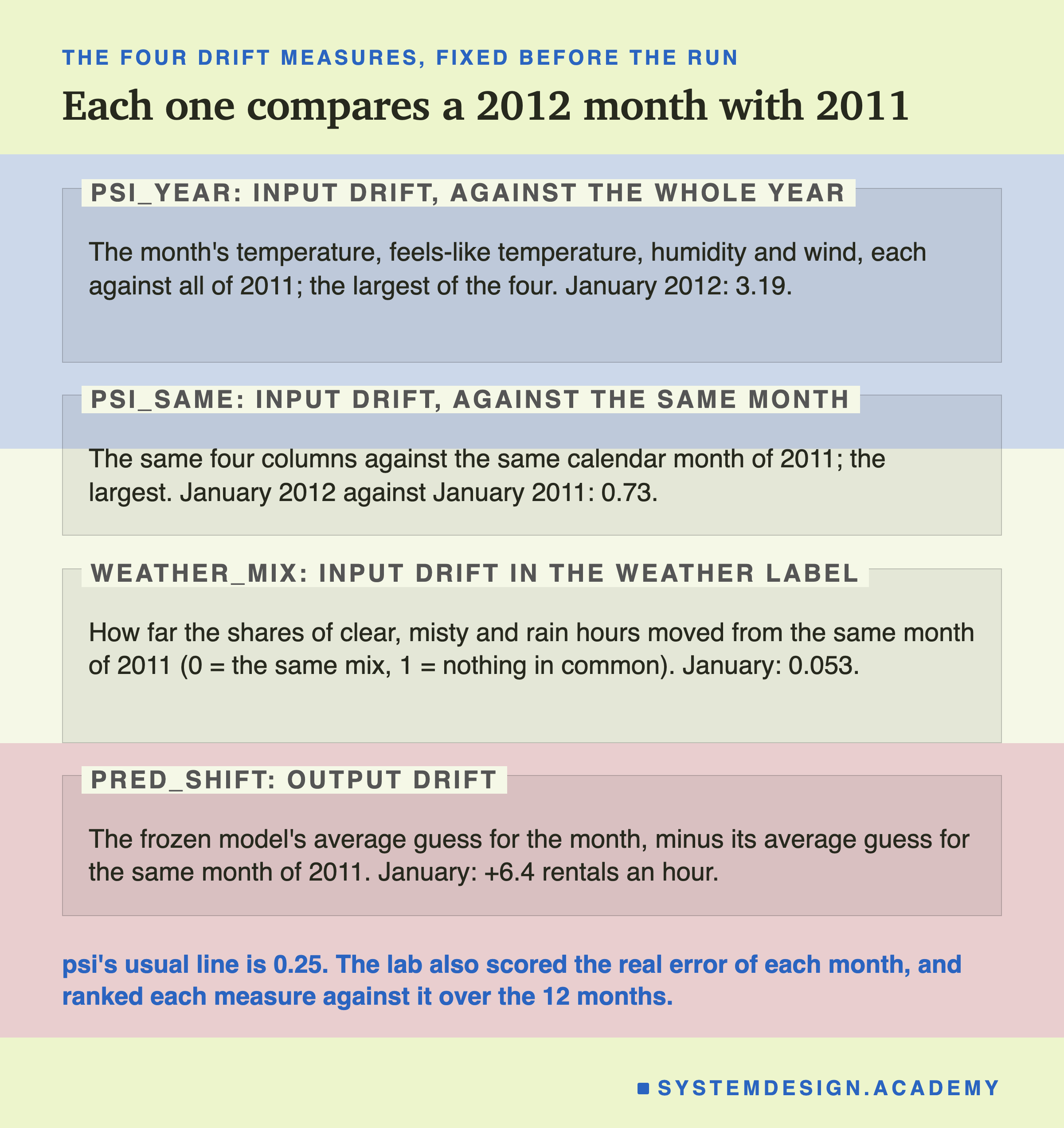
psi_year is psi as most monitoring guides use it: the month's values of the four weather numbers (temperature, "feels like" temperature, humidity and wind speed) against all of 2011, the model's whole training year. Each column is cut into ten bands, each holding a tenth of 2011's hours, and psi adds up how far the share of hours in each band moved. The measure keeps the largest of the four columns. psi_same does the same against only the same calendar month of 2011: January 2012 against January 2011, using the same ten bands, cut from all of 2011. That is the fix lesson 4 tried for single days.
weather_mix looks at the weather label instead (clear, misty, rain). It is the share of hours that would have to change label to make the month's mix match the same month of 2011: 0 means the same mix, 1 means nothing in common.
pred_shift is the one measure of output drift. It is the frozen model's average guess for the month, minus its average guess for the same month of 2011. It needs no labels: both are the model's own guesses.
psi's usual line is 0.25, a rule of thumb from lesson 4: a simple figure people use because it often works, not one worked out for this data. A measure that could warn about the error should be high in the months where the error is high and low where it is low. The rank correlation measures exactly that.
No Measure Moved in Step With the Error
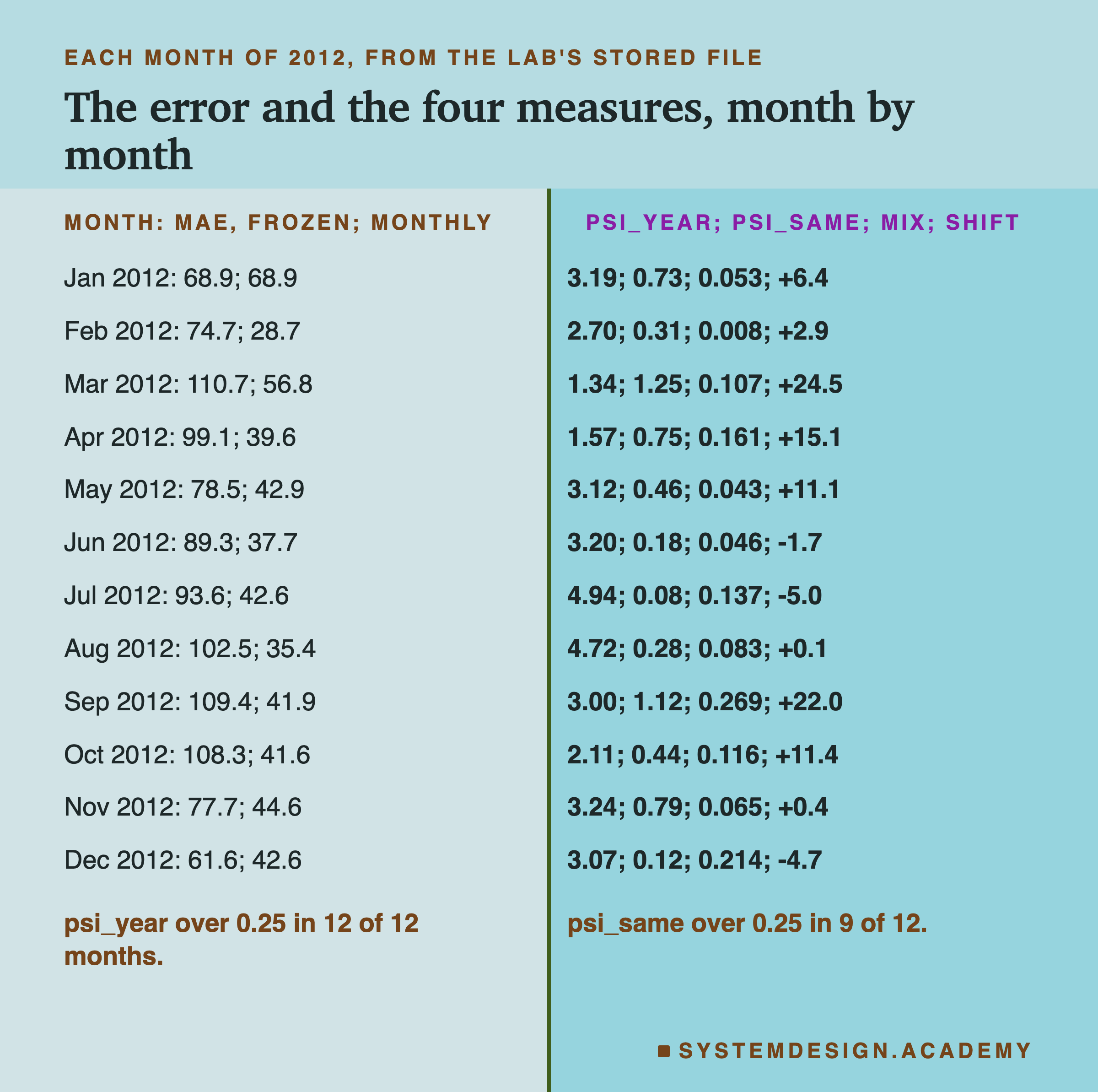
Here is the headline, from the lab's stored file, results/watch.json.
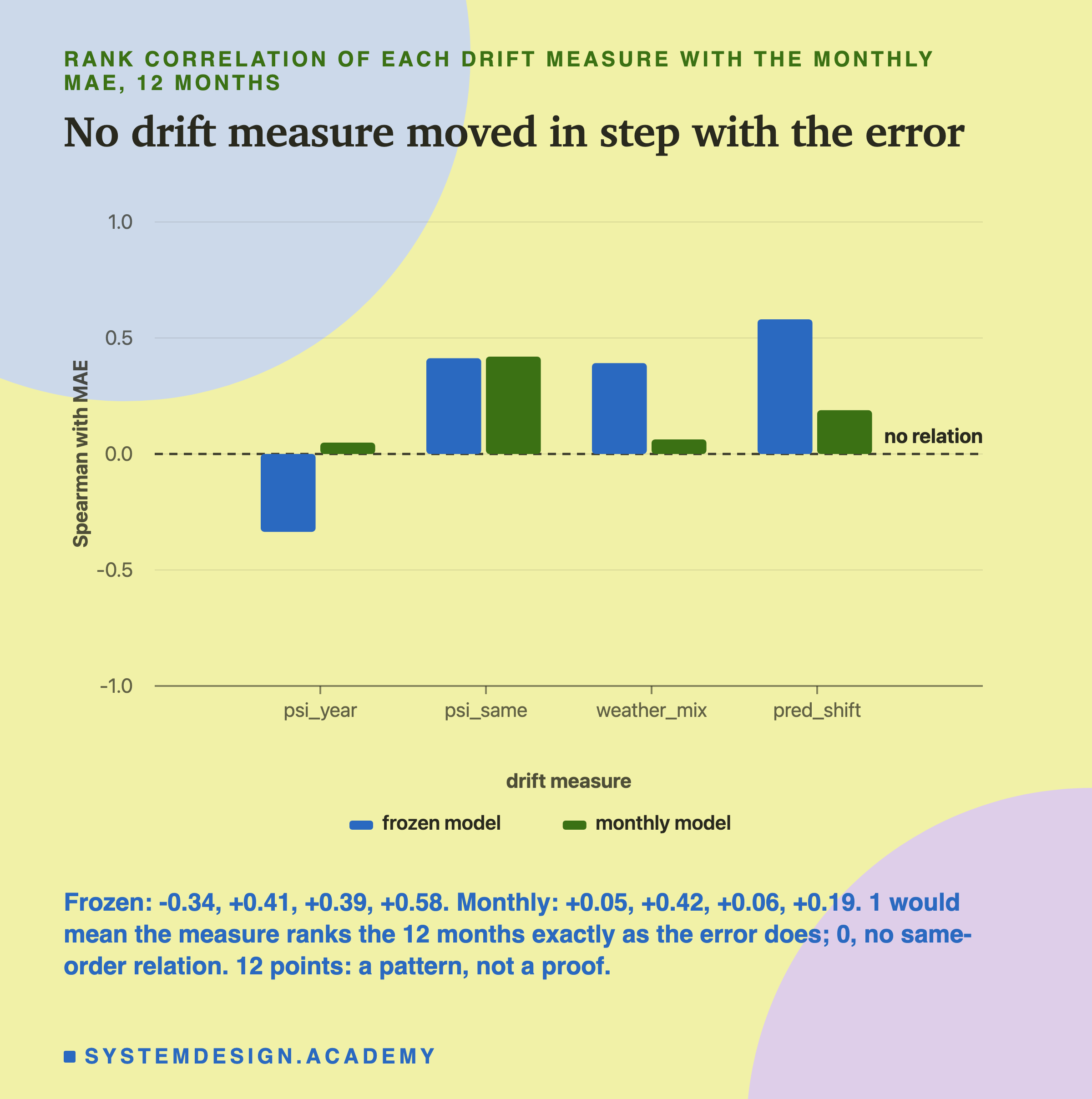
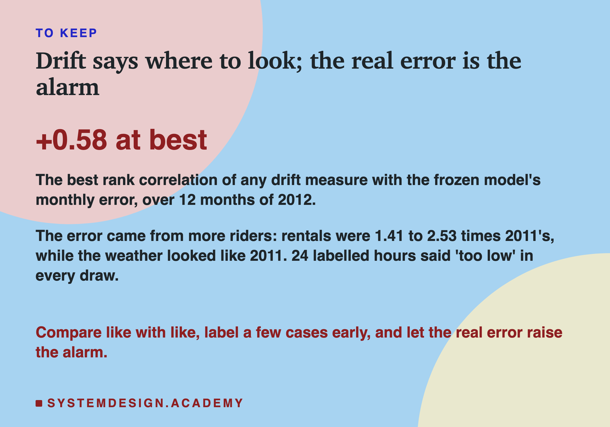
For the frozen model, the rank correlations with its monthly MAE were -0.34 for psi_year, 0.41 for psi_same, 0.39 for weather_mix and 0.58 for pred_shift. For the monthly model they were 0.05, 0.42, 0.06 and 0.19. A measure that could take the error's place would sit near 1. None came close. The usual psi, psi_year, even ran slightly the wrong way for the frozen model: its months with the highest psi tended to be months with a lower error.
A rank correlation is easier to feel with the months themselves. The three months with the frozen model's largest errors were March (110.7), September (109.4) and October (108.3). The three months with the largest pred_shift were March, September and April: two of the three match. For psi_same the top three were March, September and November: again two of three. For psi_year the top three were July, August and November: none of the three. For weather_mix they were September, December and April: one. So pred_shift and psi_same did pick out the two worst months, and missed others; psi_year pointed at the hottest summer months, which were not the worst. I read this table after the results; the design only asked for the correlations.
I use a rank correlation rather than the ordinary kind on purpose, and the design fixed it before the run. It asks only about order: is the month with the third-highest drift also the month with the third-highest error? One extreme month cannot dominate it, and it does not care whether psi and the MAE are on the same scale, which they are not.
These are 12 points each, and the design declared that no significance test could be run on 12 points. So I read them as a description of this year only. With 12 points, a correlation of 0.4 or 0.6 can appear from a pattern that is not really there; what the numbers can say is that no measure tracked the error closely here.
psi_year Measures the Season
psi_year was far over the line every month. Before calling that drift, I asked (after the results) what it would say about months that certainly had not drifted: the 2011 months the frozen model learned from, each scored against 2011 as a whole.
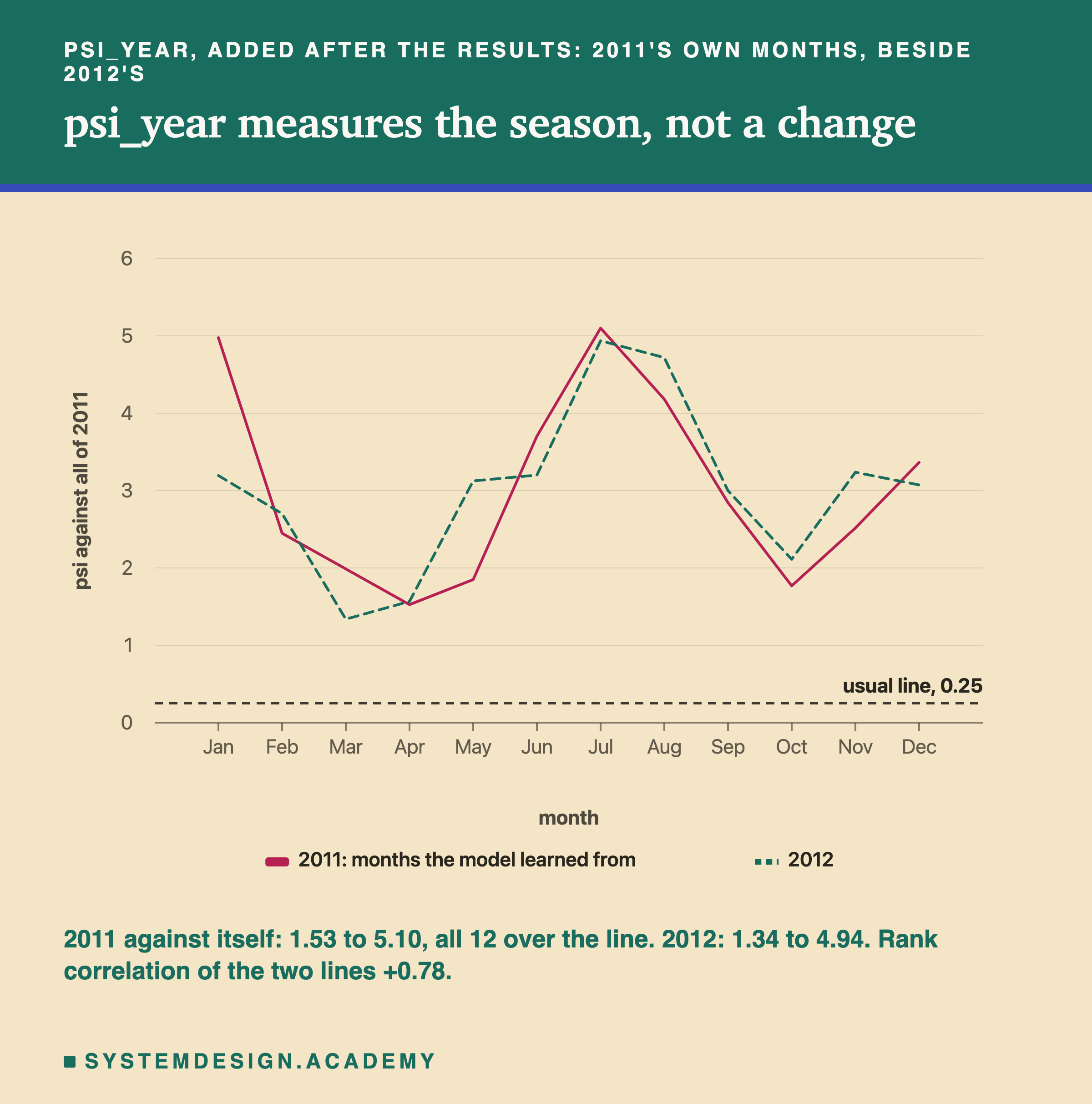
They scored just as high. 2011's own months ran from 1.53 to 5.10, all 12 over the line, and they rise and fall with 2012's months in almost the same order: the rank correlation between the two lines is 0.78. July is the highest in both years and April or March the lowest. The column that scores highest is always the temperature or the "feels like" temperature. And psi_year has a rank correlation of 0.81 with how far the month's average temperature sits from 2011's yearly average of 20.1 C. So psi_year mostly measures how far a month is from an average day of the year: the season. A July is hot compared with a whole year. That is not a change in the world.
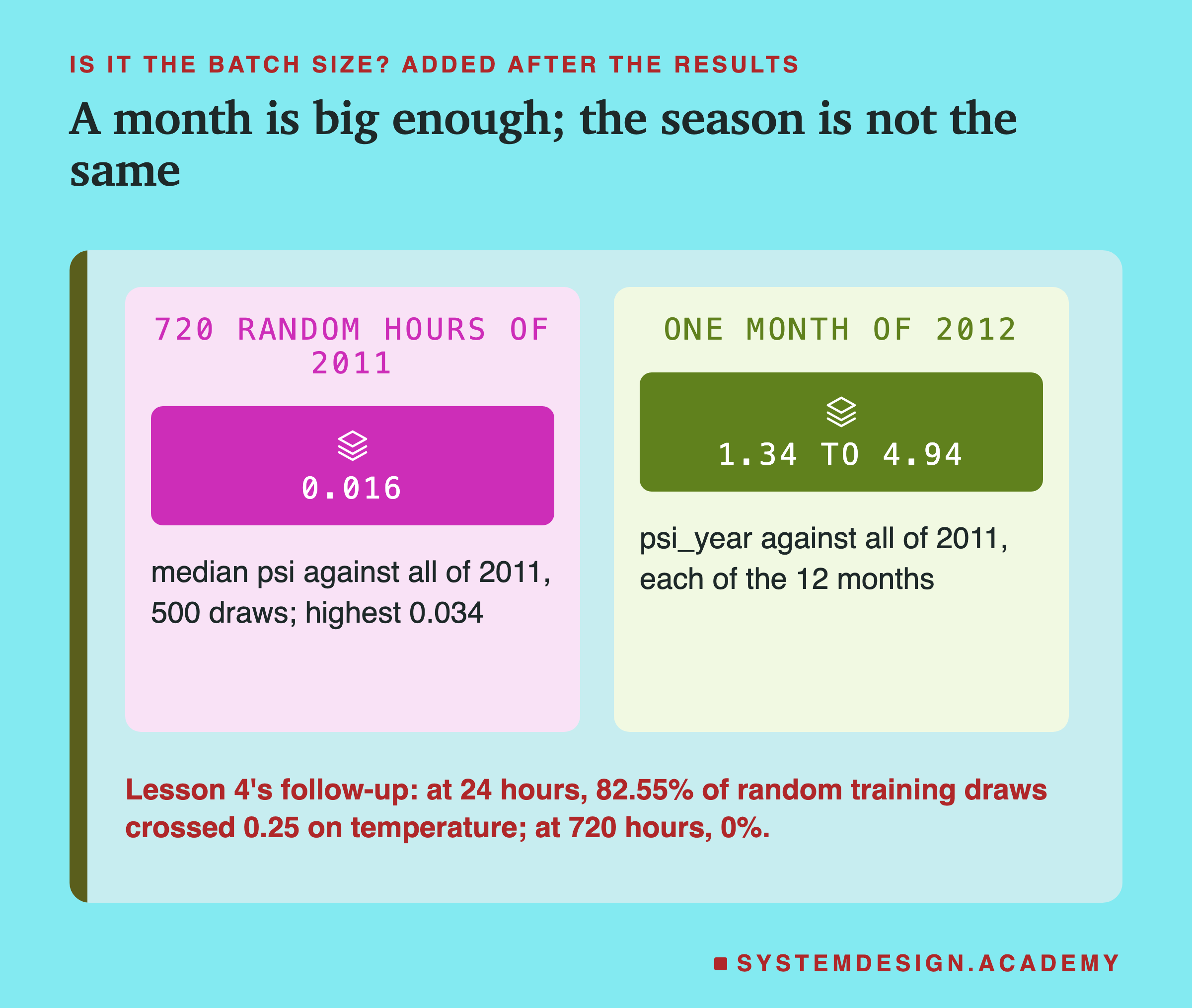
Could the batch size explain it, as it did in lesson 4? That follow-up found that at 24 hours, random draws from the training hours themselves crossed 0.25 on temperature 82.55% of the time, and at 720 hours never. I checked the same here, after the results: 500 random draws of 720 hours from 2011, each against all of 2011, with a fixed seed (a starting number for the random choices, so a rerun picks the same hours). The median psi (the middle value when all 500 are lined up) was 0.016, and the highest 0.034. A month is big enough. The 1.34 to 4.94 is not noise from a small batch; it is the season, measured correctly against the wrong reference.
Over the Year, the Weather Looked Like 2011. The Riders Did Not.
If the inputs did not explain the frozen model's error, what did? I compared the same month in both years (after the results).
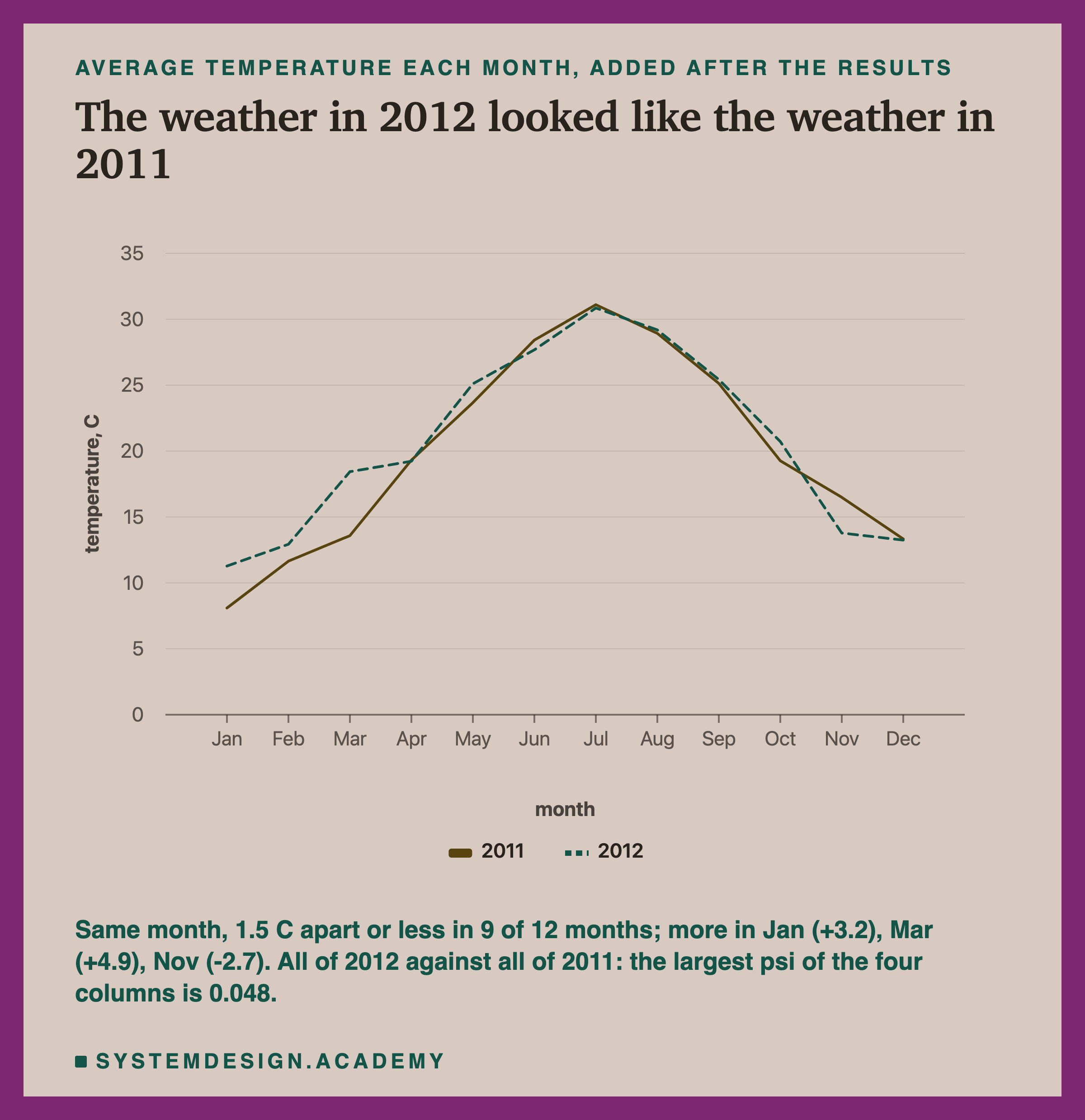
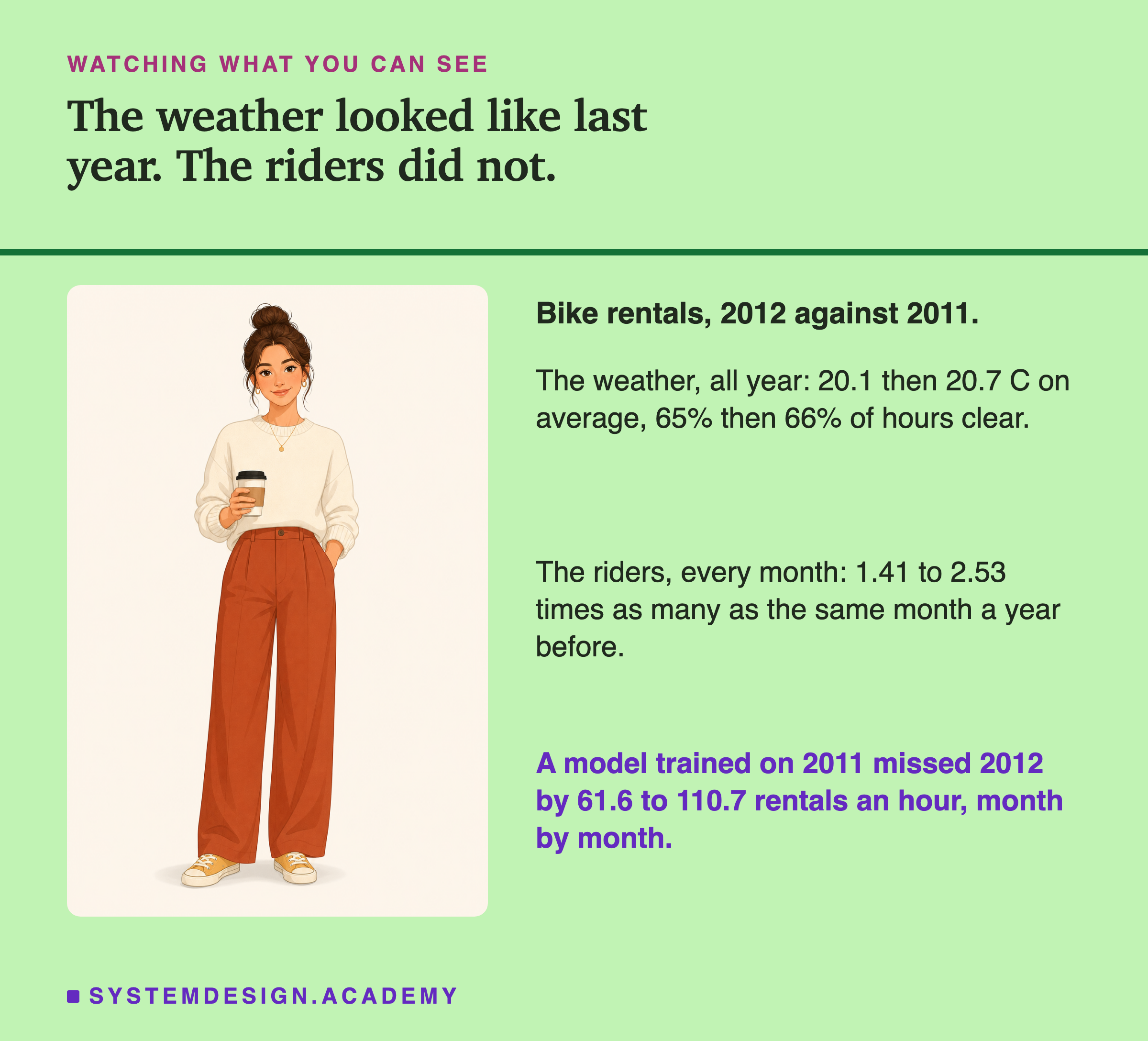
Over the whole year, the weather of 2012 looked very much like 2011's. Month by month it moved more. The average temperature of the same month differed by 1.5 C or less in 9 of 12 months. March 2012 was warmer, by 4.9 C, and January by 3.2; November was colder by 2.7. Over the whole year, 2011 averaged 20.1 C and 2012 20.7; 65% of 2011's hours were labelled clear and 66% of 2012's. All of 2012 against all of 2011 gives a psi of at most 0.048 in any column, far under the line. Single months differed more: psi_same crossed 0.25 in 9 of 12 months, and the weather label moved most in September (0.269) and December (0.214, clear hours falling from 67% to 45%). So the fair summary is: similar on yearly averages, not identical month by month.
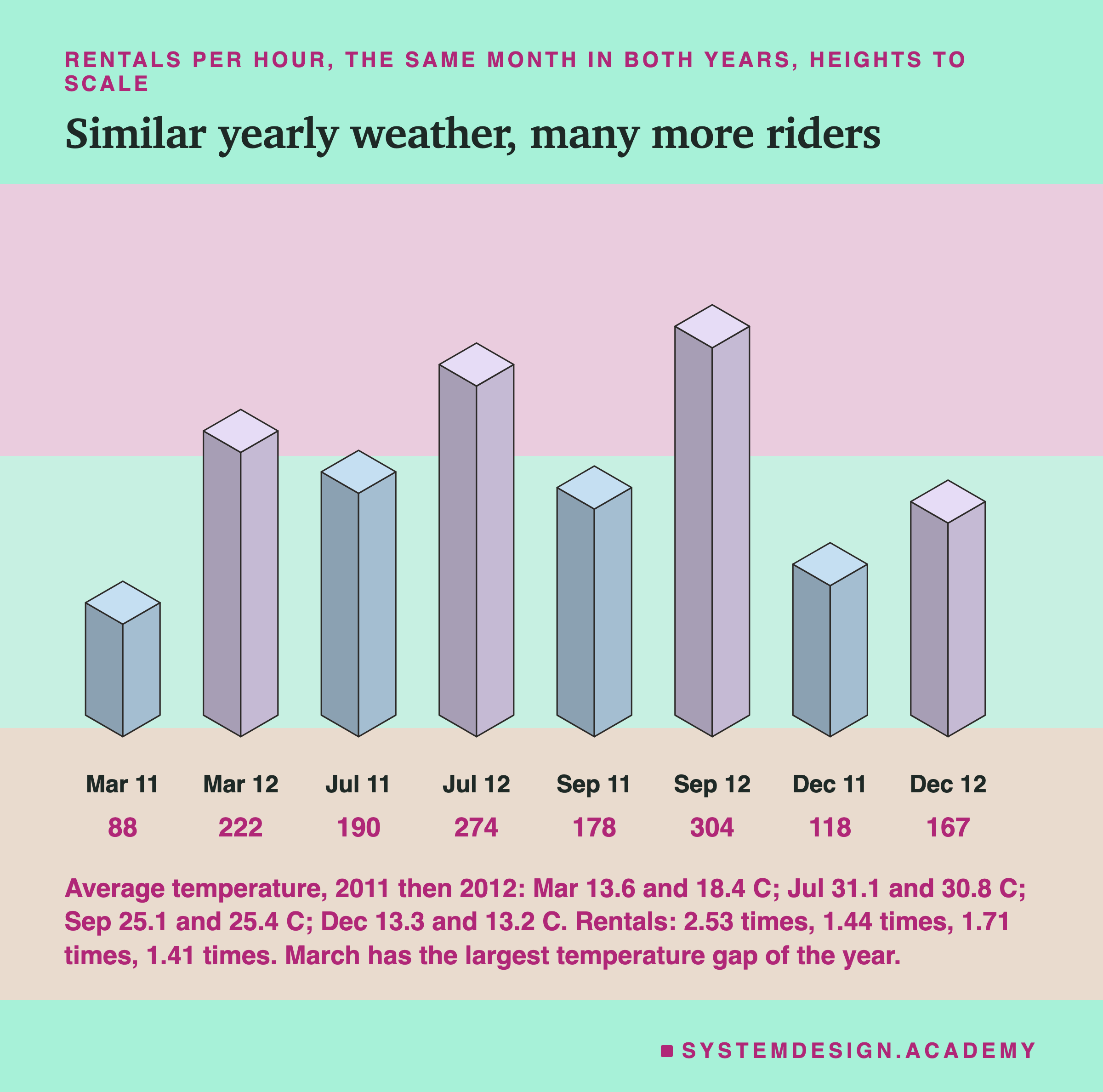
The riders did not look like 2011. Every month of 2012 had between 1.41 and 2.53 times as many rentals an hour as the same month of 2011, 234.7 an hour against 143.8 over the year. The four months in the drawing include March on purpose: it had the largest temperature gap of the year, and still most of its extra riders are left over once the weather is counted, as the next figure shows. That is the change lesson 2 measured, and it is a change in the target, the number the model guesses, not in its inputs.
Output Drift Moved a Little, the World a Lot
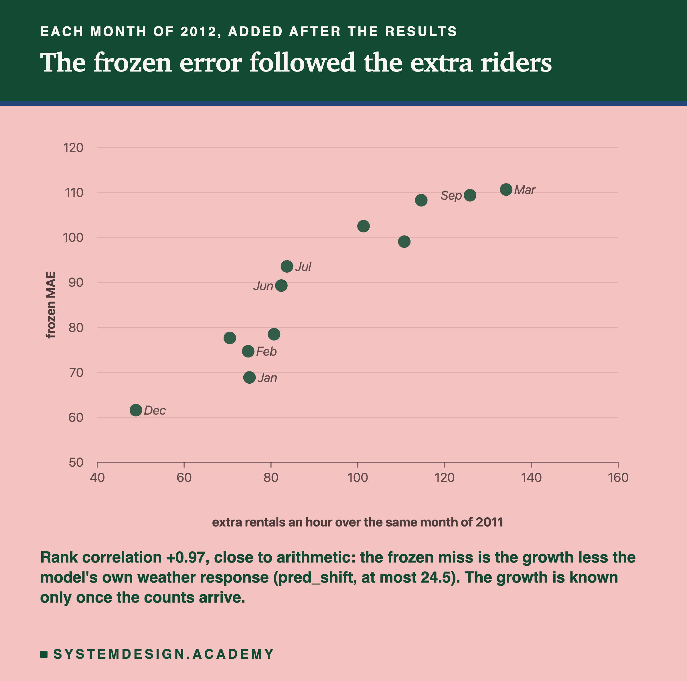
pred_shift, the output drift, had the highest correlation of the four, 0.58. It is worth seeing what it actually measured.
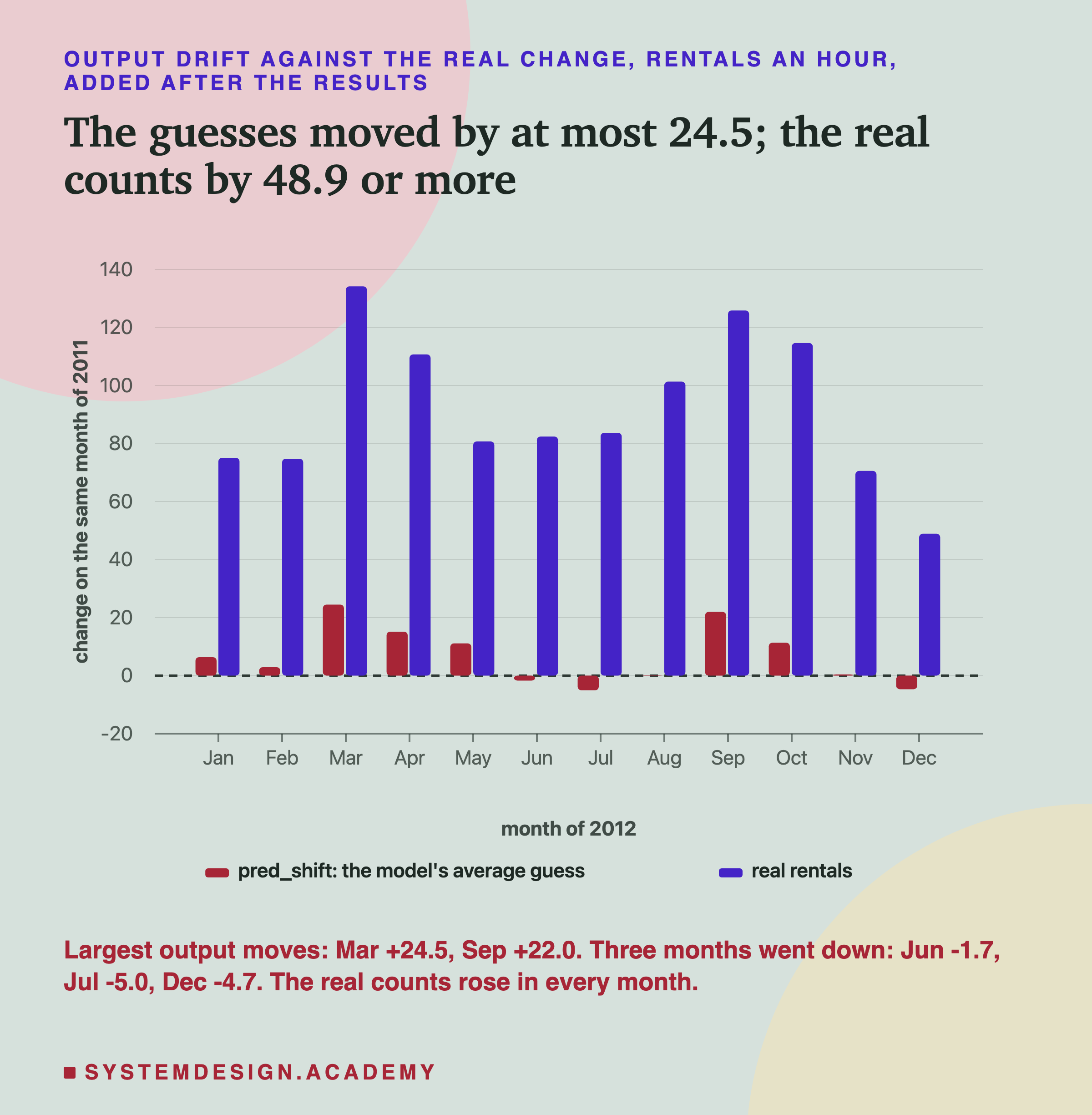
The frozen model's average guess for a 2012 month was never more than 24.5 rentals an hour away from its average guess for the same month of 2011. The real counts moved by 48.9 to 134.2 in the same months. The lab did not store the model's guesses on 2011, so the report works out the 2011 average as the 2012 average minus pred_shift, and says so.
This is not a fault in the measure. A frozen model's guesses can only move as far as its inputs push them. In March 2012, which was 4.9 C warmer than March 2011, the model raised its guess by 24.5, partly, it seems, because warm days bring riders. That reason is untested: March 2012 was also clearer than March 2011, with different humidity and a different calendar. It could not raise its guess for whatever brought the extra riders, because nothing in its inputs described it. Output drift is input drift seen through the model: it tells you how much the model thinks the world changed, never how much it really did.
Why did pred_shift still rank the months somewhat like the error did? Its rank correlation with the real change in riders was 0.65 (measured). My guess, not tested: the months with better weather than last year were also months with the biggest growth, perhaps because good weather brings out more of a growing number of riders. With 12 points I cannot tell that apart from chance.
The Same-Month Reference as an Alarm
psi_same is the fairer reference: January against January. At a month's size, batch size alone no longer makes psi cross the line (lesson 4's follow-up, and the random draws on the season slide). So I read it, after the results, the way a team would: as an alarm at the usual 0.25.
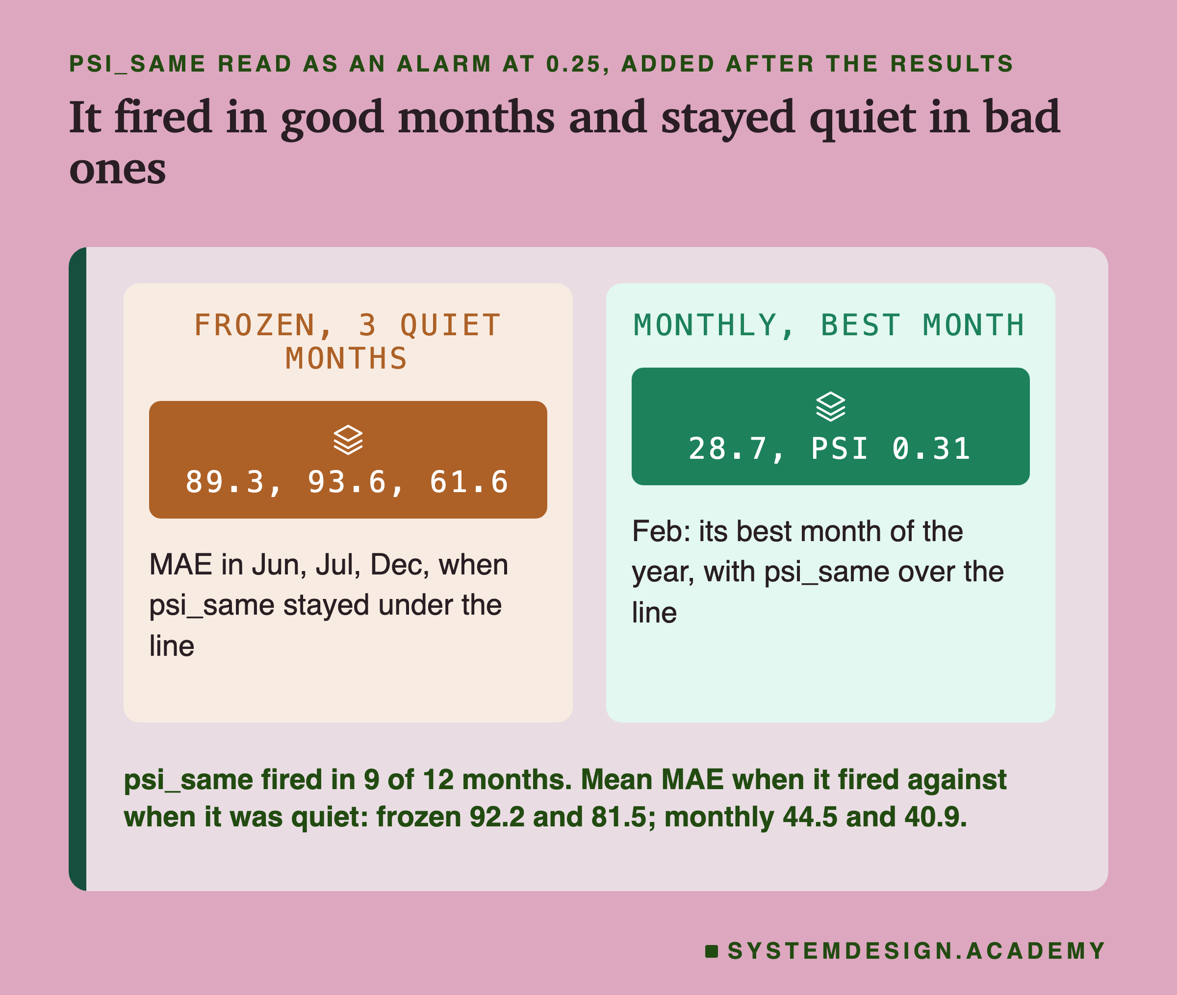
It fired in 9 of the 12 months. For the frozen model, the months it fired averaged an MAE of 92.2, and the three quiet months, June, July and December, averaged 81.5. So the quiet months were not good months: the frozen model missed them by 89.3, 93.6 and 61.6 rentals an hour, between 32% and 37% of each month's real average. An alarm that stays quiet during those months would have told a team that all was well while the model was far behind.
It fails the other way too. The monthly model, retrained every month, had its best month of the year in February, with an MAE of 28.7. psi_same was 0.31 in February, over the line. So the alarm fired on the best month of the healthy model. For the monthly model, the months it fired averaged 44.5 and the quiet months 40.9: close to no difference.
psi_same measured something real. March 2012 was warmer than March 2011, and September 2012 was much clearer (75% of hours clear against 48%, the largest weather_mix of the year, 0.269). Those are true changes in the weather. They are just not the same thing as the model being wrong. A model that has seen warm Marches and clear Septembers can handle them.
One more detail changes the verdict itself, and a review of this lesson found it. Lesson 4 also scored whole months against the same month of 2011 and found 2 of its 5 test months over the line (September 0.87 and November 1.01), where this lab finds 4 of the same 5. The difference is how the ten bands are cut: this lab cuts them from all of 2011, while lesson 4 cut them from the same month of 2011 itself (and used only the last 588 hours of August). I recomputed psi_same lesson 4's way for every month (after the results; the report checks it against lesson 4's stored values): it crosses 0.25 in 7 of 12 months instead of 9, because August falls from 0.28 to 0.11 and October from 0.44 to 0.15. So whether a month crosses 0.25 depends on how the bands are cut, which is one more reason not to treat that line as an alarm.
The Real Alarm: A Few Labels, Early
If the inputs could not show the frozen model's problem, what could, and how soon? Everything on this slide was added after the results, and it reads lesson 2's stored guesses; no model was trained for it.
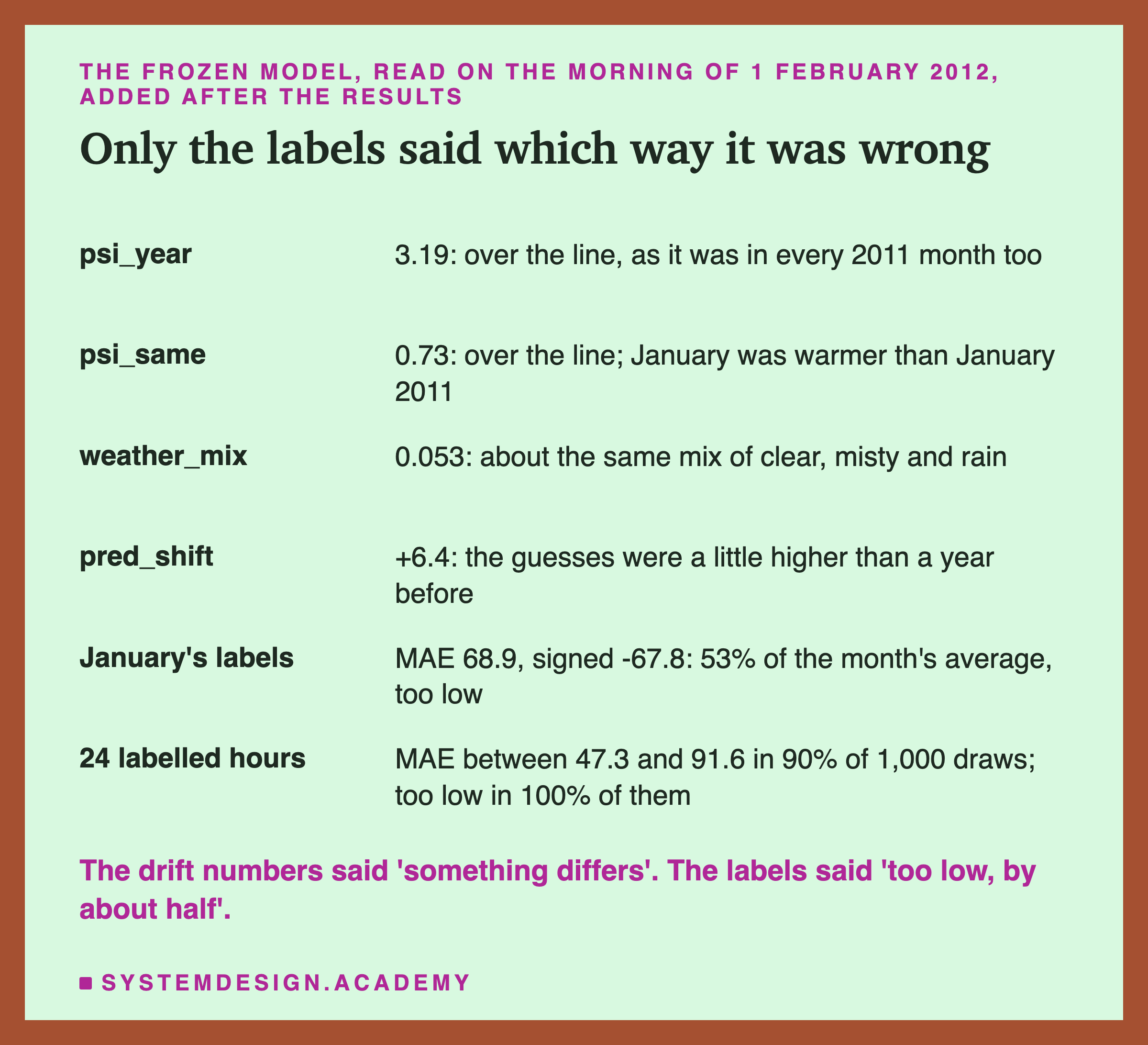
Put yourself on the morning of 1 February 2012, with the frozen model in service. psi_year says 3.19, but it said as much about every month of 2011. psi_same says 0.73: January was warmer than a year before. weather_mix says 0.053, about the same weather. pred_shift says +6.4: the model's guesses were a little higher than last January. None of them says which way the model is wrong, or by how much. January's labels do: an MAE of 68.9 and a signed error of -67.8, 53% of the month's average, too low. That is lesson 2's newest labelled month, and it said the same thing every month after.
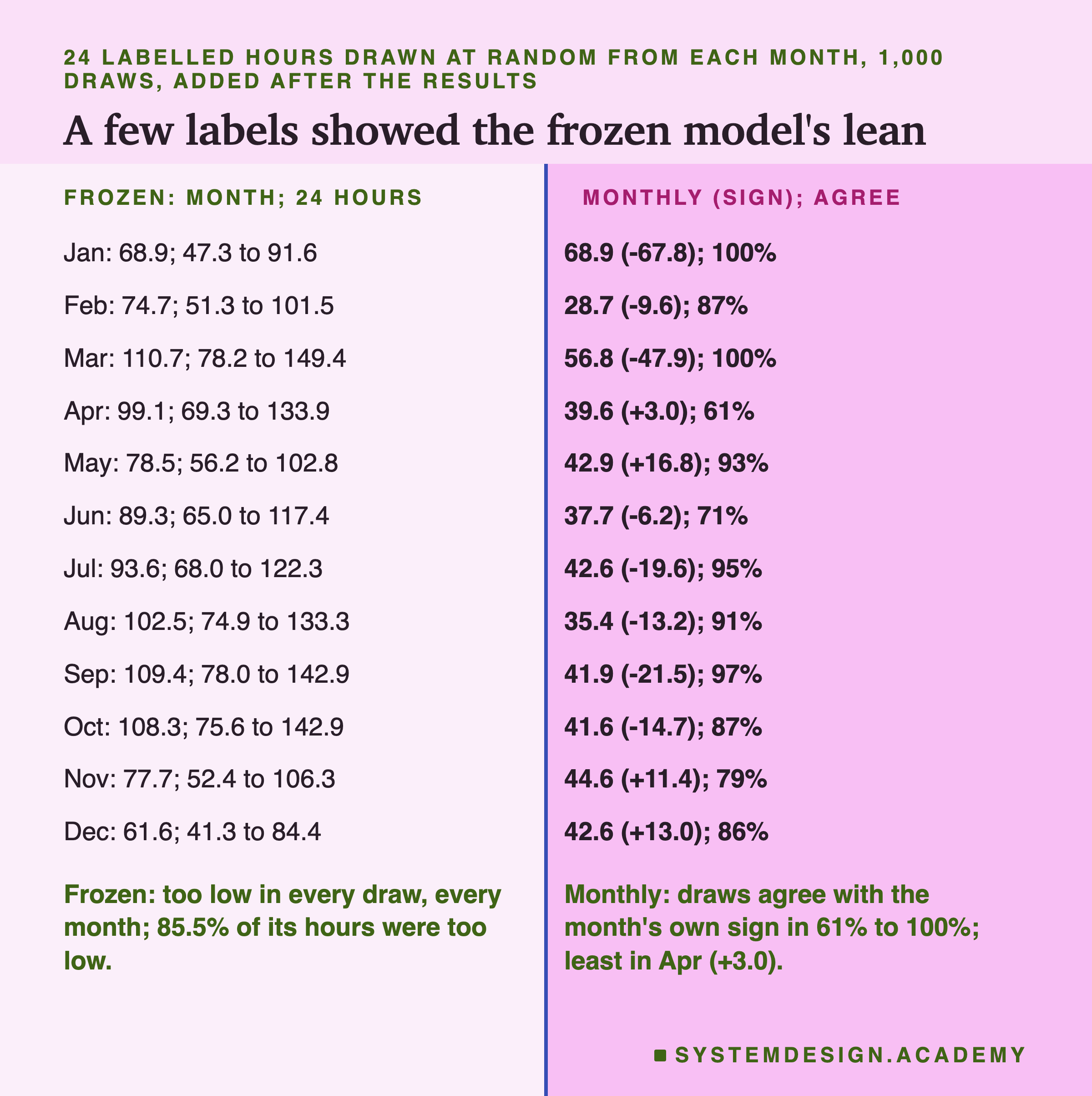
You may not have a whole month of labels. So I asked how few would do. For each month I drew 24 hours at random, 1,000 times, and scored the model on those 24 alone. Those hours come from across the whole month, so all 24 exist only at its end; a team would collect them as a small daily sample, a little under one labelled hour a day, adding up to 24 by the end of the month. The lab tested the 24, not the daily routine. For the frozen model, every one of the 1,000 draws in every month had a signed error below zero: 24 labels were enough to see that it guessed too low. For January, 90% of the draws gave an MAE between 47.3 and 91.6, against the full month's 68.9: rough, but in the right place. The frozen model leaned so far that a few labels found it. The monthly model leaned much less. Its draws agreed with the sign of the whole month in 61% to 100% of cases. In May only 7% of the draws said "too low", and that is right: May's whole-month signed error was +16.8, too high. The draws split only where the month's own lean was small: April (+3.0, 61% agree) and June (-6.2, 71%). A small lean needs more labels.
Try It Yourself
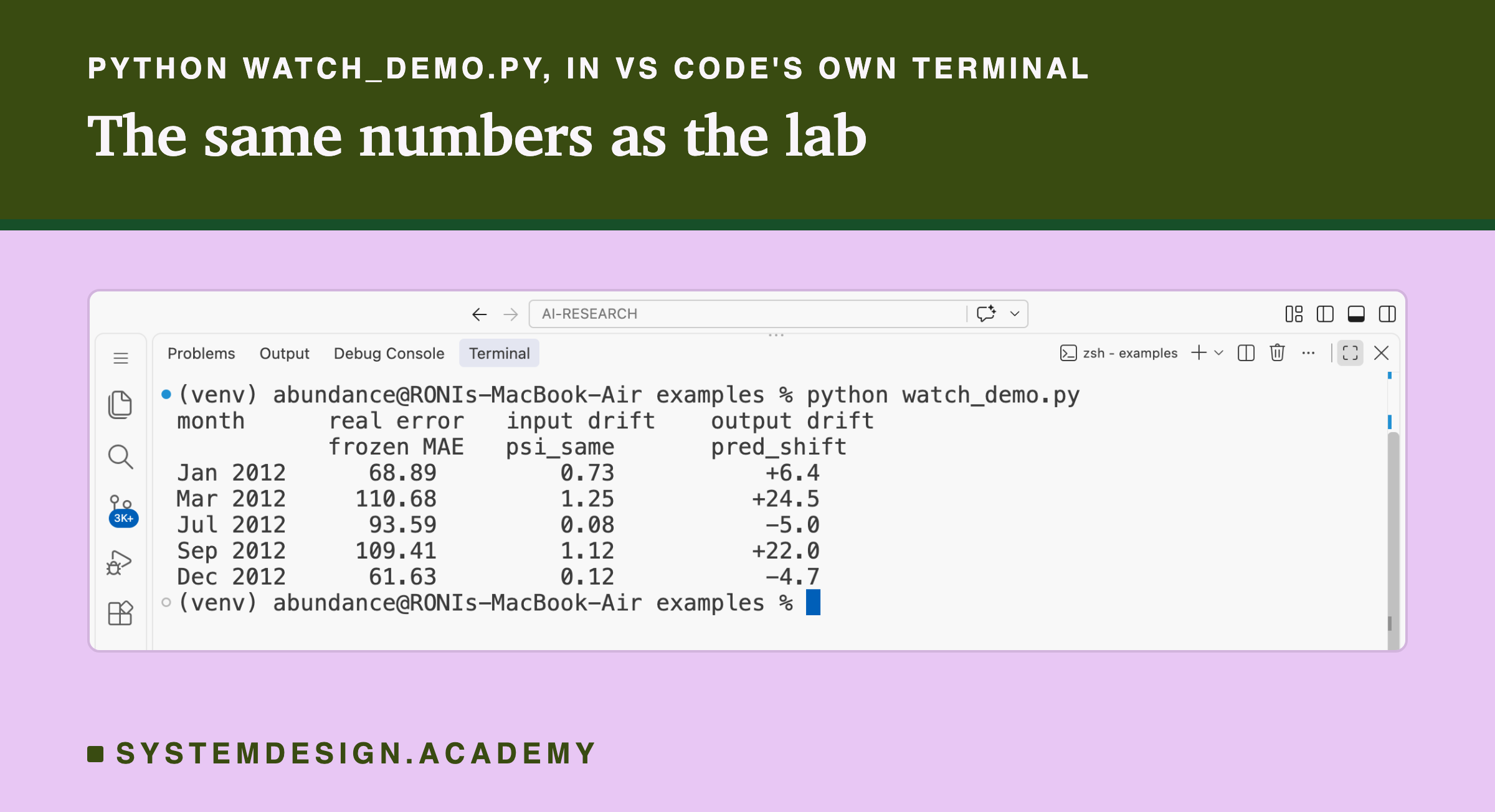
This script is the lab made small. It downloads the same data, trains the frozen model once on 2011, and for five months of 2012 prints the frozen model's real error, psi_same and pred_shift side by side. It does not need a GPU.
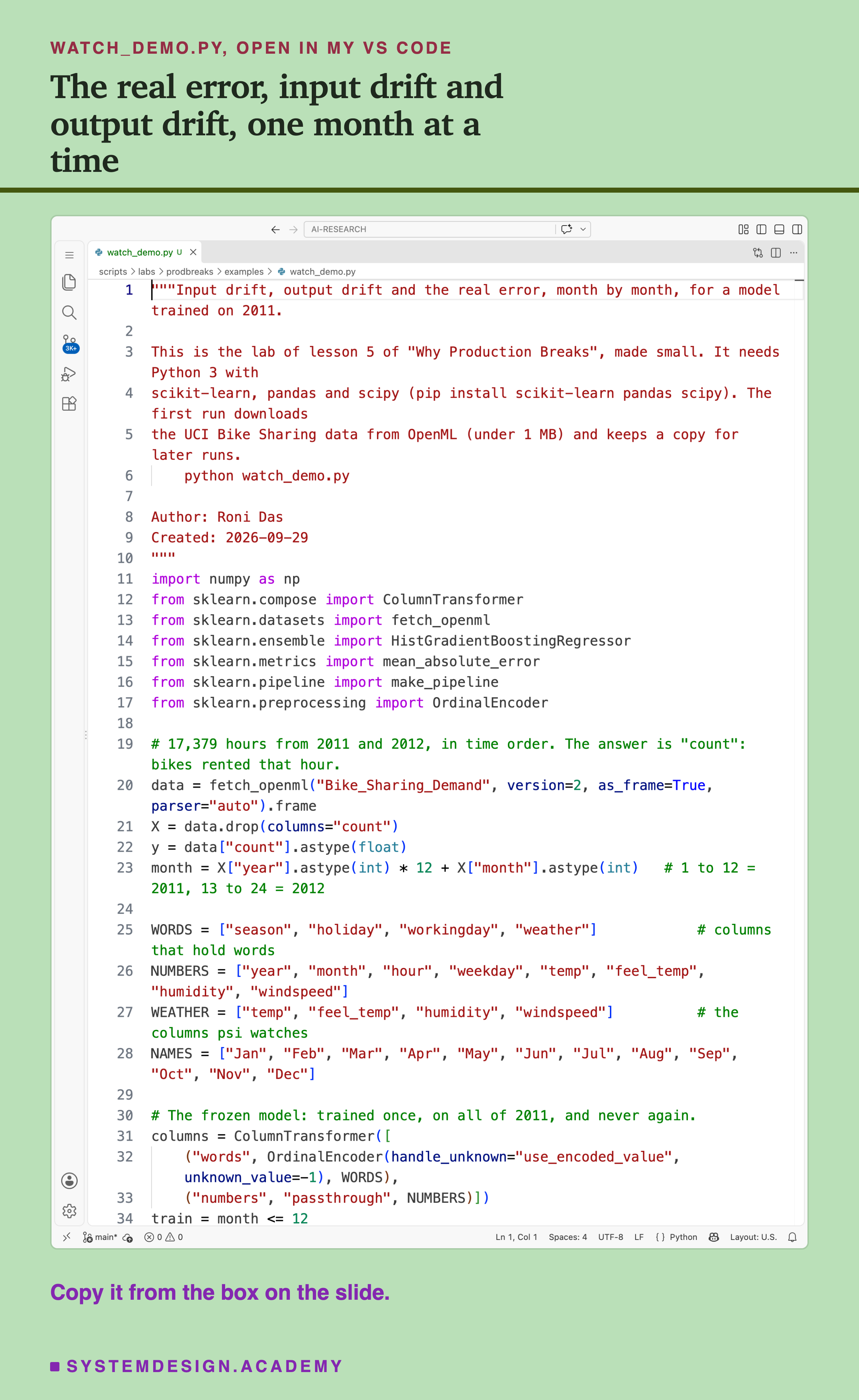
Before you run this lab. You need Python 3 and three libraries: pip install scikit-learn pandas scipy. The demo itself needs only scikit-learn and pandas (its docstring lists scipy too); scipy comes with scikit-learn anyway, and the full lab and report use it for the rank correlation. scikit-learn holds the model and the download, and pandas holds the table. The first run downloads the Bike Sharing data from OpenML, so it needs an internet connection once; scikit-learn keeps a copy in a folder in your home directory (scikit_learn_data) for later runs. I ran it with scikit-learn 1.9.1 on a Mac. scikit-learn runs the same way on Windows and Linux, but I have not checked the numbers there, and another version of scikit-learn may give slightly different decimals.
"""Input drift, output drift and the real error, month by month, for a model trained on 2011.

This is the lab of lesson 5 of "Why Production Breaks", made small. It needs Python 3 with
scikit-learn, pandas and scipy (pip install scikit-learn pandas scipy). The first run downloads
the UCI Bike Sharing data from OpenML (under 1 MB) and keeps a copy for later runs.
    python watch_demo.py

Author: Roni Das
Created: 2026-09-29
"""
import numpy as np
from sklearn.compose import ColumnTransformer
from sklearn.datasets import fetch_openml
from sklearn.ensemble import HistGradientBoostingRegressor
from sklearn.metrics import mean_absolute_error
from sklearn.pipeline import make_pipeline
from sklearn.preprocessing import OrdinalEncoder

# 17,379 hours from 2011 and 2012, in time order. The answer is "count": bikes rented that hour.
data = fetch_openml("Bike_Sharing_Demand", version=2, as_frame=True, parser="auto").frame
X = data.drop(columns="count")
y = data["count"].astype(float)
month = X["year"].astype(int) * 12 + X["month"].astype(int)   # 1 to 12 = 2011, 13 to 24 = 2012

WORDS = ["season", "holiday", "workingday", "weather"]            # columns that hold words
NUMBERS = ["year", "month", "hour", "weekday", "temp", "feel_temp", "humidity", "windspeed"]
WEATHER = ["temp", "feel_temp", "humidity", "windspeed"]          # the columns psi watches
NAMES = ["Jan", "Feb", "Mar", "Apr", "May", "Jun", "Jul", "Aug", "Sep", "Oct", "Nov", "Dec"]

# The frozen model: trained once, on all of 2011, and never again.
columns = ColumnTransformer([
    ("words", OrdinalEncoder(handle_unknown="use_encoded_value", unknown_value=-1), WORDS),
    ("numbers", "passthrough", NUMBERS)])
train = month <= 12
frozen = make_pipeline(columns, HistGradientBoostingRegressor(random_state=0))
frozen.fit(X[train], y[train])

# psi cuts each weather column into 10 bands, each holding a tenth of 2011's hours.
bands = {}
for c in WEATHER:
    edges = np.unique(np.quantile(X[train][c].astype(float), np.linspace(0, 1, 11)))
    edges[0], edges[-1] = -np.inf, np.inf
    bands[c] = edges


def psi(before, now, edges):
    # population stability index: how far the share of hours in each band moved
    b = np.clip(np.histogram(before, edges)[0] / len(before), 1e-4, None)
    n = np.clip(np.histogram(now, edges)[0] / len(now), 1e-4, None)
    return float(((n - b) * np.log(n / b)).sum())


print("month      real error   input drift    output drift")
print("           frozen MAE   psi_same       pred_shift")
for m in [13, 15, 19, 21, 24]:                                    # Jan, Mar, Jul, Sep, Dec 2012
    now, last_year = X[month == m], X[month == m - 12]            # this month, same month of 2011
    mae = mean_absolute_error(y[month == m], frozen.predict(now))
    drift = max(psi(last_year[c].astype(float), now[c].astype(float), bands[c])
                for c in WEATHER)
    shift = frozen.predict(now).mean() - frozen.predict(last_year).mean()
    print(f"{NAMES[m - 13]} 2012   {mae:8.2f}     {drift:8.2f}       {shift:+8.1f}")
The Lab Report
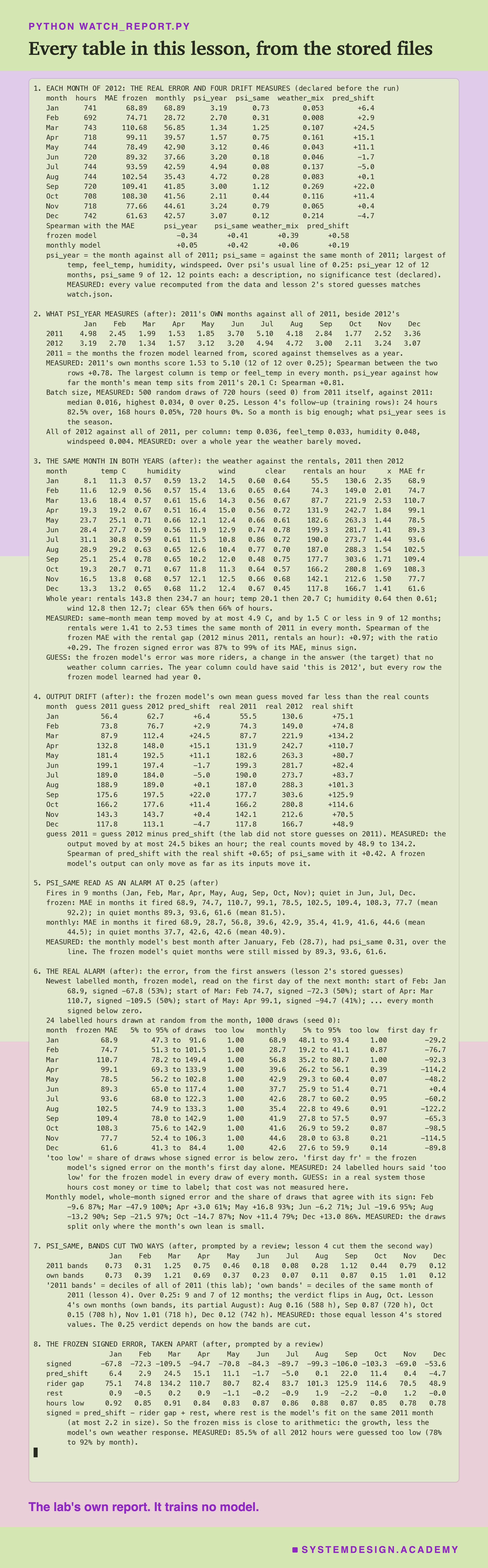
The report lives in scripts/labs/prodbreaks/watch_report.py. It reads the lab's stored file, results/watch.json, lesson 2's stored guesses in results/drift.json, lesson 4's batch-size follow-up in results/checks_psi_size.json and its same-month psi in results/checks_followup.json, and the Bike Sharing data itself from scikit-learn's local copy. It trains no model.
Before it prints anything, it checks the files against the data and against each other. Each month's MAE in watch.json must equal lesson 2's stored MAE for the same model and month. psi_year, psi_same and weather_mix are recomputed from the data and must match. The eight rank correlations are recomputed and must match. The one number it cannot recompute is pred_shift, because the model's guesses on 2011 were never stored; the report reads it from watch.json, cross-checks its 2012 half against lesson 2's guesses, and says so. If anything differs, the report stops. Every explanation it prints starts with MEASURED or GUESS.
Rank the Measures Yourself
This box has no model in it. It holds the lab's four drift measures for each month of 2012, the average rentals of each month of 2011, and every hour of 2012 with its real count and the stored guesses of both models (to two decimals). It runs in your browser.
As it is, the box prints the table from the results slide and the frozen model's four rank correlations: -0.34, +0.41, +0.39 and +0.58, the lab's numbers. The report's box mode checks every printed row and all eight correlations against watch.json; storing the guesses to two decimals moves a monthly MAE by at most 0.00017.
Try agreement(MONTHLY) for the monthly model: +0.05, +0.42, +0.06, +0.19. Try label_a_few(0) to score January from 24 random hours: with seed 0 it gives an MAE of 44.8 and a signed error of -42.7, against 68.9 for the whole month. That is an unusual draw, just below the 47.3 to 91.6 that held 90% of the report's draws (the box picks hours with Python's own random module, so its draws are not the report's). label_a_few(0, seed=1) gives 75.9 and -74.8. Different hours, the same direction. Then try the monthly model in May, label_a_few(4, guess=MONTHLY): 24 hours gave a signed error of +42.8 and n=100 gave +28.7, against +16.8 for the whole month: the right direction, the size still rough. The spearman function takes any two lists of 12 numbers, so you can build your own measure and rank it against [mae(FROZEN, m) for m in range(12)].
The Code, Part by Part
Loading and training. fetch_openml("Bike_Sharing_Demand", version=2, as_frame=True) downloads the data (or reads the local copy). The line month = X["year"].astype(int) * 12 + X["month"].astype(int) numbers the months 1 to 24, so "all of 2011" is month <= 12. The frozen model is the pipeline from the earlier lessons: an OrdinalEncoder turns the four word columns into number codes, and HistGradientBoostingRegressor(random_state=0) is the boosted trees. It is trained once, on 2011.
The bands. For each weather column, np.quantile finds the values that cut 2011's hours into ten equal groups. The first and last edges are set to minus and plus infinity, so every value lands in some band.
psi. psi(before, now, edges) counts the share of hours in each band for the reference and for this month, gives an empty band a share of 0.0001 so the logarithm is defined (the log, written np.log, cannot be taken of 0), and adds up the difference in shares times the log of their ratio. It is the lab's own function.
The loop. For five months of 2012, now is this month's rows and last_year the same month of 2011. The real error is mean_absolute_error of the frozen model's guesses. psi_same is the largest psi over the four columns, last_year against . pred_shift is the model's mean guess on minus its mean guess on .
How to Watch a Model Whose Answers Arrive Late
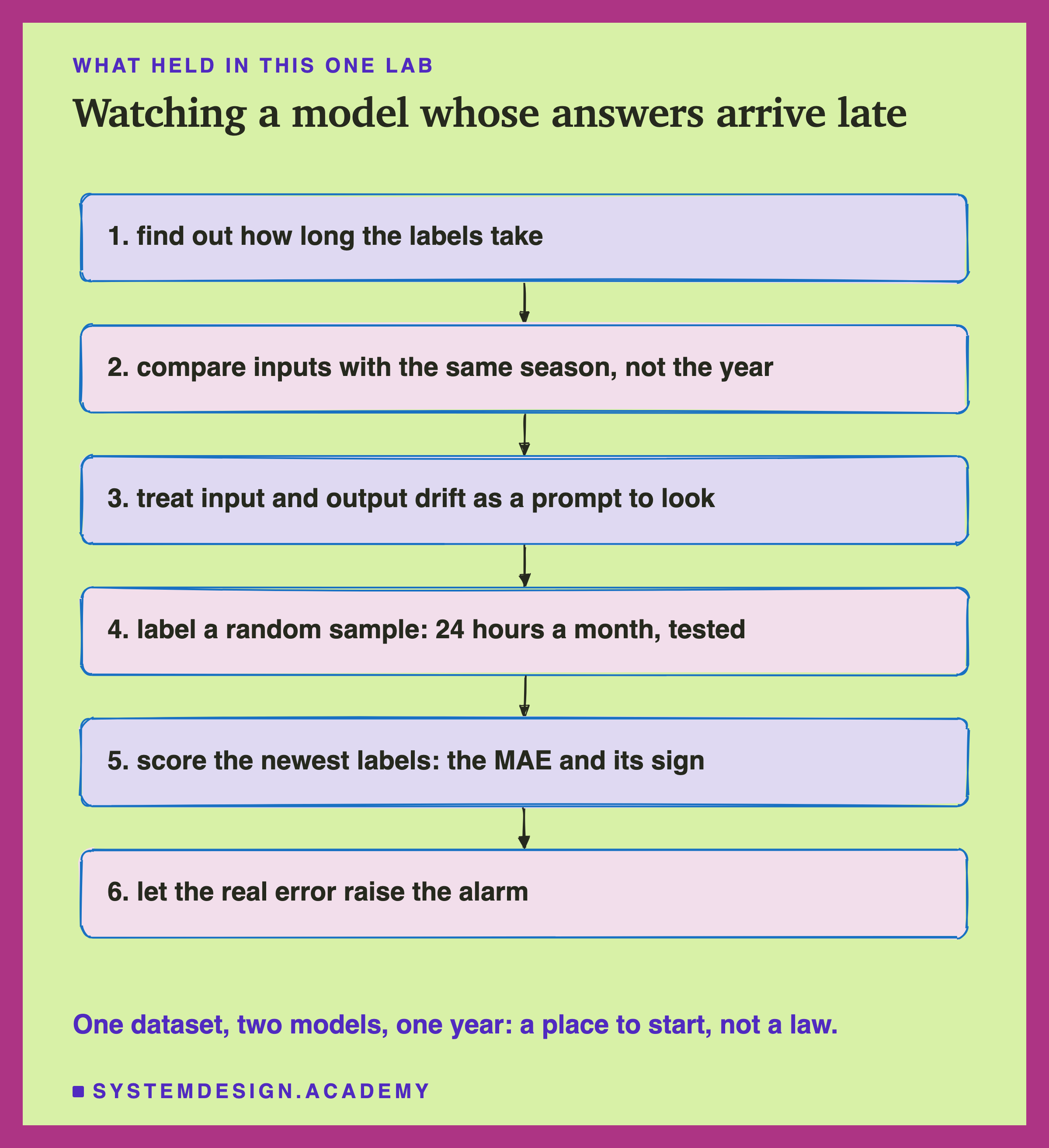
Find out how long the labels take. Before you choose what to watch, measure the label delay. If labels arrive within an hour, as they do for bike rentals, score the real error every day and treat everything else as a detail. If they take months, you need something else in the meantime, and you need to know how long "in the meantime" is.
Compare inputs with the same season, not the whole year. A reference that mixes all seasons makes every month look like drift. Here psi_year fired on every month of 2012 and on every month of 2011, the model's own training year. Compare a July with past Julys, and check on known-good data how often your measure crosses its line.
Treat a drift number as a reason to look. When a drift number moves, someone should look at what moved and ask whether the model has seen anything like it. Here psi_same rose in a warm March and a clear September: real changes, and ones the model could mostly handle.
Label a small random sample, a little each day. Pay for it if you must. 24 labelled hours a month, a little under one a day, were enough to show the frozen model's lean in every draw, every month; the lab tested the 24, not the daily routine. The sample must be random: labelling only the cases that are easy to check gives a biased answer.
Score the newest labels: the MAE and its sign. As in lesson 2, compare with the error you accepted at launch, and read the sign.
Let the real error raise the alarm. Calling someone, retraining, going back to the old model: tie them to the real error on labelled data, not to a drift number alone.
When Drift Measures Help, and When They Do Not
Use input drift checks when labels are slow and inputs can break. Lesson 4 showed simple input checks catching unit changes, new labels, stuck sensors and missing values with few false alarms. Those are breaks in the inputs themselves, and there the inputs are exactly the right place to look. A value no training hour ever had is a real fault, so those checks can raise an alarm on their own. A shift in the mix of values, the drift this lesson measured, should not be the only alarm.
Use a same-season reference when your data has seasons. Weather, shopping, travel, school terms. Against a whole-year reference, a season looks like drift every time: here 1.34 to 4.94 in 2012, and 1.53 to 5.10 in the very year the model learned from.
Use output drift to see what the model believes changed. It is cheap and needs no labels. Here it showed the model raising its March guesses by 24.5 rentals an hour for a warmer March. Just remember that it can only move as far as the inputs push it.
Do not let input drift take the place of the error when the target itself can move. More customers, new prices, a competitor closing, a change in what people want. Here the error came from more riders, which none of the weather inputs carried, and the best rank correlation of any measure was 0.58 on 12 points.
Do not call people out on a drift line you have not tested on clean data. psi_same fired in 9 of 12 months, including the healthy model's best month. Measure the false alarms first, as lesson 4 did.
Do not skip labels because labels are expensive. A small random sample is cheaper than a year of a model that misses by 30% to 53% of each month's average, and here it gave the direction of the miss from 24 hours.
What These Numbers Can and Cannot Tell You
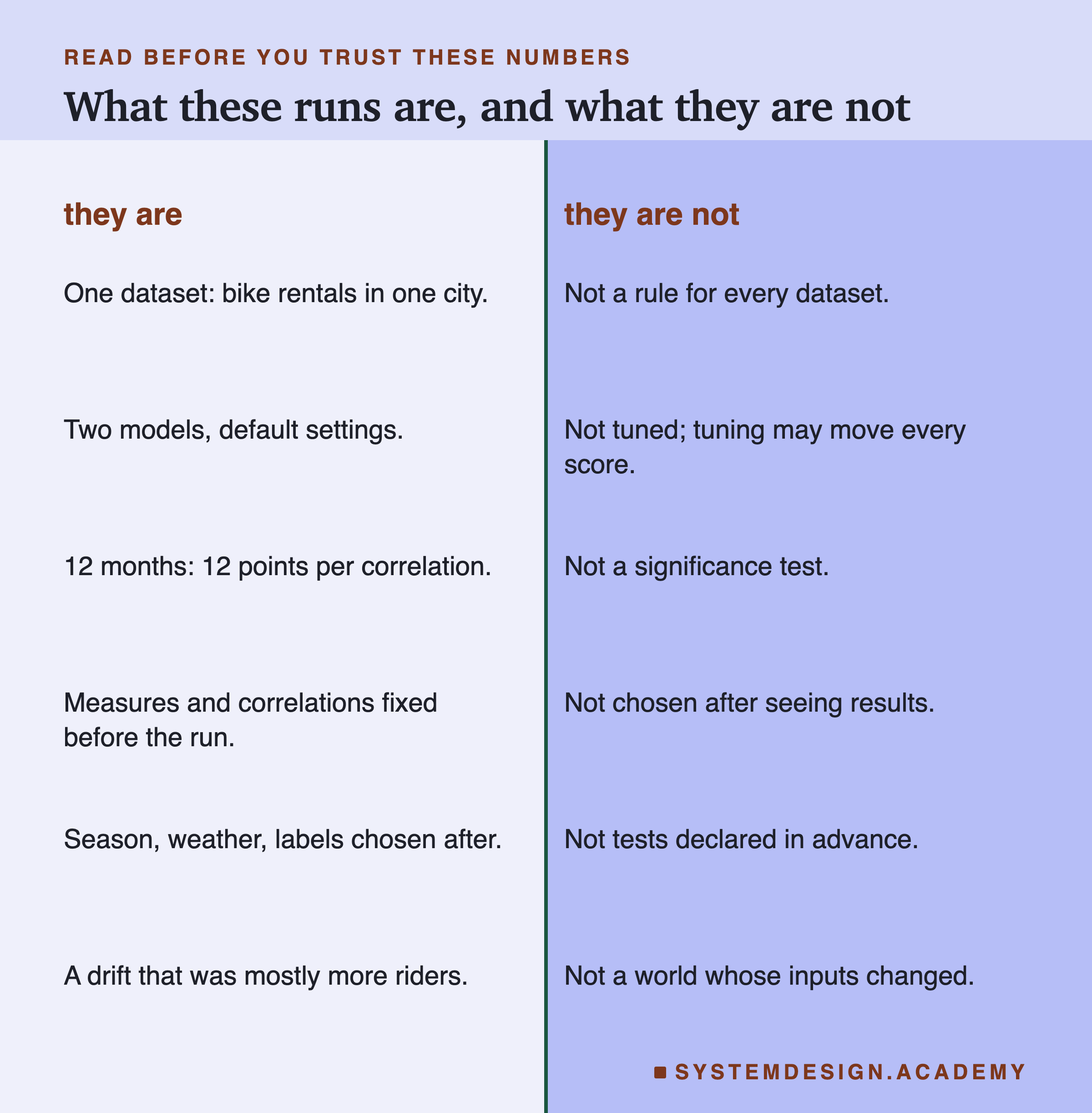
One dataset, one year. Hourly bike rentals in one city, and the twelve months of 2012. The drift here was mostly one kind: many more riders, with weather much like the year before. In data where the inputs themselves change a lot (a new kind of customer, a new sensor, a new region), input drift could track the error much better than it did here. I make no claim that it fails everywhere.
Two models, default settings. The frozen and monthly boosted trees of lesson 2, not tuned. Another model might react to the same months differently.
12 points per correlation. The design declared that 12 months are far too few for a significance test, so none was run. -0.34, 0.41, 0.39 and 0.58 describe this year; they are not estimates of anything general.
The design was declared; the reading was not. The two models, the four measures and the rank correlations were written in watch_lab.py before the run. 2011's own months, the random draws, the weather and rental comparisons, the rank link with the rental gap, the alarm reading and all the label sampling were chosen after I saw the results. The 24-hour size and the 1,000 draws were my choice then, not something I tested several values of.
The reasons are partly guesses. That the weather looked like 2011 over the year, and the riders did not, is measured. That the frozen model's error came from the growth is close to arithmetic: its signed error is the growth less its own weather response, give or take 2.2, and lesson 2 found it never used the year. Why pred_shift ranked the months at 0.58 is a guess I have not tested.
What to Do Next
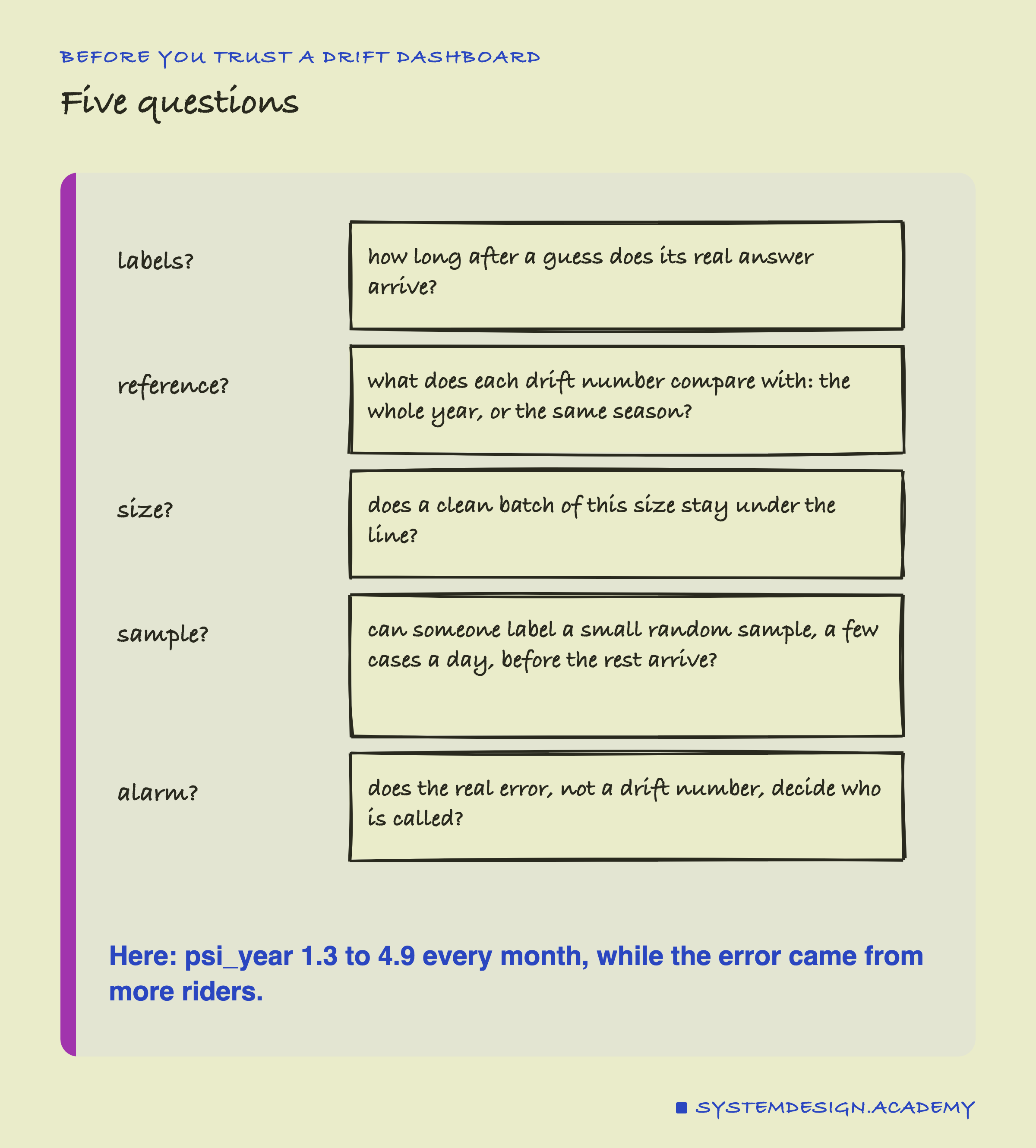
Take a model that you or your team runs, and look at its drift dashboard, if it has one. For each number on it, find out what it compares with. If the answer is "the training data" and the data has seasons, run the same measure on a stretch of the training data itself, a month at a time, and count how often it crosses its line. That count is how often it will raise an alarm for nothing.
Then find out how long the labels take, and whether you could label a small random sample sooner. About one labelled case a day adds up to the 24 a month tested here, and even several a day is a small job for a person. Score the model on them as they arrive, read the sign, and let that number decide who is called.
The next lesson in this chapter looks at a harder case: what happens when the model's own guesses change the data it will later learn from, a feedback loop, as a clearly labelled simulation built on the same real data.
Knowledge Check
Knowledge Check
4 questions - Score 80% to pass
psi_year was above 0.25 in every month of 2012. What did the lab find it mostly measured?
Why could no input measure show the frozen model's main error?
On the morning of 1 February 2012, which reading showed which way the frozen model was wrong?
What does the lesson recommend doing with input and output drift numbers?